Axii.

Axii.
More Posts from Artificelux and Others

skull tears

The Alchemist.


Back to taking about the book!
Check it out below:

A Monument to Our Destruction. (Atomic Shadow.)


Main Title Design: Lesson 3.
For this assignment, we were tasked with creating six narrative frames with typography using only a limited set of 40 images. The film is a documentary about the Apollo mission. I used only 6 of those images, in my effort to create a set of modern minimal titles.
Instead of going for the sepia-faded, old-film look, I really wanted everything to have a strong black level, to make it feel more modern, (perhaps more like how the movie Gravity made me feel about outer space). However, I didn't want to completely do away with a nod to the past, to the "Golden Age" of space exploration, so the opening frames are very warm as the sun breaks around the edge of a hidden planet. It evokes a more mysterious energy, more like a sci-fi movie, speaking to discovery and unknown worlds.
As we begin to pan across the planet, we see the Command Module hanging in orbit around the planet. It's moving towards us slightly, even as we pan further to the left of it. As it grows larger in our field of vision, preparing to pass by on the right side of the screen, the camera pulls back through a window, and we realize we are in the Lunar Module, seeing through the eyes of one of the astronauts.
The camera pans away from the first window, settling on the smaller "approach" window. At first the view through that portal is blurred, focusing instead on the numbers on the glass. But once we move beyond that glass, the moon is passing by, filling our vision, until finally, we settle on the final frame. This last shot mirrors and inverts the first frame, contrasting the warm glow of exploration and expectations of 1960s space exploration with the colder, harsher reality that is outer space.
As for why I chose the "side" view of the moon, instead of putting it at the bottom of the shot... simply put, it's not a view we see as much in film and other media. And the truth is, there is no up or down in space, so the views aren't grounded in the planet's surface being beneath your feet.
The font is "Impact Label Regular." I chose it in an attempt to replicate the old-style label machines that created the raised labels for technical systems and buttons back in the 60s and 70s. The font also evokes the feel of classified documents, riddled with black redaction marks. The Apollo missions were all part of the space race and NASA's battle with the Soviet Union (not to mention the strong undercurrents of the Cold War). The science and research documents behind the rockets and computer systems were highly classified materials, and so I wanted to make sure to include an homage to this atmosphere.
(via Homework - 3. A Controlled Experiment)
@ashthorp

Full moon today... looking up at a full moon is always one of those times when I feel the scale of the solar system and planets more acutely, and naturally it gets me thinking about science fiction and outer space. For those in the northern hemisphere, we're also a month into very warm summer, which has me dreaming of somewhere dark and cold more often than not.
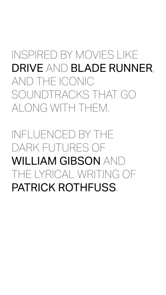
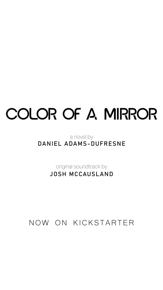
Put these two things together, and we have the first ever sale bundle for my debut novel Color of a Mirror and its accompanying soundtrack! Set on the moon in a subterranean cyberpunk city, it's the perfect antidote to too much heat and not enough jacket weather. Add in the dark ambient soundtrack, and it's as close as you can get to actually being there.
And so... The Full Moon Bundle.
If you purchase the Hardcover Novel, the Vinyl Soundtrack, and the E-book all together, you automatically get 25% off all three! No sign-ups or anything necessary; just go to the purchase page for any of those three items, and you'll find an option to purchase the bundle.
If you want a psychological noir sci-fi mystery that Kirkus Reviews called "intricate, next-generation cyberpunk, with a head-spinning finale," check out the link below! There's never been a better time to wander into The Dive.

-
 black-kenobi liked this · 9 years ago
 -
 apianoaday liked this · 9 years ago
 -
 geffadamsphotography liked this · 9 years ago
 -
 sejkko liked this · 9 years ago
 -
 artificelux reblogged this · 9 years ago
