This Is Still Something I Struggle With, So This Is Less A Tutorial And More Just A Collection Of Tips
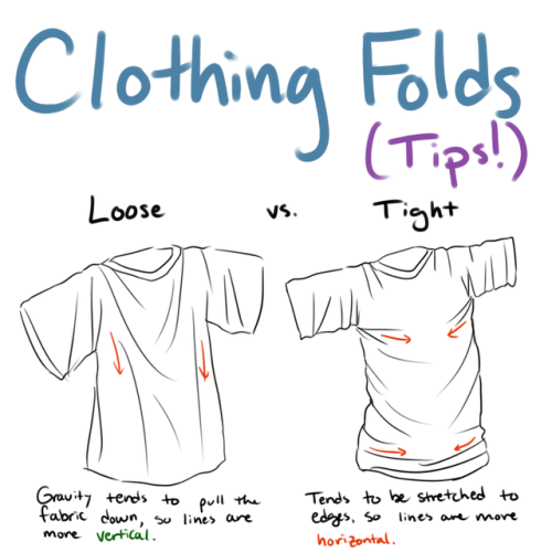
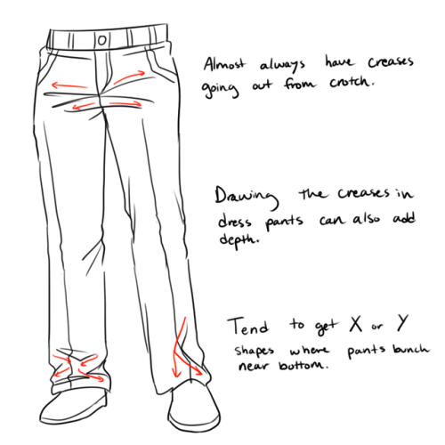
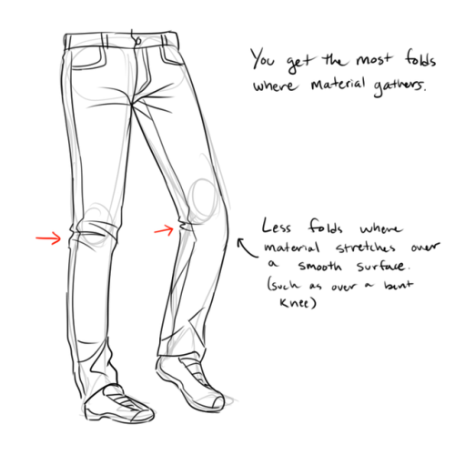
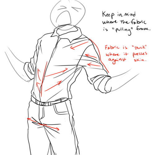
This is still something I struggle with, so this is less a tutorial and more just a collection of tips and things I’ve noticed when drawing clothing folds! I hope this helps some of you!
More Posts from Arttuti and Others
Webcomic tips
In the conclusion for now, some things I’d really recommend doing if you’re seriously considering making a webcomic (or really a comic in general). Some of these don’t really apply to strips or gag-a-day type of comics, but I’m not talking about those here.
1. Write down ideas\sketch stuff, LEGIBLY. “I’m gonna remember it later” NEVER works. And if you scribble it somewhere on a piece of paper, you’d better scan it or retype in one doc later, because tiny notes always get lost among other doodles in my skethbooks.

(i know it’s hard to keep everything clean and organized, but this mess is just not productive)
If your project is a collaboration, save your conversations. If you’re working alone, make a blog for your ramblings. You have no clue what tears of relief I cry when I open that blog and rememeber I don’t have to painstakingly look through my heaps of sketchbooks and folders for a tiny idea I’m not even sure I wrote down a few months ago.
2. Inspiration folders, or even better, inspo blog with tags also help with collecting and remembering ideas. Color schemes, landscapes, style inspirations, atmospheric stuff, maybe some photo references, all those neat things.

3. Basic tier: character design sheets. Top tier: common poses, expressions. God tier: outfits they wear throughout the comic. Holy cow tier: turnaround sheets for all those outfits.

(I’d die trying to find good pages for references without these)
4. If you haven’t finished detailing the plot, don’t even think about moving on to drawing the comic. You’re gonna regret it when you come up with a really cool plot element that can’t be incorporated anymore because you’ve already drawn all the parts you could’ve tweaked.
5. Don’t just define the plot, make a script. Writing down the lines and the brief description of the actions serves me fine:

(notice that I approximately divided the pages & the text that’d go to each panel on a page)
6. Hard mode: make thumbnails for all the pages, if possible. At least whenever a new chapter starts.
7. If your story involves some convoluted chronology shenanigans, you’d better write down the events of your timeline in the chronological order.
8. Backgrounds. You can’t avoid them, bro. Like half of the comics are backgrounds, especially if your story involves a lot of adventuring and looking around. I know it hurts, but you’ll have to become friends with them. Read some tutorials, practice on photos, go out and sketch some streets, use 3d programs (like Google Sketch) to understand the perspective, use sites like houseplans to visualize your buildings better, I don’t know. Just be prepared for their imminent evil.
9. If you’re drawing digitally, pick a brush size for the lines and stick with it. You don’t want your lines and detail levels to look all wonky and inconsistent in different panels. And I don’t mean the cool stylistic varying lines, I mean this:

Also, things on the background should have thinner and/or lighter lines to avoid distraction. Usually less details too, unless you’re making a busy background with a simple foreground to help it pop out. Or wanna draw the attention to an object on the bg.

10. Readable fonts. Even if you chose to ignore people with poor sight or dyslexia, the majority of your readers aren’t gonna be excited about struggling to decypher this:

Also, as much as I love my black speech bubbles, colorful text on black still kinda hurts the eyes. I wouldn’t recommend doing that for all the characters. Black speech bubbles are usually used for creepy, inhuman voices. And yes, having a colorful outline in this case helps.
11. Probably newsflash, but did you know that panels have their place, order and functions? They do! My favourite thing ever is how I used panels when I was like 12:

(comics ain’t rocket science, but this one is)
The composition of the panels and word balloons always serve for a better reading experience. They guide your eyes over the page, so that you never feel lost or confused. The images in the comic equal frames in a movie, so it’s pretty damn important in what order you look at things and how quickly you can understand what’s going on!

(Eric Shanower & Scottie Young’s Wizard of Oz)
12. One update a week is fine for testing waters. Don’t overestimate yourself, especially if you have a pretty busy life outside it. A stable comic that updates slowly, but regularly is better than an unpredictable erratic one. You can always pick up the pace later, if you feel confident enough.
13. Try to always have a buffer - a couple of pages in reserve. If you’re making the pages much faster than you’re updating, this shouldn’t be a problem. But if those paces are equally the same, it’s goddamn HARD. But on the other hand, if something happens and you skip an update, those come in handy.
If you’re looking at this list and thinking “wow that’s a LOT of work”, you’re totally right. And it’s okay to be intimidated at first! But that’s why it’s important to start with something small. Once you get the formula down, these things will be natural to you.


Art Help

I redid this list because broken links 💀
General Tips
Stretch your fingers and hands
Art is for fun
Never too late to start/improve
Using a tablet
Editing software: pictures & video
Moodboard resources
Comic pacing
Watercolor
Coloring
Color Theory (not children's hospital)
Resources: coloring things a different color
Gold
Dark Skin undertones
Dark Skin in pastel art
POC Blush tones
Eyes colors
Cohesive Color Palette
Lights and Colors
Human Anatomy
POSE REFERENCES
Wizard Battle poses
Romance poses
Shoulders
Tips for practicing anatomy
Proportional Limbs
Skeletons
Hair Directions
Afro, 4C hair
Cane use
Clothing
Long skirts
Traditional Chinese Hanfu (clothing reference)
CLOTHING REFERENCE
Sewing information
Animals
Horse -> Dragon
Snouts: dogs, cats, wolves, fox
Foot, paw, hoof
More
Drawing references sources
Art tutorial Masterlist
Another art tutorial Masterlist
Inspiration: father recreates son's art
Inspiration: Lights
ART BOOKS
Plants/flowers: North America, Hawaii, Patagonia
Art Cheats
Sorry if someone has already asked this but can you show us a colouring tutorial please?

ya take a babi

color da babi

make a fuckin uhhh multiply/shade layer then u take ur fuckin sai marker brush
pick a shading color or something

cel shade that motherfucker
but be messy with it, literally just go fucking ham, dont be too precise and don’t make it look so clean
ysee that residue there? yea man, it looks really messy but it also kinda looks like a painting right

make a screen/luminosity layer on top of the multiply layer
then ya pick a lighting color

then u do the same thing as earlier

bam you got,,, a child
this is the simple n easy way i do it, i got more complicated ways but hewe u go
OH YEAH HERE’S MY PEN SETTINGS
Hi Fer! I simply love your blog and tutorials so much, but I was wondering on how you draw masculine bodies? My drawings have been female and slender men, and when I try... it just doesn't look right. So any tips can be really helpful because I want to try and draw different body shapes. Thank you so much! <3
easiest thing is probably to widen the shoulders and up the muscle mass! it really helps to study anatomy so you know which areas to exaggerate. a more muscular/masculine person will have a more defined sternocleidomastoid (in blue) and bigger traps (green); basically a thicker neck. playing with the shoulder to hip ratio will help as well. i guess if you want a super manly man just make him look like a dorito


You know what’s some crazy $hit?
This fabulous bitch
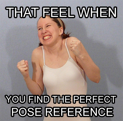
She makes a shit ton of poses (like 16,000 or some crazy nonsense). I used this lovely lady to draw so much as a teen. Whether it was some nerdy pose for my Mary Sue as fuck OCs

or for full on fight sequences

or for tragic deaths of my OCs in the arms of a totally OOC main protagonist.

this chick hooked me up.
And with the wildest, craziest stuff that you could see in your head but had no way or resources to reasonably draw like

or this

or this

DUDE! INASNE SHIT!! So I was using her for a pose reference and decided, you know what, I owe this chick some cash. Lemme dole it out for her. BUT then, I looked and saw she only has 286 fucking patrons!! This chick gives out free shit and spends countless hours arranging these shoots and setting this stuff up.
I’ll fork up the cash, SenshiStock. You’re worth it.
Check out this amazing woman’s stuff, and get knowledged: https://www.deviantart.com/senshistock


-
 frei-betao liked this · 2 weeks ago
 -
 myonceinmylifetime liked this · 2 weeks ago
 -
 lenmorph liked this · 1 month ago
 -
 always-devon reblogged this · 1 month ago
 -
 sunflowerfern liked this · 2 months ago
 -
 bara-godzilla liked this · 2 months ago
 -
 one12345two liked this · 2 months ago
 -
 eternalsong513 reblogged this · 2 months ago
 -
eternalsong513 liked this · 2 months ago
-
 thatlittledandere reblogged this · 2 months ago
 -
 talisman975 reblogged this · 2 months ago
 -
talisman975 liked this · 2 months ago
-
 welcome-home-official reblogged this · 2 months ago
 -
 mickeysartrefs reblogged this · 3 months ago
 -
 california-112 reblogged this · 3 months ago
 -
california-112 liked this · 3 months ago
-
 nevlr liked this · 4 months ago
 -
 missmillenniumbug liked this · 5 months ago
 -
 fart-gate reblogged this · 5 months ago
 -
 thorngot liked this · 5 months ago
 -
 persbaderse reblogged this · 5 months ago
 -
 mordayks liked this · 6 months ago
 -
 mytoonyvalentine liked this · 6 months ago
 -
 susansontaggf reblogged this · 7 months ago
 -
 vraiamourneil liked this · 7 months ago
 -
 shalvis liked this · 8 months ago
 -
 katzesofi liked this · 9 months ago
 -
 jaketopygasm liked this · 9 months ago
 -
 re-maljaws reblogged this · 10 months ago
 -
 leafguitar liked this · 10 months ago
 -
 ostensiblyfunctional reblogged this · 1 year ago
 -
 scify65 liked this · 1 year ago
 -
 scifyrefs reblogged this · 1 year ago
 -
 angelofcrazyfandoms42 reblogged this · 1 year ago
 -
angelofcrazyfandoms42 liked this · 1 year ago
-
 sch4r4 reblogged this · 1 year ago
 -
sch4r4 liked this · 1 year ago
-
 firapolemos05 reblogged this · 1 year ago
 -
firapolemos05 liked this · 1 year ago
-
 artreferencesarchive reblogged this · 1 year ago
 -
 insanityinanuttshell liked this · 1 year ago
 -
 toxiemind liked this · 1 year ago
 -
 darradreamer liked this · 1 year ago
 -
 littlestarrys liked this · 1 year ago
 -
 mickey-art-refs reblogged this · 1 year ago
