Quick Proportion Tips
quick proportion tips
- eyeballs are an eyeball width apart - ears align with the top of your brows to the bottom of your nose, and are the center-point of a profile view - lip corners line up to the center of each eye - hands are roughly the size of your face - feet are the same size as your forearm - elbows are aligned with your belly-button - your hands reach down mid-length of your thighs - both upper and lower legs (individually) are roughly the same size as your torso (this is all rough estimates for proportion! feel free to add more to help others)
More Posts from Arttuti and Others


Your art is so good !!! How do you color the skin its soo smooth
Thank you very much Anon ( ̄ε ̄@)hehehe!!Well I have some shots of one of my recent drawings so I’ll try to explain it a little bit hhahahah


Basically what I do is: 1. Put on base color2. Add some light shadows (They don’t even have to look very smooth, like the images above) 3. Then I start adding some darker shades of color and different skin tones to give it the correct shape, at this point I start adding some brighter tones, so yeah, they usually look very messy at this point. My brushstrokes also look like crosses or some sort on this step I think (I do it like that ‘cuz I think it’s easier to merge the colors later, at least for me hehehe) 4. Aaaand at the end, to merge the colors and make them look smoother I use a soft brush with low opacity to add some light shadows and brighter tones on bigger areas, I also try to use almost the same tones I used on the step three so it can merge nicely.So yeah, I think that’s about it (〜 ̄△ ̄)〜I hope I helped you out with that <3
Stumbled across your art recently, and I totally admire your work! As a complete noob to the digital art scene, I'd just like to ask whether you have any tips on colour picking (like for skin tones, under varied/dramatic lighting and such!). I have a ton of other things I want to ask, but I'll limit myself to one question and then try to google the rest, haha/ Thanks for sharing your art with us! ^^
ahh thank you so much! ♥ welcome to the digial art scene friend, i hope you enjoy your stay and ctrl + z
now onto your question! (if you don’t know what layer and layer modes are and how they generally work you should probably google that before you continue reading)
we all perceive colour differently (thx science) and i trust my intuition a lot when it comes to colour picking because of that, and also because i feel like you can make pretty much every colour combination work within the right context. context is key! but still, remember that all of this is about how i perceive colour, so you might not agree with everything i say.

here’s a quick rundown of terms you’ll see around a lot in reference to colours and shading: the hue, which is the ‘colour’ itself, the saturation aka the intensity, and the brightness [or value] which describes how dark or bright we perceive a colour to be.
rule of thumb: when you shade don’t just add black (or white) to your base colours, that will make your drawings boring and lifeless. use different hues and saturation!
now first things first: which skin colour does the character have?

you’ll mostly be navigating in the red to yellow spectrum for the skin tone. so when i pick the base colours i usually start with the skin and adjust the rest of the colours accordingly. if you’re not sure where to begin it might help if you first determine the values (brightness) of the base colours in grayscale.
and here are a few colour variations—i stuck to the approximate values but played around with a lot of different hues and levels of saturation.
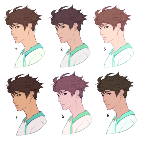
now compare 3 and 5: you’ll notice that 3 is very bright and leans towards orange hues, whereas 5 has a pinkish tint.

on the left i gave 5 the hair colour of 3 and in my opinion the pink hue of the skin doesn’t go well with the orange undertone of the hair. you’ll have to experiment a lot to find out which combinations work for you.
ctrl + u is your biggest friend (or image >> adjustments >> hue/saturation in photoshop, the shortcut works in sai and clip studio paint too). play with the sliders and see what happens. i do that a lot myself, because it’s easier to coordinate the colours like that afterwards instead of trying to manually pick perfectly matching ones right away.
for further adjustments i like to use an extra semi-transparent layer on top of everything with just a single colour to add atmospheric light. this unifies the colours and makes them more harmonious, if that’s what you’re looking for. this is about as far as i’d go if i didn’t want to shade the drawing.

if i do want to shade, especially with high contrasts and dramatic light, i darken the base by just adding an additional black layer, here set to 40% opacity. of course you could add a colour layer like the ones i mentioned previously too.


to create an impression of dramatic light you need a high contrast between light and dark areas (1). if i want additional visual intrest i often add secondary light which falls onto the main shadow areas. here i picked a faint greenish blue to balance out the yellow (2). and since light is at least partially reflected when it hits a surface you should add a faint glow that goes across the shadow/light border. i uses a mid-brown with a very soft brush on a layer set to overlay here (3).
for this shading style i like to use the layer mode colour dodge with lowered opacity + fill settings. for some layer modes opacity and fill do the exact same thing (e.g. for multiply or screen). however for colour dodge there’s a big difference:

a lowered opacity merely alters the transparency of the entire layer. that looks pretty awful sometimes, because the bright orange affects the dark of the hair much more intensely than the already brighter skin. but when you lower the fill percentage you primarily lower the amount of light that falls onto darker colours. so the layer’s opacity setting treats every colour equally whereas the fill setting takes their values into consideration. it might be hard to understand if you don’t try it out yourself, so just play around to get a feel for how it works!
and to summarise, here’s a process gif:

colour is an extremely big topic and i’ve only barely scratched the surface but i hope that still helped you out a little! the fastest way to learn is always to try things yourself, so grab a sketch and experiment. 👍
Can you make like a little color picking tutorial, my drawings always look so out of place when i color them >.<
Okay so this is probably not the best coloring tutorial and I’m sorry ahead of time because I’m not the best at explaining colors nor am I any expert lol. I don’t actually use color palettes but I highly recommend them, esp to keep a whole artwork consistent with color schemes. You can easily just google “aesthetic color palettes” or “90′s anime color palettes” which is my go to types of colors heh.
Anyway, I made an explanation/tutorial on how I usually achieve the colors on my art. There are plenty of other ways but this is some basics on filtering.


And after that, if I’m not satisfied with the colors I just go to Filter -> and adjust the Hue of the opacity or the multiply layer.
Once I’m satisfied, I just merge all the layers and clean the art up, sometimes I add even more colors and blend them. (This probably deserves an explanation on it’s own but I wouldn’t mind explaining how I paint! ><)
And here’s somewhat of the finished art lol;;; (sweats)


Thought about doing a very simple step by step since I had some WIP pics laying around ( ͡° ͜ʖ ͡°) Most of the time I start working on a drawing by laying down simple shadows and highlights in black & white - it’s one of the easiest ways to see how they affect the scene (and my favorite too). I don’t like worrying about too many things at once, so taking little steps is very helpful to avoid ruining the whole image at the very beginning~ commissions | instagram - deviantart - twitter - paigeeworld - facebook
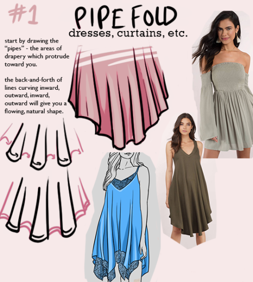
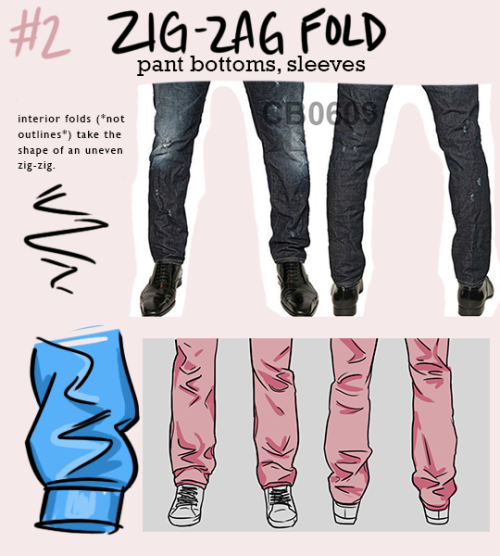
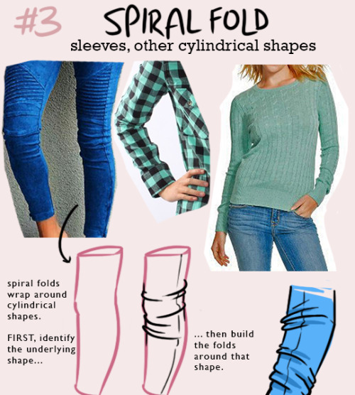
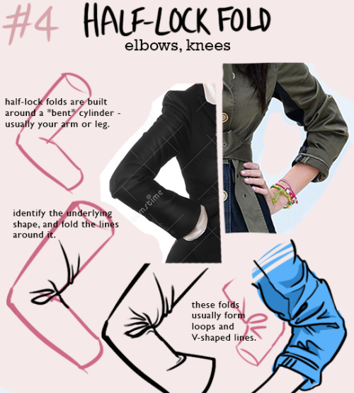
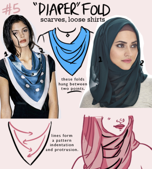
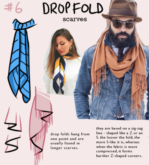
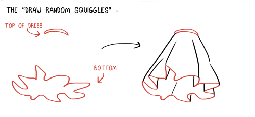
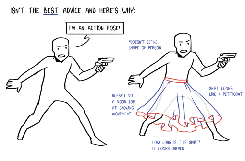
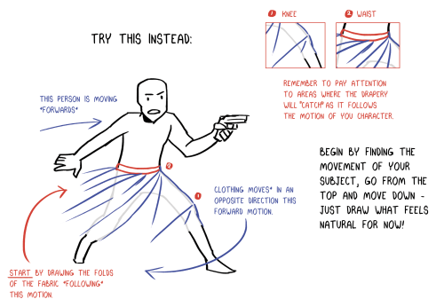
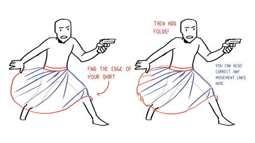
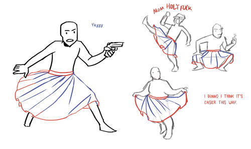
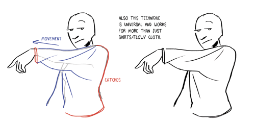
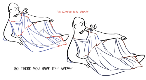
NOTE: one type of fold will rarely appear on its own - they interact with each other quite a bit! for example, spiral folds might define the outline of a pant leg, while the interior folds might be zig-zag folds.
i’m trying to re-learn how to draw clothing, so i made this little guide to the most common shapes of folds that appear. hope it helps someone else too!
-
 hauntergengar liked this · 2 weeks ago
 -
 the-quietcrow liked this · 2 weeks ago
 -
 poison--eitherway liked this · 3 weeks ago
 -
 xhabrls liked this · 1 month ago
 -
 bluewrites24 liked this · 1 month ago
 -
 zilouquaza liked this · 1 month ago
 -
 jacktheeldergod2 reblogged this · 1 month ago
 -
jacktheeldergod2 liked this · 1 month ago
-
 belsballs liked this · 1 month ago
 -
 onceuponabreeze reblogged this · 1 month ago
 -
 russetfoxfur reblogged this · 1 month ago
 -
 hogsbane reblogged this · 2 months ago
 -
 n80whatever reblogged this · 2 months ago
 -
n80whatever liked this · 2 months ago
-
 daengeli liked this · 2 months ago
 -
 inacrowdofthousands-blog liked this · 2 months ago
 -
 sheist-terrier liked this · 3 months ago
 -
 triiigeredkai234-blog liked this · 3 months ago
 -
 28nationalparkrangerskissing liked this · 3 months ago
 -
 srinyx liked this · 3 months ago
 -
 sillylien liked this · 3 months ago
 -
 helen0ftr1y reblogged this · 3 months ago
 -
 thick-thighs-and-sharp-eyes liked this · 3 months ago
 -
 kaleighbytheway reblogged this · 3 months ago
 -
 itsdetachable reblogged this · 4 months ago
 -
 cafeselection reblogged this · 4 months ago
 -
 mellowyellow236 liked this · 4 months ago
 -
 dying-inside-today reblogged this · 4 months ago
 -
 cypress404 liked this · 4 months ago
 -
 the-fab-fox reblogged this · 4 months ago
 -
 dankusoofficial reblogged this · 5 months ago
 -
 supraobsessed reblogged this · 5 months ago
 -
 silver-sass reblogged this · 5 months ago
 -
 anothergameofwickedgrace liked this · 5 months ago
 -
 kawaiikelley liked this · 5 months ago
 -
 aquila--tequila liked this · 5 months ago
 -
 stoneserafina reblogged this · 6 months ago
 -
 tsukimiki reblogged this · 6 months ago
 -
tsukimiki liked this · 6 months ago
-
 the-rat-in-the-walls reblogged this · 6 months ago
 -
the-rat-in-the-walls liked this · 6 months ago
-
 ammyamarant reblogged this · 6 months ago
 -
 judiops reblogged this · 6 months ago
 -
 batneko liked this · 6 months ago
 -
 drummergirl345 liked this · 6 months ago
 -
 snowydragon10 reblogged this · 6 months ago
 -
snowydragon10 liked this · 6 months ago
-
 wegotisms liked this · 6 months ago
 -
 fooolisher liked this · 6 months ago
