To The Casual Observer It May Look Like I'm Trying To Summon A Demon But Anyone Who Knows Me Will Realize
to the casual observer it may look like i'm trying to summon a demon but anyone who knows me will realize that i am simply calling my wife
More Posts from Badfungi and Others


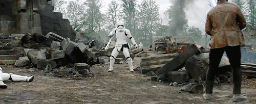
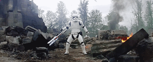
WHAT!!!!
Live-action Stardust Crusaders looks great.
I used to be a hero like you
Then I took a blow to the knee. But maybe if I just believe in mysel-
🐟✨MY LEG, MY LEG✨🐟

btw i always knew they'd find each other. if you even care.

protector
The clips of the lost ZeXal dub, edited to sync with the actual raw anime clips. Check the source for the panel where these clips came from, and a little insight on how this dub was born and how it died.
“Prior to the conclusion of the Yu-Gi-Oh! lawsuit last year, the Japanese licensors of Yu-Gi-Oh! were confident of their chances at triumphing in court and taking back the rights to the franchise. Ignoring the court’s warnings not to exercise the rights to a product that it hadn’t yet secured, ADK proceeded to produce its own version of Yu-Gi-Oh! Zexal. ADK tapped Reed to direct the series with an L.A.-based cast, including Johnny Yong Bosch (Yuma), Vic Mignogna (Shark), Richard Cansino (Bronk), Cassandra Morris, Sam Riegel, and Liam O’Brien. After nine months, the result was a full-fledged product that was ready for the airwaves.
“We cast it, we recorded up to 26 episodes of it, we stripped out the music, completely recomposed to picture with two amazing composers, re-sound designed it, reanimated some sequences, and it was one of the most big-budgeted things I’ve ever worked on as far as anime goes,” Reed explained. Oh, and Yuma actually says “Kattobing” in this version, haha.
Dissatisfied with 4Kids’ work and not wanting to do business with it any more, ADK bent over backwards to make sure the L.A. team did well and were happy working on Yu-Gi-Oh! Zexal. Reed described how ADK sent the L.A. team hard drives full of all of the animation layers and After Effect files, giving the American producers full rein to easily edit the video as they needed. Did they want to fix the mouth flaps to better fit the English dialogue? No problem! Did they need to edit an image so the network censors didn’t get on their case? Simple!
Within the American anime production industry, obtaining such resources from the Japanese studios is completely unheard of. The studios are very protective of their properties (and who wouldn’t be?) and licensees regularly need to adapt within the confines of the animation as it is presented.
Of course, we know how the lawsuit ultimately turned out. The Yu-Gi-Oh! Zexal anime by 4Kids and Konami with the New York-based cast remains the de facto version of the show, while the version with the L.A.-based cast gathers dust inside a box.”
- http://ravegrl.wordpress.com/
I do not own Yu-Gi-Oh, or Yu-Gi-Oh ZeXal. No copyright intended.

g*d i love drawing laphos
“Traitor!”
would you consider dropping some tips on how you color? your art always has such a nice feeling to it
Thank you so much, and yes, absolutely!
So... I have been agonizing over how to answer this question for over a week because I tend to make a lot of my major decisions based on what looks and feels good to me in the moment. It’s sort of hard to explain. Then I started getting philosophical with it (“how does one color? How do I explain aesthetic?”), and I started rambling, and had to cut the answer way, way, way down lol.
But here’s what I can help with right now. I think the most important part of how I color is my tools and what they allow me to do. These are currently my favorite brushes to use:

From top to bottom, I use Kyle T’s Gouache for just about everything. A lot of my recent pieces are done entirely in that– I love the chunky texture and how the pressure mimics traditional gouache. It’s great for children’s book illustrations, and filling linework, and realistic portraits. She is my soft wife and I love her.
I practically never use the default hard round. Ignore that.
The roller brush is another one I use for painting. It was my go-to before KT’s gouache, so you’ll find it a lot in my older work (and as a big texture thing in my current works). The “Sampled Tip” below that one I usually use for children’s book styled illustrations. It’s like a really dense, waxy crayon, so it’s fun for textured lines and details.
I always paint in my own shadows and highlights, but I like to use the soft round if I want to blow the shadow or highlight out. It’s for extra large areas.
And finally my pencil. I use it for sketching as well as linework, if I plan on doing a linework-centric piece. I don’t think there’s much of a difference between the two there… one is probably smoother than the other.
______________
The reason why I like textured, pressure-sensitive brushes so much is because they’re important to how I paint. When I blend, I don’t use a blender brush or a smudge tool. What I do is layer two colors– lightly– then use the eyedropper to select the color between them and continue painting with it. That’s probably the key to most of my work. I’ve gotten pretty fast at it, so I’m constantly selecting colors from the painting and reusing it throughout my painting.
I still use the color-wheel to hand-pick what I think will look best, though. This is probably going to be a really frustrating answer, but I choose color palettes based on basic color/lighting theory combined with personal aesthetic preference. It can take some studying (of both theory and other artists’ work). If you’re ever looking for a really great reference on the former subjects, I highly recommend Color and Light by James Gurny. Even if you’re not into watercolor or dinosaurs or realism, the guy is a master at explaining all that different stuff in depth.
Shape and negative space are also pretty important to me, but that's a whole other thing. And as a side-note, I recommend following more children’s book illustrators. Their work may look simple, but a lot of intention goes into how they use color, shape, space, and texture.
Also, on texture, I hand-draw most of mine. I love to add little scratches and drops and splashes when the painting is almost over. It's one of my favorite things to do :')
____
Now, the other most important tip:
Once I’m happy with the sketch/linework, and once I’ve laid down the basic colors of my piece, I do a Really Terrible Thing. I become a graphic designer’s worst nightmare and collapse everything onto one layer.
Then I paint directly on top of it, linework and all.
I do this for a lot of reasons, but mostly because 1) my tiny brain is overwhelmed by the clutter of too many layers, and 2) it forces me to approach a piece as if it was traditional media– a process which I find a lot more comfortable and rewarding. I paint right on top of the base colors, and right on top of the linework, effectively redoing and cleaning up what I already have there. Even if I'm working with a blank background, I'll paint a new blank one on top because it gives the feeling of a more unified piece, if that makes sense.
Basically, I approach my drawings as if I’m using traditional media. I like chunky brushes, utilizing (what I personally think are) interesting color combinations and textures, and smashing everything down onto one page so I can just paint.
Anyway, please let me know if there’s anything specific you’d like me to go into detail on, any pieces of mine you’d like to know how exactly I went about it, etc etc etc. I’m happy to answer ^^
-
 catalllo reblogged this · 2 weeks ago
 -
 boops-boops-boops reblogged this · 2 weeks ago
 -
 mishtygirlcat liked this · 3 weeks ago
 -
 wickyvicked reblogged this · 3 weeks ago
 -
 nocinovae liked this · 4 weeks ago
 -
 stonerwizardsandwitch liked this · 4 weeks ago
 -
 autumnalhalcyon reblogged this · 4 weeks ago
 -
 villainouspotential reblogged this · 4 weeks ago
 -
 arkh4mgh0st reblogged this · 4 weeks ago
 -
 ahoohahoohahooha reblogged this · 4 weeks ago
 -
ahoohahoohahooha liked this · 4 weeks ago
-
 bunnymoon-phase reblogged this · 4 weeks ago
 -
 autismfox reblogged this · 4 weeks ago
 -
 stitched-rabbit00 reblogged this · 4 weeks ago
 -
stitched-rabbit00 liked this · 4 weeks ago
-
 void-writes-stuff reblogged this · 1 month ago
 -
 song-of-stardust reblogged this · 1 month ago
 -
 heycomeonprovolone reblogged this · 1 month ago
 -
 know-ill-keep-moving liked this · 1 month ago
 -
 averymonroe1 liked this · 1 month ago
 -
 95gabe95 reblogged this · 1 month ago
 -
 maoune-24 liked this · 1 month ago
 -
 annefraid liked this · 1 month ago
 -
 tinnydandelion liked this · 1 month ago
 -
 linatami reblogged this · 1 month ago
 -
 optomisticallyconfused reblogged this · 1 month ago
 -
 ineffable-cottage reblogged this · 1 month ago
 -
 alduinprime liked this · 1 month ago
 -
 milliethemartyr reblogged this · 1 month ago
 -
 withyoureyesbert liked this · 1 month ago
 -
optomisticallyconfused liked this · 1 month ago
-
 i-couldnt-think-of-one reblogged this · 1 month ago
 -
 unstableomni reblogged this · 1 month ago
 -
unstableomni liked this · 1 month ago
-
 lilleeboi reblogged this · 1 month ago
 -
 gleeandshame reblogged this · 1 month ago
 -
 toothpasteisrabiesfoam reblogged this · 1 month ago
 -
toothpasteisrabiesfoam liked this · 1 month ago
-
 my-mountain-hyacinth liked this · 1 month ago
 -
 l3fan reblogged this · 1 month ago
 -
 notthepasteldyke reblogged this · 1 month ago
 -
 doilooklikeinoe reblogged this · 1 month ago
 -
 rue-finley-kazoo reblogged this · 2 months ago
 -
 high-warlock-of-your-pants reblogged this · 2 months ago
 -
 missshadowpup liked this · 2 months ago
 -
 bliretch reblogged this · 2 months ago
 -
 itsoktheseabirdsarecoming reblogged this · 2 months ago
 -
 mumblingpizza reblogged this · 2 months ago
