THE LAYERS CHEAT SHEET PART TWO (PART ONE HERE) Once Again, I’m No Expert- There Are Things About These

THE LAYERS CHEAT SHEET PART TWO (PART ONE HERE) Once again, I’m no expert- there are things about these layers I probably haven’t covered, so please try them out for yourself! Layers 1-7 help your contrast. They are usually a pair of the former two groups I went over in my last post. 1. OVERLAY: Helps your contrast by boosting your lights and darks, while the more mid tone pixels aren’t affected as much. It does this based on the layers beneath it. “Screens” the lights, “multiplies” the darks. 2. SOFT LIGHT: Similar to overlay, but a “softer” effect. You can think of soft light as more transparent. 3. HARD LIGHT: You can look at hard light as an intense version of overlay, with much brighter colors and a much less transparent look. 4. VIVID LIGHT: This is the heavy metal version of overlay- think of it similar to color dodge and color burn. Very intense colors, good for finding interesting lighting and color combos. 5. LINEAR LIGHT: Crazy amounts of contrast and color is added here, even more than vivid light. so heavy metal 6. PIN LIGHT: This one is interesting because besides it also being an intense contrast layer, it can add random noise to the active layer. Apparently this is a combo of the lighten blend mode on the light pixels and darken on the dark pixels, but the noise effect is what makes it really interesting imo. 7. HARD MIX: You will turn this mode on and be like “no” but it is actually adjusting its fill will reveal another overlay-ish type layer. It throws the colors on the active layer towards a more primary color such as blue, or magenta. _____ 8. DIFFERENCE: This will invert your colors, taking into account the layers below. If colors are very close, they will be black. 9. EXCLUSION: This also inverts your colors, taking into account the layers below. If colors are very close, they are grey. Exclusion and difference are layers that would be good for graphic pieces, I haven’t really gotten used to incorporating them in my painting workflow. 10. SUBTRACT: Similar to the above layers, but more intense. You will notice that the darker you make your active layer with Difference, exclusion, and subtract, the lighter and more transparent looking the result will be. 11. DIVIDE: Divide, however, usually results in crazy highlights that are pretty opaque unless the layer is fairly light, and then it will begin to go transparent. ___ 12. HUE: Makes the lower layer take on the hue of the active layer. 13. SATURATION: The lower layers take on the saturation of the active layer. 14. COLOR: The lower layers take on the color of the active layer. 15. LUMINOSITY: The lower layers take on the luminosity, or brightness, of the active layer. Once again, I’m no expert, but I hope this helps. Thanks guys! http://drawmaevedraw.tumblr.com/
More Posts from Chelsychacon and Others

#inktober2018 #inktober #inktoberday3 yesh!!!! Guess who @foolart_ , just a doodle to keep up with inktober . . . . https://www.instagram.com/p/Bof0wxQBENL/?utm_source=ig_tumblr_share&igshid=sqsmaelaa6yl
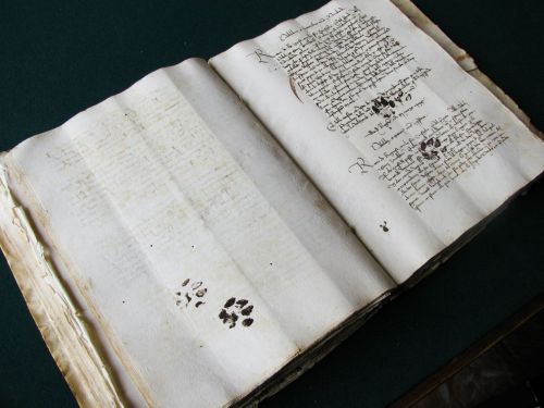
Paw prints from a cat on a 15th century manuscript
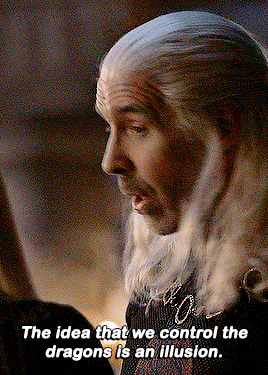


One that brought Valyria its doom.
HOUSE OF THE DRAGON (2022-) S01E01 | “The Heirs of the Dragon” S01E10 | “The Black Queen”
“I thought the dragons were gods” bitch you never heard of what happened to Valyria, Meraxes & Quicksilver?! “They are just meat” no shit i thought they are made of Valyrian steel!

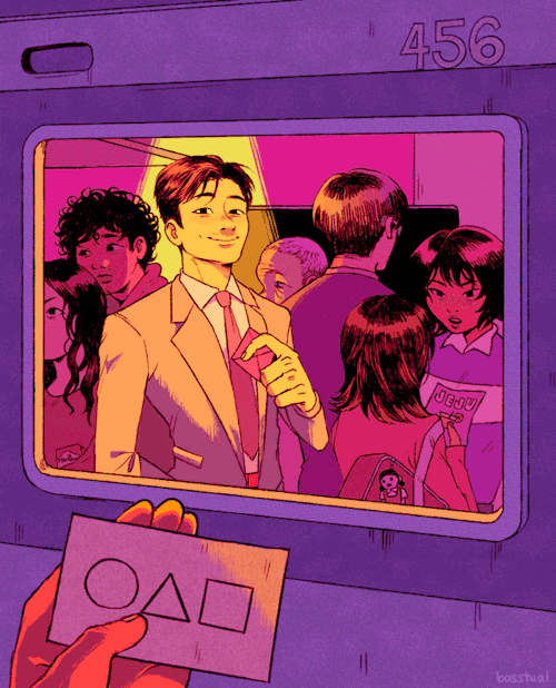
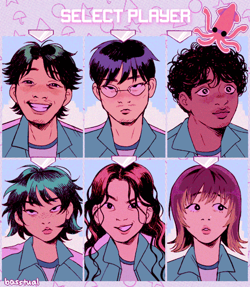
SQUID GAME ◯ △ ☆ ☂

Could we crash tumblr if we all posted the word "crash" on the 1st of april 2022, 12:35 EST?

Seated Woman with Her Left Hand in Her Hair, 1914, Egon Schiele
Medium: watercolor,paper
cool that there’s a trans guy character in that new baymax series or whatever. idc it will never detract how funny it is to me that they thought a man saying “these are the type of pads i use for my period” wasn’t an obvious enough signifier of him being trans so they just. put him in a trans t shirt. like JUST. a tshirt. in case you missed that this is the trans character. this is the trans character guys. cant you tell by the Giant Trans Flag he’s wearing

Packaging illustration done for Everything Dice
-
 madokasoratsugu liked this · 1 month ago
 -
 alittlemadbutstillok liked this · 3 months ago
 -
 k4karma liked this · 5 months ago
 -
 sketchkobold liked this · 9 months ago
 -
 kalisarobot liked this · 1 year ago
 -
 doomboy911 liked this · 1 year ago
 -
 fraughtto reblogged this · 1 year ago
 -
 hiimsuperawkwarddontmindme liked this · 1 year ago
 -
 amiemiemie liked this · 1 year ago
 -
 conmepenonbuzz liked this · 1 year ago
 -
 adorable-bookworm liked this · 1 year ago
 -
 hellisnowlove liked this · 1 year ago
 -
 modarthelp reblogged this · 2 years ago
 -
modarthelp liked this · 2 years ago
-
 reference-edwardcollectsurns reblogged this · 2 years ago
 -
 zippiestrock liked this · 2 years ago
 -
 matidream liked this · 2 years ago
 -
 hazy-silence reblogged this · 2 years ago
 -
 dekuboy liked this · 2 years ago
 -
 bl00000g liked this · 3 years ago
 -
 chocobiko reblogged this · 3 years ago
 -
chocobiko liked this · 3 years ago
-
 vanillamichi liked this · 3 years ago
 -
 varezhkova liked this · 3 years ago
 -
 specialar liked this · 3 years ago
 -
 nikymerii reblogged this · 3 years ago
 -
 chelsychacon reblogged this · 3 years ago
 -
 yuugisbarber liked this · 3 years ago
 -
 okills liked this · 3 years ago
 -
 idiotbrains liked this · 3 years ago
 -
 selkietutorials reblogged this · 3 years ago

| Visual Developer, Character Designer & Illustrator | Feel free to contact me chelsychacon@gmail.com
224 posts