International Rendezvous In Space. The Soviet Soyuz 19 Spacecraft Approaches The Apollo Command Service

International rendezvous in space. The Soviet Soyuz 19 spacecraft approaches the Apollo Command Service Module for docking during the Apollo Soyuz Test Project, July 1975. The historic mission was the 1st joint American/Russian space flight & symbolic of the end of the space race which kicked off with Sputnik back in 1957. The Docking Mechanism of the CSM is visible at the top of the photo. Soyuz 19 spent 5 days & 22 hours in space completing 96 orbits while the Apollo spacecraft orbited 148 times over 9 days.
More Posts from Genna-ivanovich and Others
me on tumblr
me to me: you can’t like every picture of yuri gagarin
me *going through the yuri gagarin tag*:


For my part I know nothing with any certainty, but the sight of the stars makes me dream.- Vincent Van Gogh

Posted this on twitter already but uhhh here we go again
hey! im not that well versed on all things space bc it's a relatively new interest of mine. how come ive seen so many blogs post about not wanting the other nasa logo? you totally don't have to answer, i just saw that you reblogged a post about it :) hope you have a good day!
By the other NASA logo do you mean the worm or the wormball?
And to answer your question, I’m think the logo arguments are pretty much entirely aesthetic. Some people think the worm is dated and ugly, other people love how sleek it looks. Some people think the wormball is a good compromise, others think the aesthetics are clashy (I’m in that boat.)
For reference, here’s some NASA logos. The ones under the cut are a little rare and honestly you don’t have to care about them, they just look cool.

This is the meatball. It’s the original from the 60′s and it’s still in use today. Detailed yet clean. Gorgeous. The swoosh is a tie in with the aero side of NASA and the stars and orbit with space. The serif lettering manages to look classy rather than dated. Even if this isn’t your preferred logo, you have to respect how it’s got the perfect amount of detail to look interesting while also being ca clean design.

This is the worm. It was an attempt to modernize the logo around the start of the Shuttle/Skylab era. If this was for any other agency, I admit the worm styling would be a little dated. But personally, I think this logo brings back some of the enthusiasm of the early Shuttle era, just like the meatball brings back the energy of the Apollo era. It’s striking, it’s recognizable, and it’s one of my favorite worm stylings. (Compare it to SF MUNI’s worm logo, which was so cluttered I, as a local, didn’t notice it said “muni” until I was a teenager.)

This is the wormball. (Wikimedia was giving me trouble so it’s just a transparent background; I actually don’t have this one saved on my laptop for personal aesthetic reasons lmao.) Some people love it, but you will never convince me to. 100% personal preference, though, so if you love it, that’s fine, just keep it away from me. It’s like pineapple on pizza; you either love it or you hate it, but you’ve definitely got a strong enough opinion to argue about it.

This is NASA’s seal. You’ll only ever see it on official documents and things like that. It’s not something that’s displayed very commonly on, say, the wall of a NASA facility, and even less commonly on spacecraft. I believe this has been in use since the creation of the agency.
And, last but not least, I’d like to leave you with how the insignia is displayed on NASA aircraft, because they all. Look. Sick.

When they display the meatball on the rudder of an aircraft, like on SOFIA here, they omit the meatball and stars and display it like this! It looks cool as hell and it looks even better on aircraft where the rudder frames it nicer. (While I was searching around I saw a mockup for a meatballess wormball and it didn’t look awful.) Maybe we should call this the vegan meatball?
It’s also displayed like this on aircraft that were associated with NASA/USAF’s hypersonic research program in the early 60′s. Some pilots from this program went on to become astronauts.

... Including Neil armstrong who flew the X-15 above.
Aircraft from that program also featured a pretty neat rudder: it has this yellow stripe with NASA in a serif font that's unique to this design, as far as I know.
The first photo is Neil's X-15 again, the other is Dick Scobee's X-24B.


Lastly, the worm was plastered unedited onto aircraft during the worm era. It didn't always look good, but it looked too sexy on the X-29 to not include a pic.

(All photos are mine from NMUSAF!)
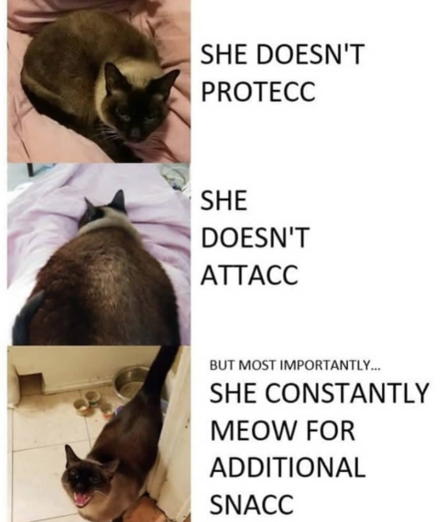
Cats in a nutshell
Ahh yes!!!💕
Maybe you and I exist together on a different wavelength than the rest of the world. Perhaps, we are on a separate frequency.
JEANS!!!CATS!!!😼👖

Sometimes you wonder where your pants went off …

The bloodroot is up and blooming. ☺️


russian flower vocab 🌻
aster - áстра
carnation - гвозди́ка
cherry-tree - ви́шня
chrysanthemum - хризантéма
cornflower - василёк
dandelion - одувáнчик
dahlia - георги́н
daisy - ромáшка
daffodil - нарци́сс
forget-me-not - незабýдка
geranium - герáнь
hyacinth - гиаци́нт
honeysuckle - жи́молость
iris - и́рис
lavender - лавáнда
lilac - сирéнь
lily - ли́лия
lily-of-the-valley - лáндыш
orchid - орхидéя
pansies - аню́тины глáзки
peony - пиóн
poppy - мак
rose - рóза
rosebud - бутóн рóзы
sunflower - подсóлнечник
tulip - тюльпáн
violet - фиáлка
flower - цветóк
flower bouquet - букéт цветóв
petal - лепестóк
meadow - луг
pot flower - кóмнатный цветóк
to plant - сажáть
to blossom - цвести́
-
 hermd123-blog liked this · 4 years ago
 -
 marij11 liked this · 4 years ago
 -
 maurizziocruz reblogged this · 4 years ago
 -
 thisishanatrying liked this · 5 years ago
 -
 osmankhtab93 liked this · 5 years ago
 -
 justanoldfashiontumblog liked this · 5 years ago
 -
 bornlistening reblogged this · 5 years ago
 -
 catgirlconspiracy reblogged this · 5 years ago
 -
 manuel82 liked this · 5 years ago
 -
 hdbaggers liked this · 5 years ago
 -
 hjlphotos liked this · 5 years ago
 -
 canuckus liked this · 5 years ago
 -
 guillemlacoma reblogged this · 5 years ago
 -
guillemlacoma liked this · 5 years ago
-
 djcomplexion liked this · 5 years ago
 -
 raticus76 liked this · 5 years ago
 -
 optimisticangelbasketballwagon liked this · 5 years ago
 -
 iamthelowercase reblogged this · 5 years ago
 -
 tiny8bit reblogged this · 5 years ago
 -
 mecha3 reblogged this · 5 years ago
 -
 hotbedofsin liked this · 5 years ago
 -
 thedemiurge26 liked this · 5 years ago
 -
 helipilot50 liked this · 5 years ago
 -
 classicteacake liked this · 5 years ago
 -
 ritwiz liked this · 5 years ago
 -
 dougs11 liked this · 5 years ago
 -
idonotliketheconeofshamesblog liked this · 5 years ago
-
 spacetimewithstuartgary reblogged this · 5 years ago
 -
 stairway2mars reblogged this · 5 years ago
 -
 billl32001 liked this · 5 years ago
 -
 wildroombas liked this · 5 years ago
 -
 ask78kim liked this · 5 years ago
 -
 mak-90 liked this · 5 years ago
 -
 eliasgoma-blog liked this · 5 years ago
 -
 bspade1975 liked this · 5 years ago
 -
catgirlconspiracy liked this · 5 years ago
-
 northknife liked this · 5 years ago
 -
cubedearth reblogged this · 5 years ago
-
cubedearth liked this · 5 years ago

Pamir | 19 | eng/ind | mostly cosmonaut/genshin/language related
228 posts