Hmm…. Inklings.


Hmm…. Inklings.
More Posts from Misterdoccy and Others


wuuh huuuh i am posting some old stuff here i wanna be more active tbh
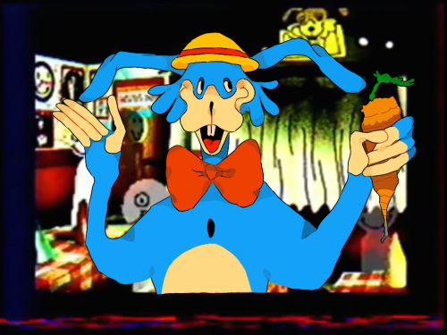
silly animatronics

The Afton kids + MCI kids circa 1984-85
Closeups under cut bc tumblr has murdered the image quality:


probably an unpopular opinion but i still think Splatoon 1 has the best graphics style in the series
the graphics were so much moodier and darker, shadows were really prominent giving it a much more gritty and realistic feel


The far-off environmental elements had a nice blur that gives them a bit of a dreamlike quality IMO.


I know the top picture is a sunset level, but; seriously is it just me? Why is everything in Splatoon 2 SO CRISP AND BRIGHT AND NEON? I talked about (probably 2 years ago at this point) how Splatoon 2 feels like it's an evolution and commercialization of Turf Wars into a product and a brand rather than how in Splatoon 1 they had a much more backstreet, discreet, shady feeling. And I feel like the graphics carry that over weirdly enough.
But most importantly, the ink and the Inklings themselves; ever since Splatoon 2 came out and people started going "omg the ink looks so good now!" i. literally never agreed with that. even with Splatoon 3 i STILL THINK the ink looks the best in Splatoon 1. In Splatoon 2 and 3, they have really been leaning into making the ink extremely neon and super saturated, and I don't think it looks great. I can't really even pinpoint the difference here (especially not with the Inklings themselves, but).


(Splatoon 1 above, Splatoon 2 under)
The Inklings in humanoid form don't stray away from having dull or dark colored tentacles in different lighting conditions, and even the ink itself is nowhere near as saturated as it is, leaning more into quieter or pastel tones. Again, it makes it look nice paired with the darker graphics of the game, and somehow it feels really at home and pretty natural? The difference in the model of the Inkling itself is also a mystery of me, it might be a case of less shading or less specular making it look flatter and that's more pleasing to the eye than how shiny they are nowadays, ESPECIALLY in Splatoon 2. The ink is notably flatter than it is in newer games, and if it wasn't obvious I definitely think it still just, looks the best? Don't ask me how. (The squids also look amazing. Like gummy.)


just thought about putting that out there. Anyone else's thoughts on the games' graphics?


Some bunnyfarm remade cutscenes that I’m probably going to use them for a remade cutscenes? 🦐

My favorite so far is this one
Puppet and lefty! In my style


dedf1sh i love you and your nonbinary swag

paliliberation posted:
Family 167 - Imagine being a mom, a wife, and a dedicated career woman on the brink of life-saving research, only to have everything ripped away. This isn’t just a personal loss; it’s an assault on progress and humanity itself. When the pursuit of knowledge and the chance to help others is brutally stopped, we should all be enraged. A world that allows this to happen is failing us all. It’s time to stand up and refuse to let dreams and lives be crushed.
please support my campaign #167 listed in paliliberation linktree

-
 prettypr0blems liked this · 1 week ago
 -
 t4r0t liked this · 2 weeks ago
 -
 usedbottlecaps liked this · 3 weeks ago
 -
 tristarnova liked this · 1 month ago
 -
 rat-in-clown-shoes liked this · 1 month ago
 -
 hedgepaw liked this · 1 month ago
 -
 sotogalmo liked this · 1 month ago
 -
 hachi-10008 liked this · 1 month ago
 -
 harkenizalone liked this · 1 month ago
 -
 metsaahenki liked this · 1 month ago
 -
 randomaven liked this · 1 month ago
 -
 latiosauce liked this · 1 month ago
 -
 pisceancreator liked this · 1 month ago
 -
 fancychaoscloud reblogged this · 1 month ago
 -
fancychaoscloud liked this · 1 month ago
-
 loolilyumm liked this · 2 months ago
 -
 jack-hambjer liked this · 2 months ago
 -
 humanp1lls liked this · 2 months ago
 -
 namegab reblogged this · 2 months ago
 -
namegab liked this · 2 months ago
-
 m00ndunes liked this · 2 months ago
 -
 gayeloncio liked this · 2 months ago
 -
 dreezer liked this · 2 months ago
 -
 codacheetah liked this · 2 months ago
 -
 ramgodd liked this · 2 months ago
 -
 possfunky liked this · 3 months ago
 -
 solarpoweredcreature liked this · 3 months ago
 -
 alexthedragongirl liked this · 3 months ago
 -
 amethystbm2002 liked this · 3 months ago
 -
 tanukiviruz liked this · 3 months ago
 -
 kubbley reblogged this · 3 months ago
 -
 the-lost-ranger liked this · 4 months ago
 -
 gtl3 liked this · 4 months ago
 -
 mochi-mochi--desu reblogged this · 4 months ago
 -
 hauntinglyfresh reblogged this · 4 months ago
 -
 voiidist liked this · 4 months ago
 -
 lola-bo-bola liked this · 4 months ago
 -
 donkeykongclassifiedsecrets reblogged this · 5 months ago
 -
 the-boyfriend liked this · 5 months ago
 -
 vulpinecircuitry liked this · 5 months ago
 -
 nulll-n-voiid reblogged this · 5 months ago
 -
 fisheadz liked this · 5 months ago
 -
 epicene-ennui liked this · 5 months ago
 -
 artisticapparitions reblogged this · 5 months ago
 -
artisticapparitions liked this · 5 months ago
-
 milestonekestrel reblogged this · 5 months ago
 -
milestonekestrel liked this · 5 months ago
-
 paradoxespersonified reblogged this · 5 months ago
 -
paradoxespersonified liked this · 5 months ago
-
 passportguardian liked this · 5 months ago
