SS16


SS16
More Posts from Mukunv and Others


Landscape and Structures | S AM Schweizerisches Architekturmuseum
Design by Claudiabasel


Casa Mila, Antoni Gaudi, Barcelona 1906-1910, Dach chimneys

Katarina Reuter (b.1964) - 4am. Oil and tempera on canvas.

Ennio leanza - keystone
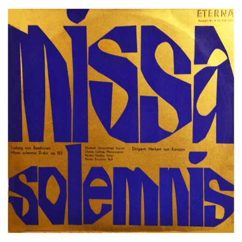
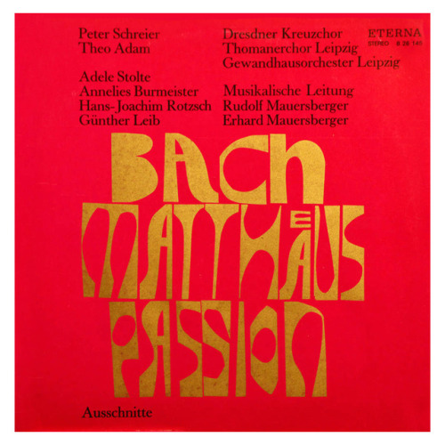

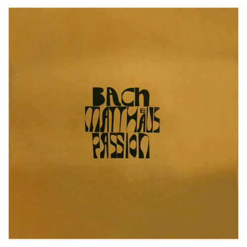
Christoph Ehbets, record cover for Label Eterna: Beethoven, Missa Solemnis, 1966. Bach / Matthäuspassion, Box-Set, 1971. DDR. Via discogs.
After 1949, Eterna was the German Democratic Republic’s foremost label for classical music, political songs, folk, some jazz and religious recordings

Spaziosunnei, Milano
The space, a candid environment of industrial reminiscence, was designed and brought to life in collaboration with Studio Modulo including marble pieces from Bloc Studios and made to measure armchairs by Egolab. Set far from the clichè Milanese fashion hub, Spazio Sunnei opens its doors in a quiet street close to “Bar Basso”, a fixture amongst the crawling creative crowd of the city. Creative assembly is the concept behind the studio, which partnered up with The Art Markets (T.A.M Books distribution) and Bjork Florence to create a special editorial corner. In fact, not only you will be able to find Sunnei’s latest pieces for sale but also a wide selection of independent art and fashion magazines. Come in for a visit!
-Sunnei

MuirMcNeil SFCA Inside Out poster mono line version 2013
SF CA Poster
‘InsideOut’, an exhibition of one-off posters organised by the AIGA San Francisco Chapter. Invited participants from inside the Bay Area and outside were asked to design a poster based on a personal impression of San Francisco. The posters were sold at silent auction on 12 November 2013 to raise funds for AIGA scholarships, educational programming and community events.
It seemed appropriate as ‘outsiders’ to adopt an approach which might in some way portray a ‘universal’ view of San Francisco; something to celebrate the influence the Bay Area had on culture, art, technology and music in the latter half of the 20th century. MuirMcNeil’s ThreeSix 31 typeface, with the contoured layering attributes of its eight weights, seemed to be the ideal vehicle with which to create a typographic psychedelia with minimal content – SF CA is a concise and easily recognisable way of representing the city in typographic form. The colours speak for themselves.