Obiwallskenobi - O ɹ ɐ ɔ

More Posts from Obiwallskenobi and Others
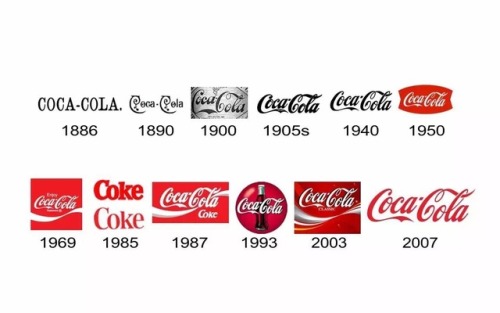
The Coca-Cola logo throughout the years. As often with logos, the initial design is simple, then it goes through various busier incarnations, before all distractions are cut and it ends up relatively minimalist again.
One Diretion: we will be back in 18 months
Me three years later:


The evolution of Doctor Stephen Strange: Doctor Strange (2016) vs Avengers: Infinity War (2018)


“Patrick; narcissistic, schizoid, suicidal alcoholic.” - Patrick Melrose (2018)


*in the soul realm*
Peter Parker: woah what snappened
Wanda:
Doctor Strange:
Bucky:
T'challa:
Peter Parker: Too soon?
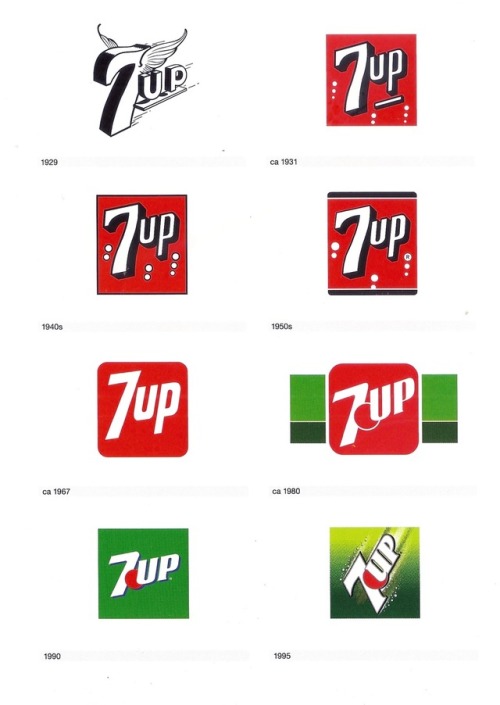
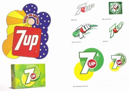
The 7UP logo throughout the years. The 1990 version is the one that’s most familiar to me; it makes me think of summer, the beach, vacation. The ice cream van that had a poorly drawn Hulk on it.
The mid-1990s was a time when nearly every company logo got busier, flashier, only to return to more basic, and in my opinion more effective, designs.
These scans come from the great book, Logo Life by Ron van der Vlugt.


The new Sabrina is very good
-
 byrdieblogs reblogged this · 4 years ago
 -
 frejjjya liked this · 4 years ago
 -
 skewedwayoflife liked this · 4 years ago
 -
 aanti1opa-blog liked this · 5 years ago
 -
 writerintheattic liked this · 5 years ago
 -
 kintsugi-miso-mushrooms reblogged this · 5 years ago
 -
 cosmicrket liked this · 5 years ago
 -
 idnkn liked this · 5 years ago
 -
 clem-cult liked this · 5 years ago
 -
 15701873ag-blog reblogged this · 5 years ago
 -
 cheezwarlock reblogged this · 5 years ago
 -
 peaforbrains liked this · 5 years ago
 -
 basse-fosse liked this · 5 years ago
 -
 thesmallestconstellation liked this · 5 years ago
 -
 churchyardgrim reblogged this · 5 years ago
 -
 pavonisgiron liked this · 5 years ago
 -
 crypticbussy liked this · 5 years ago
 -
 strawberry-fly liked this · 5 years ago
 -
 friites0904 liked this · 5 years ago
 -
 boostmobilemastershake liked this · 5 years ago
 -
 themoonsballoon reblogged this · 5 years ago
 -
 pepsiharlotarchive liked this · 5 years ago
 -
 psygull reblogged this · 5 years ago
 -
 hofudlaus liked this · 5 years ago
 -
 tickfleato liked this · 5 years ago
 -
 psshaw reblogged this · 5 years ago
 -
 ya-girl-leyyyayyy liked this · 5 years ago
 -
 mtchill reblogged this · 5 years ago
 -
 hyzakyte liked this · 5 years ago
 -
 themidnightstudent liked this · 5 years ago
 -
 diaoutro liked this · 5 years ago
 -
 mytaxidermia liked this · 5 years ago
 -
 anotheroddfish liked this · 5 years ago
 -
 juliendonkeygrl liked this · 5 years ago
 -
 yeopwo liked this · 6 years ago
 -
 punkedoutalien reblogged this · 6 years ago
 -
punkedoutalien liked this · 6 years ago
-
 prince-ezekiel liked this · 6 years ago
 -
 immaculate-missconception-blog1 liked this · 6 years ago
 -
 tsukkikeii liked this · 6 years ago
 -
 martazubieta liked this · 6 years ago
 -
 staryczlowiekiniemoze reblogged this · 6 years ago
 -
 kewpiiie reblogged this · 6 years ago
