Obiwallskenobi - O ɹ ɐ ɔ

More Posts from Obiwallskenobi and Others
I don’t care about it at all (I have carried its weight around like a rock on my chest since the very day it happened)
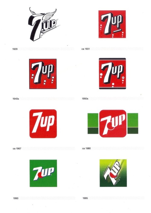
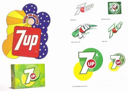
The 7UP logo throughout the years. The 1990 version is the one that’s most familiar to me; it makes me think of summer, the beach, vacation. The ice cream van that had a poorly drawn Hulk on it.
The mid-1990s was a time when nearly every company logo got busier, flashier, only to return to more basic, and in my opinion more effective, designs.
These scans come from the great book, Logo Life by Ron van der Vlugt.


Strange: You know what, you’re pretty fucking annoying
Tony: fuck off, Strange
-
Tony: hE cAlLeD mE pReTTy
Bruce: tony no


Tony Stark: Earth’s best defender

💚¡QUÉ SEA LEY! 💚 (Mi pequeña contribución a esta gran causa) foto de fondo de Cobertura Colavorativa #13j


You know, your dad liked cheeseburgers - Avengers: Endgame (2019)
-
 imlovnit reblogged this · 2 years ago
 -
 bloggingfromherbed liked this · 2 years ago
 -
 impossibleapricotlampbat liked this · 2 years ago
 -
 igotapocketfulofsunshine liked this · 3 years ago
 -
 actsofloyal-t reblogged this · 3 years ago
 -
 quilalakdu liked this · 3 years ago
 -
 katiedid746 liked this · 3 years ago
 -
 open-new-tab reblogged this · 3 years ago
 -
 ashxattack reblogged this · 3 years ago
 -
 taewrene liked this · 3 years ago
 -
 uniquewitchsoul liked this · 3 years ago
 -
 sadnesslakeof reblogged this · 3 years ago
 -
 whomst-the-fck-asked reblogged this · 3 years ago
 -
 sporadicpaperglitter liked this · 3 years ago
 -
 peacel0veandrubbergloves reblogged this · 3 years ago
 -
 winterandmisshyde liked this · 4 years ago
 -
 thebeachesofcheyenne liked this · 4 years ago
 -
 miktycent liked this · 4 years ago
 -
 shiningdiamond1968 liked this · 4 years ago
 -
 sififantsyfangirl liked this · 4 years ago
 -
 hummus-png liked this · 4 years ago
 -
 thrashypeacemaker liked this · 4 years ago
 -
 lailagska liked this · 4 years ago
 -
 lia7nne reblogged this · 4 years ago
 -
 empathquantumphysicistsalgamist reblogged this · 4 years ago
 -
empathquantumphysicistsalgamist liked this · 4 years ago
-
 luizamg-blog1 liked this · 4 years ago
 -
 allthelxves reblogged this · 4 years ago
 -
 nazife-blog2 liked this · 4 years ago
 -
 optimisticalpacakoala liked this · 4 years ago
 -
 ricsyeong liked this · 4 years ago
 -
 yellowtoothbrush reblogged this · 4 years ago
 -
 scar---smile reblogged this · 4 years ago
 -
scar---smile liked this · 4 years ago
-
 soonrimah liked this · 4 years ago
 -
 tearsforfearslover reblogged this · 4 years ago
 -
tearsforfearslover liked this · 4 years ago
