Next Week On Game Of Thrones:
Next week on Game of Thrones:

More Posts from Toaselle and Others

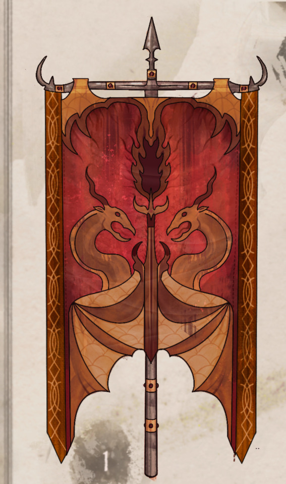


Tribe Banner concept art:
Folks seemed to enjoy my WOF WIPS, so here’s more concept art for y’all! My favorite thing about WOF is the potential for world building. I thought it’d be cool to see a tribe emblem represented on a banner/flag of sorts:
Read below for some of the thought process / headcannons behind the design choices: 👇
Skywing Banner:
Skywings pride themselves on 3 things; treasure, fire, & their enormous, soaring wingspan which steals the sky.
As such, portrayed on the banner, the fabric (often made with dyed cow or goat leathers) resembles draped dragon wings. Two Skywings embrace a goblet, which is spewing golden fire.
The banner is often held aloft with iron or gold poles, signifying to other tribes their wealth and pride.
Mudwing banner:
These banners are fashioned with leather hides from cow or crocodile skin, held aloft with bamboo, and painted with a Talon-print & Reed crest.
The talonprint symbolizes community and the strength of Mudwing sibling bonds. The reed border unifies all Mudwings regardless of their relationship to home; the swamp. Bigwings are often seen carrying these into battle, signifing their status and making it easier for a sib to locate them in the flurry of a fight.
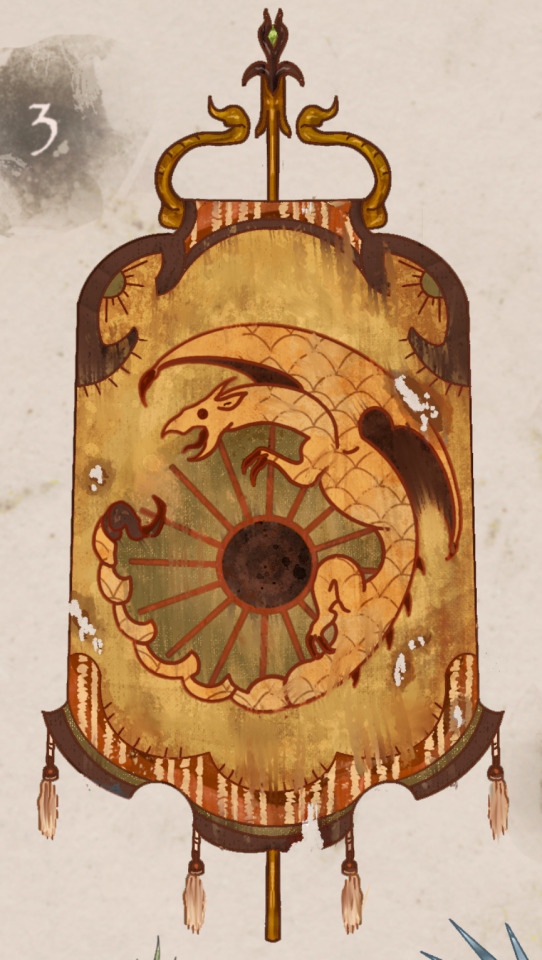
Sandwing Banner:
Sandwing flags are made with camel skins and dyed cactus leather.
A crest shows a Sandwing coiled around a beaming sun, a reminder that despite the revered 3 moons, Sandwings are born to thrive in sunlight.
The fabric is cut in a way to mimic the swooping dunes of Sandwing territory. And the poles of the flags are equally intricate, with scorpion tails and golden ropes which frame the banner.
These flags make prominent appearances in parades, festivals, and markets, and even miniature version are often displayed in homes or as tapestries/carpets.
Seawing banner:
These banners are often seen displayed in royal quarters or councils, or above land to mark territory.
A nautilus shell crest on front echoes the swirl-pattern associated with royal Seawings: The banner’s borders resemble waves and a dragon swimming beneath their surface.
These are crafted with rich materials, strung with seashells, pearls, silver dollars, and deep oceanic color fabric. There is severe penalty for Seawings found plucking treasure from the banners, as they are a direct symbol of royalty.
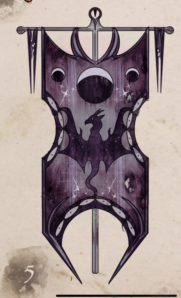
Nightwing Banner:
These banners emphasize the Nightwings’ relationship to the moon, their source of power and praise. The material, a contrast of white stitching against purple velvet showcases moonlight and night, black scales against stars, magic and mystery.
They are seen decorated with 3 moons at the top and a centered dragon reaching up into the night sky.
These banners were often used during the war as secret code by spies to deliver to other tribes. Prophecy scrolls often came attached, delivering cryptic messages or secrets in the night. These banners all helped add to the secrecy of the Dragonet Prophecy, and kept tribes on their toes around Nightwings.
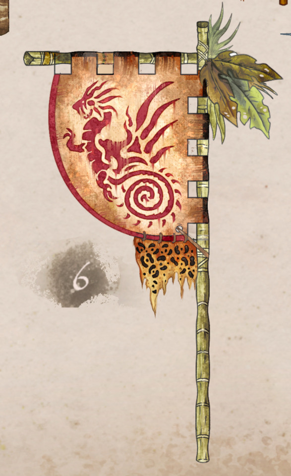
Rainwing banner:
Rainwing banners are not used for battle purposes like other tribes, most are mere decoration, location indicators, and have no unified design.
However, It is said back when Rainwings left the rainforest to trade pre-war, this particular banner design was often raised above Rainwing merchant tables, and showcases the coiled tail of a Rainwing with leaves, vines, and other sights from the rainforest adorning a bamboo pole. Bright color combinations accentuated the flag to entice curious customers.
Now, only one tattered version of the original Rainwing banner remains, displayed proudly in Queen Glory’s quarters, a reminder that building the Rainwings’ community is their most important goal.
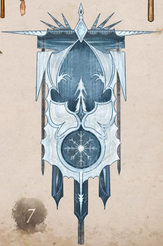
Icewing Banner:
These banners reflect the same standards Icewings hold themselves to.
Like a visual of the rankings themselves, each banner is cut perfectly from an Icewing’s trained, serrated claws to resemble icicles, and crafted with fine blue stitching.
Flags are often held aloft with perfectly polished narwhal horn or bone, and can be inlaid with sapphires or diamond.
Icewing soldiers are often gifted these during ceremonies, and perform training exercises with the flags to test their stance/attentiveness. The crest showcases the swift sharpness of ice through a flying dragon, and a snowflake toward the bottom reminding Icewings that even minuscule snowflakes, small things, should be perfect in form.
The Three Laws of Fandom
If you wish to take part in any fandom, you need to accept and respect these three laws.
If you aren’t able to do that, then you need to realise that your actions are making fandom unsafe for creators. That you are stifling creativity.
Like vaccination, fandom only works if everyone respects these rules. Creators need to be free to make their fanart, fanfics and all other content without fear of being harassed or concern-trolled for their creative choices, no matter whether you happen to like that content or not.
The First Law of Fandom
Don’t Like; Don’t Read (DL;DR)
It is up to you what you see online. It is not anyone else’s place to tell you what you should or should not consume in terms of content; it is not up to anyone else to police the internet so that you do not see things you do not like. At the same time, it is not up to YOU to police fandom to protect yourself or anyone else, real or hypothetical.
There are tools out there to help protect you if you have triggers or squicks. Learn to use them, and to take care of your own mental health. If you are consuming fan-made content and you find that you are disliking it - STOP.
The Second Law of Fandom
Your Kink Is Not My Kink (YKINMK)
Simply put, this means that everyone likes different things. It’s not up to you to determine what creators are allowed to create. It’s not up to you to police fandom.
If you don’t like something, you can post meta about it or create contrarian content yourself, seek to convert other fans to your way of thinking.
But you have no right to say to any creator “I do not like this, therefore you should not create it. Nobody should like this. It should not exist.”
It’s not up to you to decide what other people are allowed to like or not like, to create or not to create. That’s censorship. Don’t do it.
The Third Law of Fandom
Ship And Let Ship (SALS)
Much (though not all) fandom is about shipping. There are as many possible ships as there are fans, maybe more. You may have an OTP (One True Pairing), you may have a NOTP, that pairing that makes you want to barf at the very thought of its existence.
It’s not up to you to police ships or to determine what other people are allowed to ship. Just because you find that one particular ship problematic or disgusting, does not mean that other people are not allowed to explore its possibilities in their fanworks.
You are free to create contrarian content, to write meta about why a particular ship is repulsive, to discuss it endlessly on your private blog with like-minded persons.
It is not appropriate to harass creators about their ships, it is not appropriate to demand they do not create any more fanworks about those ships, or that they create fanwork only in a manner that you deem appropriate.
These three laws add up to the following:
You are not paying for fanworks content, and you have no rights to it other than to choose to consume it, or not consume it. If you do choose to consume it, do not then attack the creator if it wasn’t to your taste. That’s the height of bad manners.
Be courteous in fandom. It makes the whole experience better for all of us.
This is amazing
I can't fanthom to explain you in full how much of a significant moment this is in animation

You don't show blood in animated films, it's like almost a taboo thing. You can show characters getting beat up and bruised but never bleeding. It defies all corporate beliefs of making it a "kids movie". Even GDT's Pinocchio which has fucking nazis in it and guns shooting people never showed blood in it. It's just that sacred of a thing in animation that studios never cross.
But Puss in Boots, they showed it. Not only that, you get a fucking close up on it. Do you know how rare that is? The people who made it probably fought every tooth and nail to get this moment approved, because this is unprecedented in this industry. You don't show actual blood bleeding I cant stress how much this is such a nono in this industry.
But for this moment it's perfect, the inevitability of death in Puss in Boot's eyes, the amount of risk the studio took to get this moment in the film approved, shows how much DreamWorks really cares and wants this movie to not just be another haha kids film but for the adults watching it, the people who have seen the world and fear death, those with anxiety, get panic attacks, unsure about life the universe, getting married, being a family. These aren't ideas catered to kids.
Everytime I've seen people be like "oh studios need to stop making boring ass animations and actually make a film about serious topics and have better animation and care about the movie" THIS IS IT FOLKS. A STUDIO LISTENED AND IT'S OUT HERE IN YOUR FACE.
So seriously go watch Puss in Boots. It's incredible and you're missing out on something beautiful if you don't.


puss’ deaths told by dumb memes


Opening credits of Agatha Christie’s Poirot (1989 - 2013)
Title designer Pat Gavin created the opening sequence in 1988. It was his job to set the tone for the tv show. The neat, streamlined sequence features Art Deco iconography in flight; Cassandre-style trains, boats, and biplanes with Poirot’s name formed by the wheels. In a reference to Poirot’s most famous case, Murder on the Orient Express, the detective is glimpsed aboard the passing train.
“The idea for the titles was a portrait of a man and his time. The late Mike Oxley — or “OXO” as we called him — was the production designer and we put our heads together and found we were both thinking about Art Deco as a stylistic theme. I had some old architectural magazines with all those wonderful buildings of the ‘20s and ‘30s, with architectural plans, and that was my original inspiration. I wanted to make it all look exactly like architectural photography from that time. They had a wonderful atmosphere. But I wasn’t able to quite achieve that look, partly due to budget and partly to not having a clue! I had to find another way, so it became Art Deco–Cubism. I liked the idea of the fractured, multifaceted Cubist style because it reminded me of a puzzle and this is of course what Poirot does — he solves puzzles. Making Poirot himself a bit of a puzzle seemed to describe the man and what he does. Brian Eastman, the producer, and David Suchet, the actor who played Poirot — brilliantly, I might add — both agreed and gave me the green light. David was very helpful during the filming. He was a joy to direct.“ - Pat Gavin, artofthetitle.com interview, March 26 2013