What U Think, To Much Colour, Or Less?

what u think, to much colour, or less?
https://sdesignt.threadless.com/
More Posts from Wwwdannywyldedvigatelikhaos and Others
"New" Secret Service location tracking security chips for protectees
Just heard that Google Analytics is banned in italy, what is Google Analytics anyway?
A user metrics gathering tool. They probably violated some law there.
In a nutshell, "analytics" refers to gathering data on users in order to analyze user behavior. Like "how many users registered in one day" or "how many users are using this feature" etc. How companies use it can range from innocent to nefarious, but it's data collection.
In the first week Volume 5 came out, Hotaru no Yomeiri sold 60,046 copies. 52,095 sales are from Volume 5 alone, putting it in the top five best selling mangas for the week.


when i get a runny nose

This is honestly so relatable and I’m going to need everyone else to step it up a notch
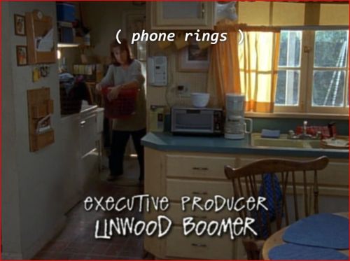
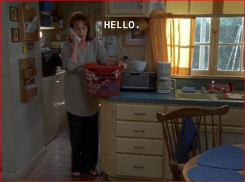
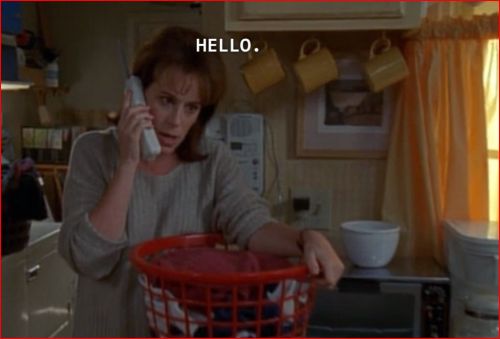
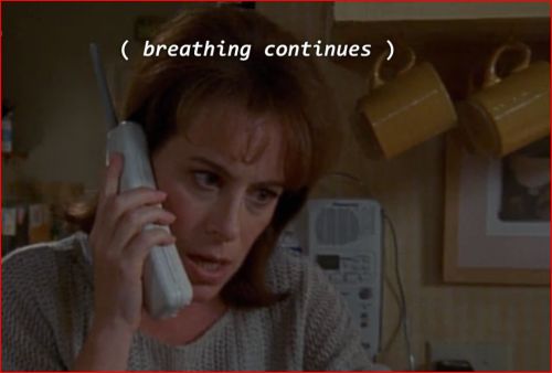
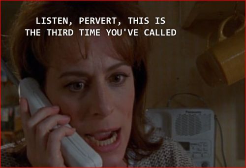
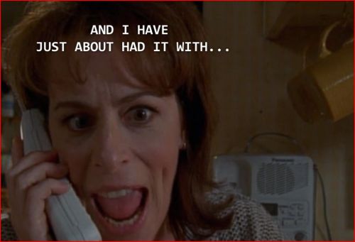
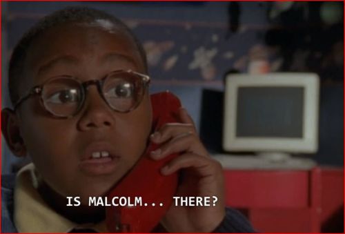
THE GREATEST MOMENT IN TV HISTORY

Hotaru no Yomeiri Volume 4 was released on April 18th, 2024. In its first month, the manga sold 82,573 physical copies.

HT @dataelixir #datascience
i’m in bed and was wondering where my cat is so i was all “oh I’ll just text him” and opened the messages app before i realized what i was doing
Data Visualization & Storytelling Part_4: How to read a chart?
In continuation to my previous post on #datavizualization
📌When it comes to reading a chart, it’s not only the actual chart but also the other supporting elements such as titles, subtitles, legends, scales, sources, etc. that makes a chart complete.
✍It’s critical to read them carefully to grasp what the chart is about, what is being measured, and how it’s being measured. Alberto Cario, in his book, suggests that to read a chart well, you must focus on:
The features that surround the content and support it —>the chart’s scaffolding—and
on the content itself —> how the data is represented or encoded. The scaffolding consists of features of the chart.
⚡If you struggle to read a chart or think of a suitable chart, you must spend some time developing graph literacy. Basically, you need to learn about visual encoding of the charts.
✍🏻For example, many times after getting some clarity on first step (selecting appropriate charts), learners are aware that they need to create stacked/grouped bar charts while plotting the distribution of two categorical variables.
When I ask them to write ggplot2 (I hope you’re familiar. If not, still you’ll get the context) code for the same, they put one variable on x-axis & other on y-axis. 🤦🏻♀
And of course, it will not work! (🛑 Pause reading & think WHY)
I hope you got it. It's not about the code but your understanding of chart elements 😃 .
👉 In a bar chart, the height/length of the rectangular bars basically represents counts/proportions/percentages.
👉 So one of the axes (usually the y-axis) has to have the counts, while the other axis will represent one of the categorical variables.
👉 As you’re planning to plot 2 categorical variables, you’ll either stack or group the categories of that second variable. Refer Image below 👇

Don’t forget to check the comment section for an awesome book to help you.
-
 frugallolafinds liked this · 6 months ago
 -
 xlsdesignt liked this · 9 months ago
 -
 wwwdannywyldedvigatelikhaos reblogged this · 9 months ago
 -
xlsdesignt reblogged this · 9 months ago

147 posts