Pixel Art - Blog Posts
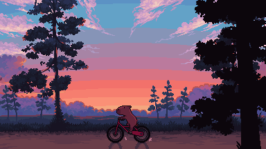
My first post :D Idea by @lily-blade of making a Pokemon fusion with the final evo of my first starter you caught and the first legendary you caught. My first starter being Cyndaquil in Pokemon gold, and first legendary is Lunala in Pokemon Moon. I did cheat a little by using the Hisuian form, but the color the theme and typing matched way better ;P Typhnala Type: Fire/Ghost Ability: Infernal Shield: If the user is at full hp it takes half damage, when it's hp gets to 1/3 hp, boost fire type attacks. (Blaze and Shadow Shield) Stats: 90 HP, 105 Atk, 87 Def, 125 Sp. Atk, 107 Sp. Def, 96 Spe, BST: 610

Lunala base and Hisuan Typhlosion palette from the Smogon Sprite proyect.
⭐ So you want to learn pixel art? ⭐
🔹 Part 1 of ??? - The Basics!
Edit: Now available in Google Doc format if you don't have a Tumblr account 🥰
Hello, my name is Tofu and I'm a professional pixel artist. I have been supporting myself with freelance pixel art since 2020, when I was let go from my job during the pandemic.


My progress, from 2017 to 2024. IMO the only thing that really matters is time and effort, not some kind of natural talent for art.
This guide will not be comprehensive, as nobody should be expected to read allat. Instead I will lean heavily on my own experience, and share what worked for me, so take everything with a grain of salt. This is a guide, not a tutorial. Cheers!
🔹 Do I need money?
NO!!! Pixel art is one of the most accessible mediums out there.
I still use a mouse because I prefer it to a tablet! You won't be at any disadvantage here if you can't afford the best hardware or software.
Because our canvases are typically very small, you don't need a good PC to run a good brush engine or anything like that.
✨Did you know? One of the most skilled and beloved pixel artists uses MS PAINT! Wow!!
🔹 What software should I use?
Here are some of the most popular programs I see my friends and peers using. Stars show how much I recommend the software for beginners! ⭐
💰 Paid options:
⭐⭐⭐ Aseprite (for PC) - $19.99
This is what I and many other pixel artists use. You may find when applying to jobs that they require some knowledge of Aseprite. Since it has become so popular, companies like that you can swap raw files between artists.
Aseprite is amazingly customizable, with custom skins, scripts and extensions on Itch.io, both free and paid.
If you have ever used any art software before, it has most of the same features and should feel fairly familiar to use. It features a robust animation suite and a tilemap feature, which have saved me thousands of hours of labour in my work. The software is also being updated all the time, and the developers listen to the users. I really recommend Aseprite!
⭐ Photoshop (for PC) - Monthly $$
A decent option for those who already are used to the PS interface. Requires some setup to get it ready for pixel-perfect art, but there are plenty of tutorials for doing so.
Animation is also much more tedious on PS which you may want to consider before investing time!
⭐⭐ ProMotion NG (for PC) - $19.00
An advanced and powerful software which has many features Aseprite does not, including Colour Cycling and animated tiles.
⭐⭐⭐ Pixquare (for iOS) - $7.99 - $19.99 (30% off with code 'tofu'!!)
Probably the best app available for iPad users, in active development, with new features added all the time.

Look! My buddy Jon recommends it highly, and uses it often.
One cool thing about Pixquare is that it takes Aseprite raw files! Many of my friends use it to work on the same project, both in their office and on the go.
⭐ Procreate (for iOS) - $12.99
If you have access to Procreate already, it's a decent option to get used to doing pixel art. It does however require some setup. Artist Pixebo is famously using Procreate, and they have tutorials of their own if you want to learn.
⭐⭐ ReSprite iOS and Android. (free trial, but:) $19.99 premium or $$ monthly
ReSprite is VERY similar in terms of UI to Aseprite, so I can recommend it. They just launched their Android release!
🆓 Free options:
⭐⭐⭐ Libresprite (for PC)
Libresprite is an alternative to Aseprite. It is very, very similar, to the point where documentation for Aseprite will be helpful to Libresprite users.
⭐⭐ Pixilart (for PC and mobile)
A free in-browser app, and also a mobile app! It is tied to the website Pixilart, where artists upload and share their work. A good option for those also looking to get involved in a community.
⭐⭐ Dotpict (for mobile)
Dotpict is similar to Pixilart, with a mobile app tied to a website, but it's a Japanese service. Did you know that in Japanese, pixel art is called 'Dot Art'? Dotpict can be a great way to connect with a different community of pixel artists! They also have prompts and challenges often.
🔹 So I got my software, now what?
◽Nice! Now it's time for the basics of pixel art.
❗ WAIT ❗ Before this section, I want to add a little disclaimer. All of these rules/guidelines can be broken at will, and some 'no-nos' can look amazing when done intentionally.
The pixel-art fundamentals can be exceedingly helpful to new artists, who may feel lost or overwhelmed by choice. But if you feel they restrict you too harshly, don't force yourself! At the end of the day it's your art, and you shouldn't try to contort yourself into what people think a pixel artist 'should be'. What matters is your own artistic expression. 💕👍
◽Phew! With that out of the way...
🔸"The Rules"
There are few hard 'rules' of pixel art, mostly about scaling and exporting. Some of these things will frequently trip up newbies if they aren't aware, and are easy to overlook.
🔹Scaling method
There are a couple ways of scaling your art. The default in most art programs, and the entire internet, is Bi-linear scaling, which usually works out fine for most purposes. But as pixel artists, we need a different method.


Both are scaled up x10. See the difference?
On the left is scaled using Bilinear, and on the right is using Nearest-Neighbor. We love seeing those pixels stay crisp and clean, so we use nearest-neighbor.
(Most pixel-art programs have nearest-neighbor enabled by default! So this may not apply to you, but it's important to know.)
🔹Mixels
Mixels are when there are different (mixed) pixel sizes in the same image.

Here I have scaled up my art- the left is 200%, and the right is 150%. Yuck!
As we can see, the "pixel" sizes end up different. We generally try to scale our work by multiples of 100 - 200%, 300% etc. rather than 150%. At larger scales however, the minute differences in pixel sizes are hardly noticeable!
Mixels are also sometimes seen when an artist scales up their work, then continues drawing on it with a 1 pixel brush.

Many would say that this is not great looking! This type of pixels can be indicative of a beginner artist. But there are plenty of creative pixel artists out there who mixels intentionally, making something modern and cool.
🔹Saving Your Files
We usually save our still images as .PNGs as they don’t create any JPEG artifacts or loss of quality. It's a little hard to see here, but there are some artifacts, and it looks a little blurry. It also makes the art very hard to work with if we are importing a JPEG.

For animations .GIF is good, but be careful of the 256 colour limit. Try to avoid using too many blending mode layers or gradients when working with animations. If you aren’t careful, your animation could flash afterwards, as the .GIF tries to reduce colours wherever it can. It doesn’t look great!

Here's an old piece from 2021 where I experienced .GIF lossiness, because I used gradients and transparency, resulting in way too many colours.
🔹Pixel Art Fundamentals - Techniques and Jargon
❗❗Confused about Jaggies? Anti-Aliasing? Banding? Dithering? THIS THREAD is for you❗❗ << it's a link, click it!!
As far as I'm concerned, this is THE tutorial of all time for understanding pixel art. These are techniques created and named by the community of people who actually put the list together, some of the best pixel artists alive currently. Please read it!!
🔸How To Learn
Okay, so you have your software, and you're all ready to start. But maybe you need some more guidance? Try these tutorials and resources! It can be helpful to work along with a tutorial until you build your confidence up.
⭐⭐ Pixel Logic (A Digital Book) - $10 A very comprehensive visual guide book by a very skilled and established artist in the industry. I own a copy myself.
⭐⭐⭐ StudioMiniBoss - free A collection of visual tutorials, by the artist that worked on Celeste! When starting out, if I got stuck, I would go and scour his tutorials and see how he did it.
⭐ Lospec Tutorials - free A very large collection of various tutorials from all over the internet. There is a lot to sift through here if you have the time.
⭐⭐⭐ Cyangmou's Tutorials - free (tipping optional) Cyangmou is one of the most respected and accomplished modern pixel artists, and he has amassed a HUGE collection of free and incredibly well-educated visual tutorials. He also hosts an educational stream every week on Twitch called 'pixelart for beginners'.
⭐⭐⭐ Youtube Tutorials - free There are hundreds, if not thousands of tutorials on YouTube, but it can be tricky to find the good ones. My personal recommendations are MortMort, Brandon, and AdamCYounis- these guys really know what they're talking about!
🔸 How to choose a canvas size
When looking at pixel art turorials, we may see people suggest things like 16x16, 32x32 and 64x64. These are standard sizes for pixel art games with tiles. However, if you're just making a drawing, you don't necessarily need to use a standard canvas size like that.
What I like to think about when choosing a canvas size for my illustrations is 'what features do I think it is important to represent?' And make my canvas as small as possible, while still leaving room for my most important elements.
Imagine I have characters in a scene like this:

I made my canvas as small as possible (232 x 314), but just big enough to represent the features and have them be recognizable (it's Good Omens fanart 😤)!! If I had made it any bigger, I would be working on it for ever, due to how much more foliage I would have to render.
If you want to do an illustration and you're not sure, just start at somewhere around 100x100 - 200x200 and go from there.
It's perfectly okay to crop your canvas, or scale it up, or crunch your art down at any point if you think you need a different size. I do it all the time! It only takes a bit of cleanup to get you back to where you were.
🔸Where To Post
Outside of just regular socials, Twitter, Tumblr, Deviantart, Instagram etc, there are a few places that lean more towards pixel art that you might not have heard of.
⭐ Lospec Lospec is a low-res focused art website. Some pieces get given a 'monthly masterpiece' award. Not incredibly active, but I believe there are more features being added often.
⭐⭐ Pixilart Pixilart is a very popular pixel art community, with an app tied to it. The community tends to lean on the young side, so this is a low-pressure place to post with an relaxed vibe.
⭐⭐ Pixeljoint Pixeljoint is one of the big, old-school pixel art websites. You can only upload your art unscaled (1x) because there is a built-in zoom viewer. It has a bit of a reputation for being elitist (back in the 00s it was), but in my experience it's not like that any more. This is a fine place for a pixel artist to post if they are really interested in learning, and the history. The Hall of Fame has some of the most famous / impressive pixel art pieces that paved the way for the work we are doing today.
⭐⭐⭐ Cafe Dot Cafe Dot is my art server so I'm a little biased here. 🍵 It was created during the recent social media turbulence. We wanted a place to post art with no algorithms, and no NFT or AI chuds. We have a heavy no-self-promotion rule, and are more interested in community than skill or exclusivity. The other thing is that we have some kind of verification system- you must apply to be a Creator before you can post in the Art feed, or use voice. This helps combat the people who just want to self-promo and dip, or cause trouble, as well as weed out AI/NFT people. Until then, you are still welcome to post in any of the threads or channels. There is a lot to do in Cafe Dot. I host events weekly, so check the threads!
⭐⭐/r/pixelart The pixel art subreddit is pretty active! I've also heard some of my friends found work through posting here, so it's worth a try if you're looking. However, it is still Reddit- so if you're sensitive to rude people, or criticism you didn't ask for, you may want to avoid this one. Lol
🔸 Where To Find Work
You need money? I got you! As someone who mostly gets scouted on social media, I can share a few tips with you:
Put your email / portfolio in your bio Recruiters don't have all that much time to find artists, make it as easy as possible for someone to find your important information!
Clean up your profile If your profile feed is all full of memes, most people will just tab out rather than sift through. Doesn't apply as much to Tumblr if you have an art tag people can look at.
Post regularly, and repost Activity beats everything in the social media game. It's like rolling the dice, and the more you post the more chances you have. You have to have no shame, it's all business baby
Outside of just posting regularly and hoping people reach out to you, it can be hard to know where to look. Here are a few places you can sign up to and post around on.
/r/INAT INAT (I Need A Team) is a subreddit for finding a team to work with. You can post your portfolio here, or browse for people who need artists.
/r/GameDevClassifieds Same as above, but specifically for game-related projects.
Remote Game Jobs / Work With Indies Like Indeed but for game jobs. Browse them often, or get email notifications.
VGen VGen is a website specifically for commissions. You need a code from another verified artist before you can upgrade your account and sell, so ask around on social media or ask your friends. Once your account is upgraded, you can make a 'menu' of services people can purchase, and they send you an offer which you are able to accept, decline, or counter.
The evil websites of doom: Fiverr and Upwork I don't recommend them!! They take a big cut of your profit, and the sites are teeming with NFT and AI people hoping to make a quick buck. The site is also extremely oversaturated and competitive, resulting in a race to the bottom (the cheapest, the fastest, doing the most for the least). Imagine the kind of clients who go to these websites, looking for the cheapest option. But if you're really desperate...
🔸 Community
I do really recommend getting involved in a community. Finding like-minded friends can help you stay motivated to keep drawing. One day, those friends you met when you were just starting out may become your peers in the industry. Making friends is a game changer!
Discord servers Nowadays, the forums of old are mostly abandoned, and people split off into many different servers. Cafe Dot, Pixel Art Discord (PAD), and if you can stomach scrolling past all the AI slop, you can browse Discord servers here.
Twitch Streams Twitch has kind of a bad reputation for being home to some of the more edgy gamers online, but the pixel art community is extremely welcoming and inclusive. Some of the people I met on Twitch are my friends to this day, and we've even worked together on different projects! Browse pixel art streams here, or follow some I recommend: NickWoz, JDZombi, CupOhJoe, GrayLure, LumpyTouch, FrankiePixelShow, MortMort, Sodor, NateyCakes, NyuraKim, ShinySeabass, I could go on for ever really... There are a lot of good eggs on Pixel Art Twitch.
🔸 Other Helpful Websites
Palettes Lospec has a huge collection of user-made palettes, for any artist who has trouble choosing their colours, or just wants to try something fun. Rejected Palettes is full of palettes that didn't quite make it onto Lospec, ran by people who believe there are no bad colours.
The Spriters Resource TSR is an incredible website where users can upload spritesheets and tilesets from games. You can browse for your favourite childhood game, and see how they made it! This website has helped me so much in understanding how game assets come together in a scene.
VGMaps Similar to the above, except there are entire maps laid out how they would be played. This is incredible if you have to do level design, or for mocking up a scene for fun.
Game UI Database Not pixel-art specific, but UI is a very challenging part of graphics, so this site can be a game-changer for finding good references!
Retronator A digital newspaper for pixel-art lovers! New game releases, tutorials, and artworks!
Itch.io A website where people can upload, games, assets, tools... An amazing hub for game devs and game fans alike. A few of my favourite tools: Tiled, PICO-8, Pixel Composer, Juice FX, Magic Pencil for Aseprite
🔸 The End?
This is just part 1 for now, so please drop me a follow to see any more guides I release in the future. I plan on doing some writeups on how I choose colours, how to practise, and more!
I'm not an expert by any means, but everything I did to get to where I am is outlined in this guide. Pixel art is my passion, my job and my hobby! I want pixel art to be recognized everywhere as an art-form, a medium of its own outside of game-art or computer graphics!
This guide took me a long time, and took a lot of research and experience. Consider following me or supporting me if you are feeling generous.
And good luck to all the fledgling pixel artists, I hope you'll continue and have fun. I hope my guide helped you, and don't hesitate to send me an ask if you have any questions! 💕
My other tutorials (so far): How to draw Simple Grass for a game Hue Shifting
I love your art so much!! It's inspiring me to get back into pixel art (I gave up quickly). A huge problem I had was I didn't know what size was best to set my canvas for specific projects. I always ended up overestimating and making it too big and then it looked less like pixel art and more like grainy digital art. Do you have a rough guide you stick to for landscapes/bedrooms/cities VS. things like animals and characters?
aw thank you i'm happy to hear that! i hope u stick with it ♥
with landscapes/bedrooms/cities i use 275x155. this provides a fair amount of detail while still keeping it pixely, plus it resizes to wallpaper size. for vertical i just reverse it at 155x275.
i've also recently started to use 215x215 (same amount of pixels as above) so that i can resize my art to easily fit both wallpapers, and mobile videos... since tiktok and instagram reels are everything nowadays 😒
for characters and animals, generally i will base the size of the canvas around how i stylize eyes.


so i'll draw the eyes first, then just draw everything else around that.


i also have a smaller resolution style with 2px dot eyes that i use for adding characters to landscapes, since my landscape resolution is too small for my regular style unless the character is close to the screen.
hope this helps!
I want to start drawing landscape. Do you have any tips?
Took me a while to answer this (sorry anon)! Drawing landscapes for me are mostly just a matter of doing a few 'art studies' and a bit of imitating life. Here's a brief rundown of my process. I find that I learn best when I see a picture or a reference that really tickles my fancy, like these ones! First image for it's colors, and the second for it's composition.


And then I pull up the dreaded white canvas on start on a rough idea or just start dribbling out the basics: composition, a bit of color, general shapes, etc. If you have a hard time doing general landscapes, don't worry! Imagine breaking it down like this: You layer on some general colors and shapes; don't be afraid to make mistakes, you can always go back to it! Be loose and organic with it at first, we're not striving for detail yet, and just let that brush move freely. And once you got the shapes down, you can go back and forth in the canvas to start detailing. I find that it's best if you really look into how some things are "made". Like for example, how that patch of grass in your reference is made: 'is it layered? does it have some shiny bits in it that I wanna highlight? are the blades of grass sharp enough to individually detail or more clumped up together to just put in a sorta grassy blob?'. Also, don't be afraid to experiment a bit. Try putting some highlights around the edges to make it pop out more, or try putting small changes in the color you're working with; something that's close but still different, so that it compliments each other! Then it's just a matter of going forward with it; see what you like and what you wanna keep and imitate, see what you want to change or maybe just leave out on. Keep on detailing and going until you're happy with it!

This is a really brief rundown and explanation of a process that can be entire unique to each and everyone of us, and takes a bit of time and practice to pull off. But I believe in you! We all start from somewhere, sometime down the line; and that can start right now if you want it to! Goodluck to any artists out there who wanna try out landscapes. It's a fun and comforting process of organic and loose art that breathes in a lot of life in some people, especially me. Twitter | Prints | Ko-Fi | Patreon
Do you have any tips for recreating the Deltarune sprite style?
Hmm... I'm not entirely sure if I've got any 100% full proof tips for the style (nor will I pretend I'm an expert on the style), but I'll give what I can for ya! So, first up, for any given color on a sprite, I'd suggest only using two colors. One brighter highlight, and one darker base/tone. the shading in DR doesn't tend to get super complex, so most of the time having only two tones for a part should work super well. Bonus points if one or both of the colors are then reincorporated into other parts too, like using one section's highlight as a shade for another, or using the same shade for multiple colors.

Second, a few in-between pixels can help give depth to sprites. You ever see those one or two pixels in-between an outline and the base color, and it uses the same color as the shade? Well, those are in-betweens, and while UT and Lightworld style sprites don't tend to use them, the Darkworld sprite tends to have way more of them, and they help distinguish Darkworld sprites. Third, don't be afraid to use a different color than outright black for your character outlines. There are a lot of sprites that use pure black like Lightworld sprites or sprites for Darkners, but if you're making a darkworld sprite for a Lightner, than get a little creative. Use a very dark tint of whatever their main color is, and that'll help them feel like more of a lightner. It's not a hard-n-fast rule (Berdly uses a black outline despite being a lightner), but it's a tool that can be used.

Fourth, use plenty of ref material. Take other DR sprites, compare them to your work, see what might be different, how you could fix it, and just try your best. And finally, remember that DR's stlye isn't perfect, has plenty of imperfections, and that it's ok to go for designs that aren't super consistent. It's part of the charm in my opinion, because even if it's definitely improved since UT, the spritework is still obviously no Metal Slug or anything, and I kinda love it for it. If you've got differences or flaws between your sprite and the official style, just remember that the official DR sprites are also pretty inconsistent, so your problems might not even register as looking wrong. Sometimes it's even fun to embrace a sprite's initial mistake and then turn it into something amazing/fun. And so uh... yeah, there's my tips. Not really sure if it helped all that much, but I hope they do! If I'm being totally honest here, my style's actually more closely based upon the style of the Undertale mod Bits and Pieces, as it's what I originally was mimicking, and it just so happened to be conveniently similar to DR's style. These are a few character sprites that I made in the style of the mod, with these all being the winners of a contest the community had to get NPCs into the mod (and the final two are mine).

I'd also made some sprites in past that were for a game project I was helping out with. It never saw fruition, though the styled was obviously influenced by the Undertale style, but they were different and they were also... well, a little rougher considering I made them when I was just getting into pixel art. I still like them and I don't think I did too bad for at the time, but it definitely doesn't match my current style (plus, the project's kinda dead in the water anyways)


⭐ Pixel Art Fundamentals - Hue Shifting
This technique is not uniquely specific to pixel art, but it's a very common term to hear when starting out watching those "dos and don'ts" videos. So what is hue shifting?

Hue shifting basically means to change the hue when making your shade darker or lighter. In this context, 'hue' = colour!

You may hear 'you need to hue shift more' when getting feedback on your art, but what does that mean really? Here are some examples:

We can see even with just a bit of hue shifting, we have quite a different vibe for each drawing. In warm / daylight settings, no hue shifting can sometimes look a bit muddy or grey.
If we swap the image to grayscale, you can see that they look much the same:

As long as the hue shifted colours have a brightness that makes sense, they usually will work. You can get quite wacky with it.


But is hue shifting always good? Not necessarily.
Below is some of my art where I intentionally didn't hue-shift at all. You can see it gives them an uncanny, digital, or photographic kind of look. As always, techniques are about your intention, or personal style.


I recommend trying different hue shifting methods! I especially love to use a cool blue or teal for the lighter shades.


Thanks for reading and I hope this helped a little! Have fun with it!!
⭐ Read my full pixel art guide here!


He's just a little guy 🥺 (Longlegs belongs to ppl behind @zooliminology)

I think he is really sweet
I MADE A STAMP!!
I was driven by intense need to have a Yuppie Psycho stamp/blinky/etc and couldnt find a single one for one of my favorite games.
♪⁽⁽٩( ᐖ )۶⁾⁾₍₍٩( ᐛ )۶₎₎♪
Im so happy!!!
FTU with credit (~˘▾˘)~


I'm going to try and get into pixel art! My plan was first to get the dimensions, but didn't want to accidentally commit art theft or something similar to tracing.
Going to have to redo this later...


Made some pixelart of my OC, Rosie ❤


Pixelart I made of my oc, Fritz!

I made some pixelart of my tree man

Pixel Sprite of my oc, Rosie!


Pixel headshots for people on amino.

I made a pixel art of Killua, so I made another one for Gon

Drawing Killua is good for the soul 💜

tamago tamago tamagotchi

tin girl
Another pixelart made from a cp2077 screenshot converted to a bitmap, prolly one of my fav way to layout a base for 1bit pixel art :) i then spent a ridiculous amount of time editing it, cause it always come out as a blurry pixelated mess. This one was done a good while ago, from a playthrought that never got quite past The Heist.
If i somehow find the original screenshot ill try to add it to the post!
![[Five Nights At Freddy's: Illuminated] The Missing Kids](https://64.media.tumblr.com/9de50c73021b395d388dea344b849ba1/71c9816a47149ea7-53/s500x750/0170dc8965d1ea490e165389350e803ac4973ae1.png)
[Five Nights at Freddy's: Illuminated] The Missing Kids
------
UGHHHH its been a long time coming i should have updated these sprites SO long ago
"I hate CassidyVictim" yeah but what if she was a cutie patootie that was doomed to suffer and be miserable? What then??

Anyways i'm a CassidyVictim fan I have like 2 AUs that have CassidyVictim, we have the bonus(?) Of this one being logbook girl too!! :]
I THINK she's from my "rewrite" AU. Idk I don't remember right now im tired I just woke up lmao.
She is my daughter. And she'll be doomed to sadness because dammit FNaF why can't you let anyone be happy?
I'll make a full body drawing of her sooner then later. probably idk lmao.
The weirdest grouping of OC pixel designs i've ever made.

Made this a little while ago, but I still really like these OCs. :3
I don't remember a lot of my story idea, but the main idea was that it was like... the afterlife, and the Mother (pink) was trying to find her way out and kept running into these two Reapers that weren't very good at their jobs and kept getting distracted.
The sad lore was that Reaper B was the mothers kid I think. Idk lol.
B has a skull charm thing because his thing is stereotypical Reaper stuff.
A was supposed to have a justice scale thing as a charm I'm pretty sure, but it didn't translate too well OR it got covered by her hair. Either way oops.
Might pick the OCs up again because i like these designs.

Basically them