Worm - Blog Posts
Retro. Modern. Iconic. That’s the worm.
#TheWormIsBack
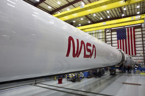
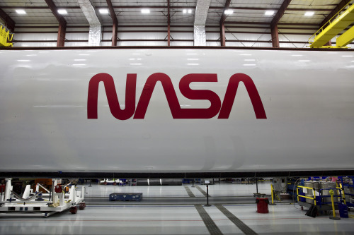
Our beloved symbol of exploration will fly once again, just in time to mark the return of human spaceflight on American rockets from American soil. The retired logo is making its comeback on on SpaceX’s Falcon 9 rocket that will take flight later this year when we #LaunchAmerica once again.
The NASA insignia, or "meatball," seen in our profile image, was quite difficult to reproduce with 1970s technology. In 1975, enter the sleek, simple design you see above! The world knew it as “the worm.” For a period of time we were able to thrive with both the worm and the meatball. However, in 1992, the 1970s brand was retired - except on clothing and other souvenir items - in favor of the original late 1950s graphic.
Image Credit: NASA/SpaceX
Make sure to follow us on Tumblr for your regular dose of space: http://nasa.tumblr.com.
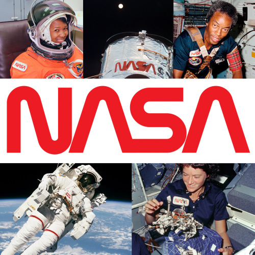
The NASA “Worm” Logo
Just like many organizations, the style and logos can change over time. You are probably most familiar with our “meatball” logo. No, unfortunately this does not refer to the delicious food. This logo (below) is our most popular symbol, and dates back to 1959.
But, we’ve also had other insignia that represented our organization throughout the years.
The “worm” logo (below) was used by the agency from 1975 until 1992. The organization wanted to create a more “modern” logo, which resulted in the unique type style of the “worm” logo.

Even though this logo was retired in 1992, the Graphics Standards Manual is still available online HERE.
You can also read up about the emblems, logos and insignia used by NASA throughout the years in a new e-Book available for free HERE.
Make sure to follow us on Tumblr for your regular dose of space:http://nasa.tumblr.com