Heres A Google Drive Folder Filled With Art Book Pdfs, If Anyone Has Some Others That You'd Like Me To
Heres a google drive folder filled with art book pdfs, if anyone has some others that you'd like me to add to it thats missing, please let me know and send me the link
More Posts from Arttuti and Others
Could you give a tutorial on how you do hair? I just looooovvvveeee the way you did rhetts hair & beard
Hey! Thank you so much. I’m not a good teacher, but I’ll give it a shot :)
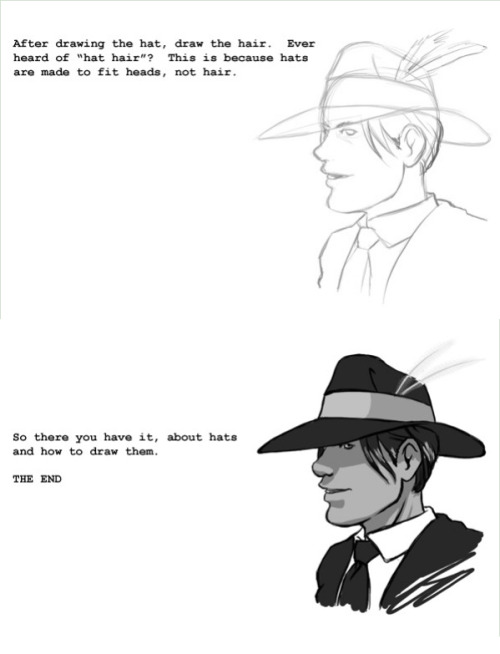
Step 1: DO NOT TRY TO DRAW EACH HAIR! Draw each bunch of hair but NEVER each hair.
Step 2: Draw a faint outline of the entire portrait using the reference photo:

Step 3: Pick one bunch of hair, and make loose, dark strokes to draw the roots of the hair. Make similar strokes at the other end of the bunch. (Remember, you’re not drawing each strand. You’re essentially drawing shadows). Don’t let them meet. This is important to render the shine in the hair. Let the pencil lift off the paper as you move towards the middle from both ends.

Step 4: Use a paper stump to smudge out the roots and the outer edge of the hair. Make loose strokes, starting from the darkest end towards the centre of the bunch. Let a few strokes run all the way through the centre to make it look like a natural shine. Then use a dark pencil to re-do smaller strokes on both ends of the bunch, to increase the contrast.

Step 5: Treat each bunch separately, and repeat till you cover the full head. To finish off, erase a few highlights from the middle of the bunches, to give a consistent shine, and smudge out the hairline for a more natural shadowed look.

I hope that was useful! Let me know if you want me to give a step by step for the rest of his face too :) - I would be completing this portrait anyway!

So I got a lot of messages after my first post asking me to explain layers, so I have put together a cheat sheet of the different layer types. The quickest way to become awesome with layers is to know exactly what each one does. Once again, I’m no expert, and these are just my personal definitions, so please try these out for yourself! LONG POST BELOWWW THE LAYERS CHEAT SHEET PART ONE: 1. NORMAL: Aw yeah you know all about this layer its just your average layer 2 DISSOLVE: This mode “dissolves” some pixels, allowing the lower layer to show through. very pixel-y. Reducing opacity makes it dissolve more. ________ 3. DARKEN: Now the difference between darken and multiply are a little confusing, so I will explain them together. MULTIPLY is more of a glaze, while DARKEN favors the darks on all layers. So if you have a darken layer on, it tend to reduce/remove the lighter tones on the layer if there are darker tones below it, while darkening the darks. 4. MULTIPLY: A glaze that darkens the color of the layer below. It is great for shading. Reduces whites. 5. COLOR BURN: “Burns” the lower layer favoring a more saturated look. Marks made over white are not preserved. 6. LINEAR BURN: “Burns” the lower layer, with a little less saturation than color Burn. Also will preserve colors over white. 7. DARKER COLOR: I tend to avoid this puppy cause it does not darken on the RGB channel. (feel free to try him though!) ______ 8. LIGHTEN: Lightens the colors below. Favors lighter colors on lower layers. 9. SCREEN: Lightens the colors below, but much closer to the “glaze” analogy as above. Reduces blacks. 10. COLOR DODGE: Often used for magic-y effects, color dodge bumps up saturation and is very bright. 11. LINEAR DODGE: Much like color dodge, but less saturation. 12. LIGHTER COLOR: Once again, this is an outside RGB channel layer, so I don’t really use this. As you probably have noticed, the second two groups are opposites, so if you have a good handle on one, you probably know exactly what the second group does! I will do the remaining groups next week as they do not follow this pattern. Thanks! drawmaevedraw.tumblr.com EDIT: Part two here: Photoshop Layers Part Two!!
hey i was wondering how you draw female faces? drawing guys im like hell yeah, but ladies im like hell neh. would you be able to give an example with rey?
Ahhh I’m not the best person to ask for drawing females but um I think generally you just have to be a little more careful with your marks. Everything should be a little softer, more curves, etc. Rey’s a little difficult bc she has a pretty boxy/angular face but her facial features are more delicate.

Of course these are just suggestions and stuff I noticed and not set rules ;;;; but I hope it helps a bit!!
quick proportion tips
- eyeballs are an eyeball width apart - ears align with the top of your brows to the bottom of your nose, and are the center-point of a profile view - lip corners line up to the center of each eye - hands are roughly the size of your face - feet are the same size as your forearm - elbows are aligned with your belly-button - your hands reach down mid-length of your thighs - both upper and lower legs (individually) are roughly the same size as your torso (this is all rough estimates for proportion! feel free to add more to help others)
Not sure if I've asked this, butt in regards to your last picture you uploaded and all of your drawings, how do you know where to line up the head/cranium with the rest of the spine in cases where the head is turned or posed?
well that is simple, the head ideally sits in the middle of the spine…

positioning the head is not the difficult part, in most cases ‘artists’ don’t need to make things ‘look’ right but make it ‘feel’ right. specially when drawing idealized and/or from imagination altering proportions and poses is rather common ⁽ˢᵘᵖᵉʳʰᵉʳᵒ ᶜᵒᵐᶦᶜ ᵃʳᵗᶦˢᵗˢ ᶠᵒʳ ᵉˣᵃᵐᵖᶫᵉ⁾

the easiest way⁽ᶦᶰ ᵐʸ ᵒᵖᶦᶰᶦᵒᶰ⁾ is to use the shoulders. Most of the time when drawing poses i will actually place the shoulders first and then draw the head. Maybe try ‘gesture drawing’ as exercise.


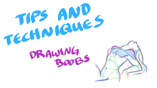
Just when you thought you knew everything about boobs… NSFW?


My darling friend Chizzi mentioned that there are a lot of booby tutorials out there are just predrawn boobs with the artist going HEY LOOK! HERE ARE SOME BOOBS! but not many that actually talk about the anatomical structure, and where to put the lines. I was like, “Hey, I can probably whip something up.“ And so I spent my thanksgiving making this.
Proportions probably aren’t exact, but I did my best. I also didn’t explore the various body types, but perhaps I could do a separate tutorial someday. I hope you find this tutorial useful :)
All photo references used in the tutorial were found on The Drawing Script. Credits to each photo belong to their respective owners.


-
 miss-yrrosa liked this · 2 weeks ago
 -
 vampmaidenslair liked this · 3 weeks ago
 -
 olivoyo liked this · 3 weeks ago
 -
 secretskrill11 reblogged this · 1 month ago
 -
 creamsiclefantasy reblogged this · 1 month ago
 -
 enjolrasingaround liked this · 1 month ago
 -
 arawtemp liked this · 1 month ago
 -
 pastelpuppet liked this · 1 month ago
 -
 justwhatineedbby reblogged this · 1 month ago
 -
 elianabixx liked this · 1 month ago
 -
 ashlideion liked this · 1 month ago
 -
 sourcematerials liked this · 2 months ago
 -
 wibbly-wobbly-who-has-the-time reblogged this · 2 months ago
 -
wibbly-wobbly-who-has-the-time liked this · 2 months ago
-
 salamanderinspace reblogged this · 2 months ago
 -
 artrefholdingblog reblogged this · 2 months ago
 -
 kyrienne liked this · 2 months ago
 -
 phthalosblues reblogged this · 2 months ago
 -
phthalosblues liked this · 2 months ago
-
 nezjazz reblogged this · 2 months ago
 -
 ritossant reblogged this · 2 months ago
 -
 whipperschnapper liked this · 2 months ago
 -
 dawbling reblogged this · 2 months ago
 -
 lemontranspo liked this · 2 months ago
 -
 ytoreadlist reblogged this · 2 months ago
 -
 dragonic-solitary liked this · 2 months ago
 -
 rcbertpattinscns reblogged this · 2 months ago
 -
rcbertpattinscns liked this · 2 months ago
-
 the-silly-creature liked this · 3 months ago
 -
 anocturnalmorningperson liked this · 3 months ago
 -
 xai-refs reblogged this · 3 months ago
 -
 sploon-fic-fan reblogged this · 3 months ago
 -
 pkducklett reblogged this · 3 months ago
 -
 aeonvy liked this · 3 months ago
 -
 lv5fancapacenindafinare reblogged this · 3 months ago
 -
 ekhsvoid liked this · 3 months ago
 -
 to-infinitea-and-bookyond reblogged this · 3 months ago
 -
 fintishh reblogged this · 3 months ago
 -
fintishh liked this · 3 months ago
-
 danielleitloudernow liked this · 3 months ago
 -
 yourstrullyme reblogged this · 3 months ago
 -
yourstrullyme liked this · 3 months ago
-
 mitiafrida liked this · 3 months ago
 -
 urdykebf reblogged this · 3 months ago
 -
urdykebf liked this · 3 months ago
-
 hotsaucevitamins reblogged this · 3 months ago
 -
 saveyoulater reblogged this · 3 months ago
 -
 ezroar liked this · 3 months ago
