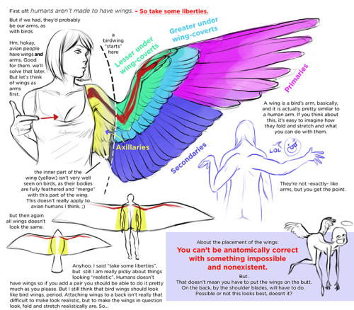
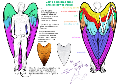
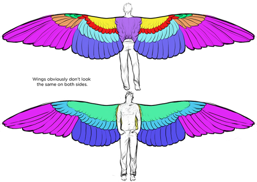
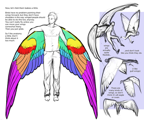
Tweet
tweet
Something like this would be so colossally helpful. I'm sick and tired of trying to research specific clothing from any given culture and being met with either racist stereotypical costumes worn by yt people or ai generated garbage nonsense, and trying to be hyper specific with searches yields fuck all. Like I generally just cannot trust the legitimacy of most search results at this point. It's extremely frustrating. If there are good resources for this then they're buried deep under all the other bullshit, and idk where to start looking.
More Posts from Arttuti and Others
Painting & Rendering Tips

If you’re looking to start working in a painterly style, or have trouble finishing your work in it, I’ve compiled some tips for it. I love talking about painting so this got a bit long. Lots of image examples await…
Also whether you’re using digital or traditional mediums, all of this stuff can be applied to both. I’ll separate general tips from ones about rendering with headings so it’s easier to navigate this.
Keep reading
How I Animate

The Technique:
I draw the frames and then I use the liquify tool to push the lines into the next frame and redraw them where I need to. This allows me to keep the lines consistent, but gives me the control of frame by frame animation bc I am still making each frame manually! I also use 3d models as reference to help me with the angles! Super important to use reference while you animate (and with art in general), if youre no good handling 3d models then act it out and record yourself!

The Theory:
i think most people are at least loosely familiar with the 12 principles of animation (if youre not, heres a 2.5 minute video showcasing them!), but may not necessarily know how to employ them. the main 3 i tend to focus on when I animate is rhythm, telegraphing, and inertia so ill cover those there 👍
1. Timing & Rhythm
Timing is how you space out your frames both in how long an individual frame is held for, and also when you drawn an inbetween of two frames you can favour one frame slightly more than the other instead of drawing the exact average of the cels, giving the favoured cel more timing weight.

Left line has the cels evenly spaced out on the timeline, right holds the first cel for longer and the second cel slightly favours the last frame. It creates a more interesting rhythm to the animation! Rhythm is how I think of animation timing. Theres a beat like a song to every animation I make, and creating an interesting beat is what makes an animation fun to watch (for me, anyway):

2. Anticipation / Telegraphing

Before I animate a big change in movement, I like to telegraph that its coming. Usually this is doing a little counter movement in the opposite direction, but thats not the only way to telegraph a motion, e.g. eye movement can telegraph a head turn!

3. Follow-through / Overshoot / Inertia


Unless the movement is mechanical, it wont come to a hard stop and will have some level of bounce or easing out to it. How much "bounce" you add will have a big impact on how the animation feels, but a very subtle bounce will add a natural feeling to the end of a motion.

Secondary animations will use a lot of this, note that the head and the hand have a small amount of continuous motion (primary animation), and then the hair has a lot of bounce and inertia (secondary animation which reacts to the primary animation). Note the different amounts applied to the braid vs the sideburn vs the bangs
anyway! I hope this was insightful ❤️ if you like my art you can commission me by the by :)
Can you make like a little color picking tutorial, my drawings always look so out of place when i color them >.<
Okay so this is probably not the best coloring tutorial and I’m sorry ahead of time because I’m not the best at explaining colors nor am I any expert lol. I don’t actually use color palettes but I highly recommend them, esp to keep a whole artwork consistent with color schemes. You can easily just google “aesthetic color palettes” or “90′s anime color palettes” which is my go to types of colors heh.
Anyway, I made an explanation/tutorial on how I usually achieve the colors on my art. There are plenty of other ways but this is some basics on filtering.


And after that, if I’m not satisfied with the colors I just go to Filter -> and adjust the Hue of the opacity or the multiply layer.
Once I’m satisfied, I just merge all the layers and clean the art up, sometimes I add even more colors and blend them. (This probably deserves an explanation on it’s own but I wouldn’t mind explaining how I paint! ><)
And here’s somewhat of the finished art lol;;; (sweats)


Okay so I followed this video about foreshortening and…


Sycra. I love you so much for making this video.
hey i was wondering how you draw female faces? drawing guys im like hell yeah, but ladies im like hell neh. would you be able to give an example with rey?
Ahhh I’m not the best person to ask for drawing females but um I think generally you just have to be a little more careful with your marks. Everything should be a little softer, more curves, etc. Rey’s a little difficult bc she has a pretty boxy/angular face but her facial features are more delicate.

Of course these are just suggestions and stuff I noticed and not set rules ;;;; but I hope it helps a bit!!


-
 slanky-here liked this · 1 week ago
 -
 driedsnapdragons reblogged this · 1 week ago
 -
 theautismarcana reblogged this · 1 week ago
 -
theautismarcana liked this · 1 week ago
-
 adorable-bookworm liked this · 1 week ago
 -
 brittany-diamond reblogged this · 1 week ago
 -
 suicidallyreckless liked this · 1 week ago
 -
 aaustinwrites reblogged this · 1 week ago
 -
 c0ffee-mag3 liked this · 1 week ago
 -
 lowkeydonkey liked this · 1 week ago
 -
 etrujii liked this · 1 week ago
 -
 curious-magpie liked this · 1 week ago
 -
 elegantlyenchantedstubbornfool liked this · 1 week ago
 -
 g-6708-reen reblogged this · 1 week ago
 -
g-6708-reen liked this · 1 week ago
-
 fake-gothhh liked this · 1 week ago
 -
 somewhere-over-the-drainbow reblogged this · 1 week ago
 -
 tangerinebats reblogged this · 1 week ago
 -
 waitwithwaluigi reblogged this · 1 week ago
 -
 vicwriting reblogged this · 2 weeks ago
 -
 thewildesituation liked this · 2 weeks ago
 -
 venerablegreatking reblogged this · 2 weeks ago
 -
 ciaodearchas liked this · 2 weeks ago
 -
 perhaps42 reblogged this · 2 weeks ago
 -
perhaps42 liked this · 2 weeks ago
-
 romulaowl liked this · 2 weeks ago
 -
 miscriont reblogged this · 2 weeks ago
 -
miscriont liked this · 2 weeks ago
-
 learningfromlosing reblogged this · 2 weeks ago
 -
learningfromlosing liked this · 2 weeks ago
-
 pleasepleasepleaseme reblogged this · 2 weeks ago
 -
 dragon148 liked this · 2 weeks ago
 -
 theneurodivergentfox reblogged this · 2 weeks ago
 -
theneurodivergentfox liked this · 2 weeks ago
-
 illya-roma liked this · 2 weeks ago
 -
 purplepri reblogged this · 2 weeks ago
 -
purplepri liked this · 2 weeks ago
-
 gojosauce liked this · 2 weeks ago
 -
 gothgleek reblogged this · 2 weeks ago
 -
 fillthelighter liked this · 2 weeks ago
 -
 cl0wnb0yyy reblogged this · 2 weeks ago
 -
 tofumoons liked this · 2 weeks ago
 -
 transorbitalperegrine reblogged this · 2 weeks ago
 -
 pomelo-cat reblogged this · 2 weeks ago
 -
 that-0ne-tallguy liked this · 2 weeks ago
 -
 reconstructwriter reblogged this · 2 weeks ago
 -
 quietquaking reblogged this · 2 weeks ago
