Illustration Inspired By Nhật Bình. Credit To Toma.184 (Instagram).


Illustration inspired by Nhật Bình. Credit to toma.184 (Instagram).
More Posts from Chelsychacon and Others


Museum Hours, Jem Cohen, 2012

"Être dans une paranoïa est comme l'obscurité, avec beaucoup de voix ennuyeuses qui vous parlent et vous ne savez pas quoi faire, mais écouter ta voix me guide sur un chemin pour aller là-bas et comprendre les choses, voir ce chemin vous fait revenir à la vie , courez et sachez que vous pouvez sortir." . . . . https://www.instagram.com/p/BrY19j0BHJv/?utm_source=ig_tumblr_share&igshid=1f9gzuksekja1

THE LAYERS CHEAT SHEET PART TWO (PART ONE HERE) Once again, I’m no expert- there are things about these layers I probably haven’t covered, so please try them out for yourself! Layers 1-7 help your contrast. They are usually a pair of the former two groups I went over in my last post. 1. OVERLAY: Helps your contrast by boosting your lights and darks, while the more mid tone pixels aren’t affected as much. It does this based on the layers beneath it. “Screens” the lights, “multiplies” the darks. 2. SOFT LIGHT: Similar to overlay, but a “softer” effect. You can think of soft light as more transparent. 3. HARD LIGHT: You can look at hard light as an intense version of overlay, with much brighter colors and a much less transparent look. 4. VIVID LIGHT: This is the heavy metal version of overlay- think of it similar to color dodge and color burn. Very intense colors, good for finding interesting lighting and color combos. 5. LINEAR LIGHT: Crazy amounts of contrast and color is added here, even more than vivid light. so heavy metal 6. PIN LIGHT: This one is interesting because besides it also being an intense contrast layer, it can add random noise to the active layer. Apparently this is a combo of the lighten blend mode on the light pixels and darken on the dark pixels, but the noise effect is what makes it really interesting imo. 7. HARD MIX: You will turn this mode on and be like “no” but it is actually adjusting its fill will reveal another overlay-ish type layer. It throws the colors on the active layer towards a more primary color such as blue, or magenta. _____ 8. DIFFERENCE: This will invert your colors, taking into account the layers below. If colors are very close, they will be black. 9. EXCLUSION: This also inverts your colors, taking into account the layers below. If colors are very close, they are grey. Exclusion and difference are layers that would be good for graphic pieces, I haven’t really gotten used to incorporating them in my painting workflow. 10. SUBTRACT: Similar to the above layers, but more intense. You will notice that the darker you make your active layer with Difference, exclusion, and subtract, the lighter and more transparent looking the result will be. 11. DIVIDE: Divide, however, usually results in crazy highlights that are pretty opaque unless the layer is fairly light, and then it will begin to go transparent. ___ 12. HUE: Makes the lower layer take on the hue of the active layer. 13. SATURATION: The lower layers take on the saturation of the active layer. 14. COLOR: The lower layers take on the color of the active layer. 15. LUMINOSITY: The lower layers take on the luminosity, or brightness, of the active layer. Once again, I’m no expert, but I hope this helps. Thanks guys! http://drawmaevedraw.tumblr.com/


Book and magazine illustration was historically an environment very populated by women in times in which they weren’t allowed the same room for artistic education, exposure and professional careers as cis men artists. Even though the Golden Age of illustration brings usually the names of the “fathers” of the artform, many women developed artistic styles that added new significance to storytelling. Still, it’s important to note that the environment was still a place of great privilege and only few women (especially white women with enough means) were able to find sustainable work in the industry in the XIX and early XX century. Some of the women showcased here became historically relevant many years after they passed, having awards named after them, becoming firsts to enter artistic halls of fame, creating networks for employment that outlived them, and being included in “gay-themed history tours” that recognized their lives, among many other legacies.
These are the few artists showcased here: Eleanor Vere Boyle (1825-1916), Josephine Pollard (1834-1892), Kate Greenaway (1846-1901), Alice Bolingbroke Woodward (1862 — 1951), Jessie Willcox Smith (1863 – 1935), Isobel Lilian Gloag (1865–1917), Helen Stratton (1867-1961), Elizabeth Shippen Green (1871 – 1954), Violet Oakley (1874 – 1961), Anne Anderson (1874 — 1952), Jessie M. King (1875—1949), Elenore Plaisted Abbott (1875–1935), Ruth Mary Hallock (1876-1945), Florence Susan Harrison (1877-1955), Mabel Lucie Attwell (1879-1964), Rie Cramer (1887-1977), Margaret Tarrant (1888-1959), Ida Rentoul Outhwaite (1888—1960), Dorothy P. Lathrop (1891—1980), Cecile Walton (1891—1956), Margaret Tempest (1892-1982), Wanda Gág (1893-1946), Jennie Harbour (1893-1959), Virginia Frances Sterrett (1900—1931), Adrienne Segur (1901-1981), Janet Grahame Johnstone (1928 – 1979) and Anne Grahame Johnstone (1928 – 1998), Trina Schart Hyman (1939-2004) and Kinuko Y. Craft (1940).

EDIT:
It has come to my attention that this post has been reblogged by some terf blogs (I’ve already blocked). Make no mistake, I don’t welcome terfs on my posts (or my blog, for that matter).
In my intention to share some of the artists I was studying during March 8th, I didn’t realize that people could take my inclusion of these often forgotten artists as an exclusion of others. The fact that trans illustrators and visual artists in history haven’t been as acknowledged as cis artists doesn’t mean they weren’t there, it’s a reflection of how systematic gender oppression acts on history and what it upholds.
It was my mistake to not see that this selection could imply exclusion, and even if not my intention, it’s not a possibility I’m willing to let people entertain. Therefore, I added now some trans visual artists and illustrators who were contemporary to the ones I included prior: Lili Elbe (1882-1931), Ovartaci (1894 – 1985), Anton Prinner (1902-1983), Michel Marie Poulain (1906-1991), Jeffrey Catherine Jones (1944-2011), El Kazovsky (1948-2008).
I also want to include a couple of resources on current trans inclusive platforms that house artists through history as well as current illustrators that you can check out right now:
Queer Art History: curated currently by Baylee Woodley (she/her/hers or they/them/theirs), this site includes a category on Transgender & Gender Non-Conforming art, which goes through different historical periods and mediums.
Women Who Draw: this directory and platform is trans-inclusive, it also houses trans and gender non-conforming illustrators currently working.
If you want to include more artists, you’re welcome to do so!
Gender Neutral Terms
Mom or Dad: Ren, Parent, Caregiver, Guardian
Mr. or Ms.: Mx. Mxr.
Aunt or Uncle: Titi, Zizi, Auntcle
Niece or Nephew: Nibbling
Brother or Sister: Sibling,
Son or Daughter: Sprong, Child, Kid
Grandma or Grandpa: Grandren, Granguardian, Grandparent
Godmother or Godfather: Godren, Godparent, Godparent
Girlfriend or Boyfriend: Enbyfriend, Partner, Significant other
Fiancée or Fiancé: Epox, Partner
Ma'am or Sir: Tiz
King or Queen: Caln, Quing, Monarch, Royal
Prince or Princess: Prin, Prinxe, Royal
Lord or Lady: Lairde
God or Goddess: Goddex, Deity
Boy or Girl: Enby, Person
Fanboy or Fangirl: Fanenby, Fankid
Acter or Actress: Actrex
( let me know if I need to add or change anything )


Art by Vanessa Morales

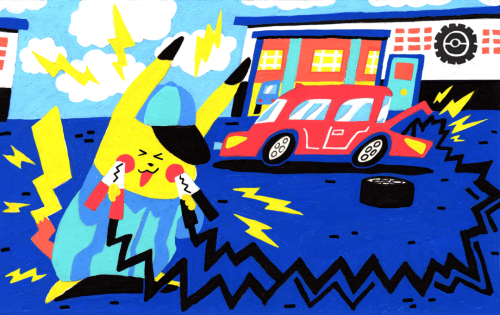
The third piece I did, Pikachu working at the mechanic giving my Corolla a jumpstart lol
the reason why characters explaining oppression and fascism to Cassian in the Andor show never really bothered me is because TO ME and how I interpreted it, it looked like Cassian is fully-aware and doesn’t NEED explaining to. he already knows and understands everything that everyone tries to convince him about fighting against oppression. He’s lived it. The line “I’ve been in this fight since I was 6 years old” underlines how he’s always understood that his sheer existence is a sign of resistance against the Empire. He doesn’t need convincing and a list of reasons WHY oppression is bad, but his whole life has been fighting just to exist. He’s so tired and exhausted.
the explaining of systemic oppression is of course for the audience, but I also thought Cassian reflected how a lot of POC respond to other well-meaning people. Nemik is starry-eyed and well-intentioned, and while Cassian does throw some cynical remarks, he never fully stomps down his ideas or respond in bitterness. He nods along, nods along to everyone listing their reasons on why they’re choosing to fight back. He doesn’t want to shoot down Nemik, but he doesn’t want to be vulnerable and explain why he already understands Nemik’s points bc he’s LIVED it. He’s tired, and it’s even more exhausting to bring up the pain of his life story, and he’s not gonna share it with some kid he just met.
I know Cassian’s journey towards the Rebellion will clarify his arc more, but I always viewed him in this show and where his character is at this point in time as someone already knowing/understanding what everyone is telling him, but his response is “I’m already so tired of fighting to exist since the oppressors want me dead just for living, why should I be asked to give more?”
which is a sentiment i deeply resonate with. sometimes you are so tired of fighting just to be treated like a human being in everyday life, that it’s exhausting to have to give more of yourself to a cause or to be asked to participate in even more activism.
I was gonna close this more coherently but hopefully you know what i mean? maybe i will add more to this later
Bram Stoker:

-
 ghost-does-whatever reblogged this · 3 weeks ago
 -
ghost-does-whatever liked this · 3 weeks ago
-
 eclectichellmouth reblogged this · 1 month ago
 -
 drakonialmusings reblogged this · 1 month ago
 -
 doorhineinspo reblogged this · 3 months ago
 -
 bongus777 reblogged this · 4 months ago
 -
 godtoldmeshoottokill reblogged this · 4 months ago
 -
 letgobean liked this · 5 months ago
 -
 myau-myau liked this · 5 months ago
 -
 bigthickrat liked this · 5 months ago
 -
 pixiezombie liked this · 5 months ago
 -
 b-a-m-b-i reblogged this · 5 months ago
 -
 dykespiegel liked this · 5 months ago
 -
 pepsisoap liked this · 5 months ago
 -
 caim reblogged this · 5 months ago
 -
 peineperdu reblogged this · 5 months ago
 -
 daibashizuma reblogged this · 5 months ago
 -
 santa-lilio-sangre liked this · 5 months ago
 -
 whatmeaningfullessthings reblogged this · 5 months ago
 -
 daydreamerbean liked this · 6 months ago
 -
 medicalmechanicas reblogged this · 6 months ago
 -
 uncertainghosts liked this · 6 months ago
 -
 greatlyunknowablenumbers reblogged this · 6 months ago
 -
 feyariel reblogged this · 6 months ago
 -
 eri-fuka reblogged this · 6 months ago
 -
 asksunandmoon liked this · 6 months ago
 -
 thatninjacat27 reblogged this · 6 months ago
 -
 leatherhoffmoved liked this · 7 months ago
 -
 mossself reblogged this · 7 months ago
 -
 euay liked this · 7 months ago
 -
 shortnsalt reblogged this · 7 months ago
 -
 kiwi-jam reblogged this · 7 months ago
 -
kiwi-jam liked this · 7 months ago
-
 naomao reblogged this · 7 months ago
 -
 kapuchino357 reblogged this · 8 months ago
 -
 albatrossdeveloper liked this · 8 months ago
 -
 gulmohr reblogged this · 8 months ago
 -
 lakepeigneur reblogged this · 9 months ago
 -
 sketching-shark liked this · 9 months ago
 -
 baddiez liked this · 9 months ago
 -
 largishcat liked this · 9 months ago
 -
thatninjacat27 liked this · 9 months ago
-
 borealflorist liked this · 9 months ago
 -
 softergoth reblogged this · 9 months ago
 -
 wistsandmagic reblogged this · 9 months ago
 -
 wordsandwealth liked this · 9 months ago
 -
 quetzalpapalotl reblogged this · 9 months ago
 -
 partyp0isonisd3ad liked this · 9 months ago

| Visual Developer, Character Designer & Illustrator | Feel free to contact me chelsychacon@gmail.com
224 posts