Belladonna Of Sadness, Dir. Eiichi Yamamoto, 1973


Belladonna of Sadness, dir. Eiichi Yamamoto, 1973
More Posts from Chelsychacon and Others

Isabella Stewart Gardner Museum, Boston, Massachusetts, by Melissa Lee


A little doodle I did in @im.one.artist 's sketchbook of her original character Charlotte, I liked the idea of a Tea Witch because I love tea c: I hope you liked, Lizy! Thank you for sharing your ideas! . . . #sketch #sketchbook #sketch_dailydose #dailyart #dailysketch #anime #animegirl #cartoon #calartssketchbook #illustration #doodle #sketches #sharpies #characterdesign #characterdevelopment #visualdevelopment #visdev #traditionalart #artistoninstagram #sharpies #kitsune #japan #witch #youkai #tea #womenday


THE LAYERS CHEAT SHEET PART TWO (PART ONE HERE) Once again, I’m no expert- there are things about these layers I probably haven’t covered, so please try them out for yourself! Layers 1-7 help your contrast. They are usually a pair of the former two groups I went over in my last post. 1. OVERLAY: Helps your contrast by boosting your lights and darks, while the more mid tone pixels aren’t affected as much. It does this based on the layers beneath it. “Screens” the lights, “multiplies” the darks. 2. SOFT LIGHT: Similar to overlay, but a “softer” effect. You can think of soft light as more transparent. 3. HARD LIGHT: You can look at hard light as an intense version of overlay, with much brighter colors and a much less transparent look. 4. VIVID LIGHT: This is the heavy metal version of overlay- think of it similar to color dodge and color burn. Very intense colors, good for finding interesting lighting and color combos. 5. LINEAR LIGHT: Crazy amounts of contrast and color is added here, even more than vivid light. so heavy metal 6. PIN LIGHT: This one is interesting because besides it also being an intense contrast layer, it can add random noise to the active layer. Apparently this is a combo of the lighten blend mode on the light pixels and darken on the dark pixels, but the noise effect is what makes it really interesting imo. 7. HARD MIX: You will turn this mode on and be like “no” but it is actually adjusting its fill will reveal another overlay-ish type layer. It throws the colors on the active layer towards a more primary color such as blue, or magenta. _____ 8. DIFFERENCE: This will invert your colors, taking into account the layers below. If colors are very close, they will be black. 9. EXCLUSION: This also inverts your colors, taking into account the layers below. If colors are very close, they are grey. Exclusion and difference are layers that would be good for graphic pieces, I haven’t really gotten used to incorporating them in my painting workflow. 10. SUBTRACT: Similar to the above layers, but more intense. You will notice that the darker you make your active layer with Difference, exclusion, and subtract, the lighter and more transparent looking the result will be. 11. DIVIDE: Divide, however, usually results in crazy highlights that are pretty opaque unless the layer is fairly light, and then it will begin to go transparent. ___ 12. HUE: Makes the lower layer take on the hue of the active layer. 13. SATURATION: The lower layers take on the saturation of the active layer. 14. COLOR: The lower layers take on the color of the active layer. 15. LUMINOSITY: The lower layers take on the luminosity, or brightness, of the active layer. Once again, I’m no expert, but I hope this helps. Thanks guys! http://drawmaevedraw.tumblr.com/
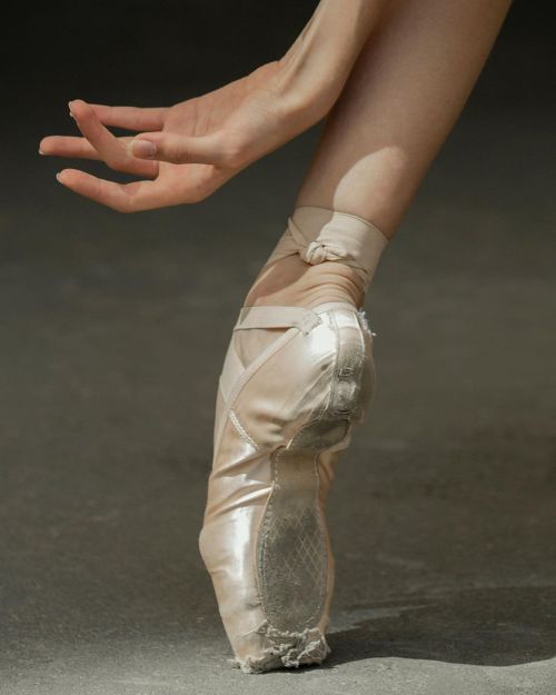
Daria Kulikova Bolshoi Ballet Academy


Studies by Yulin Li
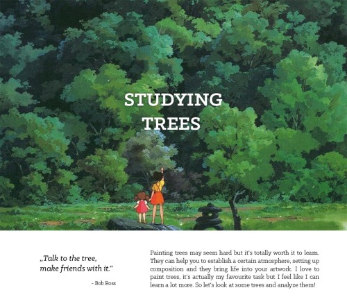

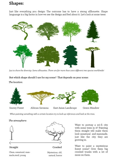
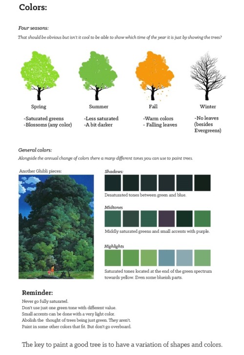
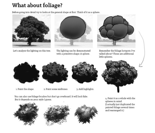
Studying Trees by Fabian Rensch
An artist : Aw man! I saw my arts were reposted on Instagram. I’ve asked them to take my arts down but they ignored me.
Me : Say no more! Click this link, then click ‘fill out this form’. Fill the form and wait for about 1-2 days, the staffs will remove the image you were reporting from the reposter’s account :^)

18 by Theo Inglis
-
 deathbydrizzle reblogged this · 1 week ago
 -
deathbydrizzle liked this · 1 week ago
-
 femmeboys liked this · 1 week ago
 -
 badfurwar reblogged this · 1 week ago
 -
 lilithvvaensland liked this · 1 week ago
 -
 ibuildblasters liked this · 2 weeks ago
 -
 lackluster-violet liked this · 2 weeks ago
 -
 brumblerumble reblogged this · 2 weeks ago
 -
 brunklebunkle liked this · 2 weeks ago
 -
 rizegirl liked this · 2 weeks ago
 -
 undeadcatgirl reblogged this · 1 month ago
 -
undeadcatgirl liked this · 1 month ago
-
 theterrancrowe liked this · 1 month ago
 -
 wishwander reblogged this · 1 month ago
 -
wishwander liked this · 1 month ago
-
 curiouscompanions liked this · 1 month ago
 -
 thegrimdarkoffice reblogged this · 1 month ago
 -
 lizzieisdying liked this · 1 month ago
 -
 aloverpriedout liked this · 1 month ago
 -
 g-oku reblogged this · 1 month ago
 -
g-oku liked this · 1 month ago
-
 rosemp3 reblogged this · 1 month ago
 -
rosemp3 liked this · 1 month ago
-
 spiffyricky liked this · 2 months ago
 -
 spoookyb0t liked this · 2 months ago
 -
 noc-bez-svitanja liked this · 2 months ago
 -
 ponyosib reblogged this · 2 months ago
 -
 ithinkthatsmykink liked this · 2 months ago
 -
 baby-on-the-net reblogged this · 2 months ago
 -
baby-on-the-net liked this · 2 months ago
-
 mihaashiii liked this · 2 months ago
 -
 pintsofguinnesmakeyoustrong reblogged this · 2 months ago
 -
 meidozanghetsu-nah reblogged this · 3 months ago
 -
 angelic-moonbeams liked this · 3 months ago
 -
 kassandraflowers liked this · 4 months ago
 -
 duchessie liked this · 4 months ago
 -
 s-h-y-y-a-n-n-e liked this · 4 months ago
 -
 somewhereoverthepinkaesthetics reblogged this · 4 months ago
 -
 ughworstever reblogged this · 4 months ago
 -
 murdersaints liked this · 4 months ago
 -
 itimbh liked this · 5 months ago
 -
 ladylazrus reblogged this · 5 months ago
 -
 vedulcet liked this · 5 months ago
 -
 rogozaurus liked this · 5 months ago
 -
 hibiscusbabyboy reblogged this · 5 months ago
 -
 chachassirkom reblogged this · 6 months ago
 -
 qwoberch liked this · 6 months ago

| Visual Developer, Character Designer & Illustrator | Feel free to contact me chelsychacon@gmail.com
224 posts