
| Visual Developer, Character Designer & Illustrator | Feel free to contact me chelsychacon@gmail.com
224 posts
Latest Posts by chelsychacon - Page 4

Creating the Helix Nebula in Adobe Photoshop by uxmal750ad

Fundamentals of Light - Notes, Pg. 01 by 9lg
threw together a quick little narrated video showing the Photoshop layer breakdown for my Valentina piece! It’s actually a pretty simple process when you get down to it 👌🏼

Brushes by IvanKhomenko

Here’s a new tutorial on snow, I’ve been working on giving my Patreon tutorials a new look *:・゚✧
By supporting me on Patreon you’ll get exclusive tutorials like this one along with other rewards such as full-res artworks, process images, and wallpapers!
Follower Advice #1
I thought it’s be a good idea to post art advice prompts every now and then so people can pass on their knowledge, so here’s the first one:
What advice would you give to your former self as an artist that you wish you knew earlier?

Amethyst. Tutorial by Anastasia-berry

Here’s a new tutorial on stars, specifically the glaring kind that you see in a lot of deep space images! ✧
Support my art on Patreon you’ll get exclusive tutorials like this one along with other rewards such as full-res artworks, process images, and wallpapers!
The Outbreak by Atey Ghailan


Digital “Oil Painting” Tutorial by Francis Boncales
Get the tutorial files from the artist here on their Gumroad!
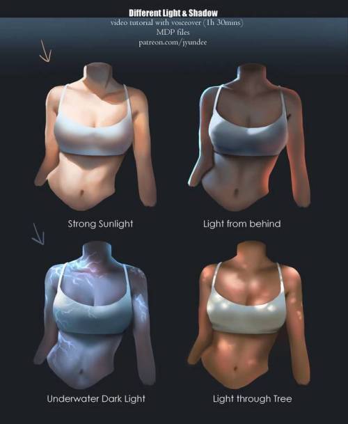
Various Light by Jyundee
Support the artist on Patreon!

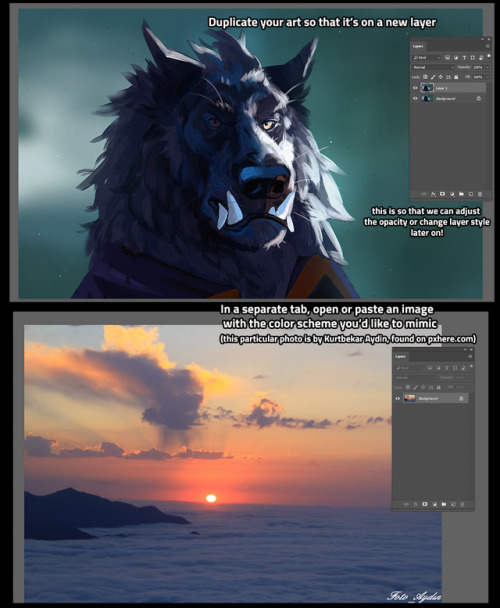
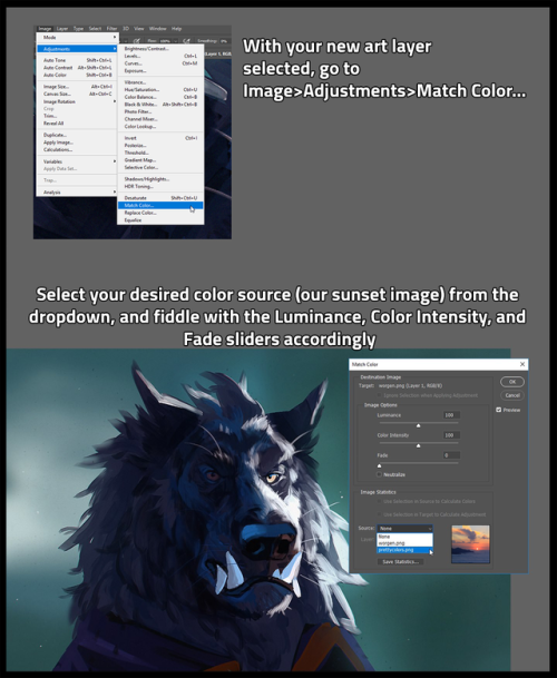
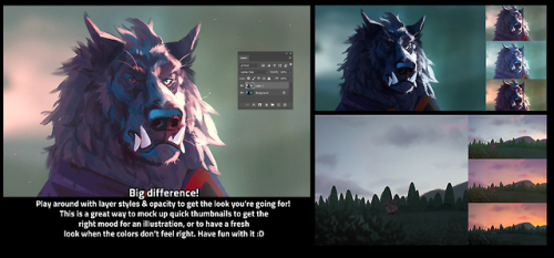
I’m sure a ton of people already know how to do this, but I only learned recently, so I wanted to share one of my favorite thumbnailing tricks! Color matching is SUPER helpful to quickly map out potential color schemes :D
[EDIT] this is in Adobe Photoshop, sorry for forgetting to mention that!

Gemstone. Tutorial by Anastasia-berry
Support the artist on Patreon!


fabric studies __________________________________ •ArtStation •OnlineShop •Instagram •deviantart •BUYMECOFFEE! COMMISSION INFO ___________________________________
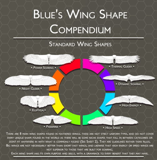
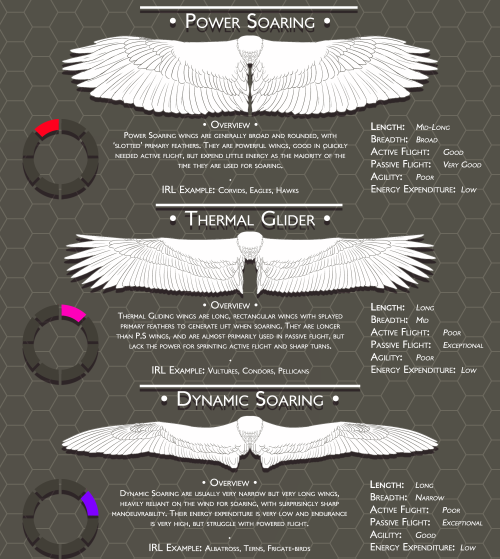


Blue’s Feathers and Wings Compendium: Standard Wing Shapes
Part 1 [Standard ]| Part 2 [Atypical] | Feather Markings | Tail Feathers
I have expanded the traditional 4 types; Highspeed, Elliptical, Low Aspect and High Aspect ratio, because they were very narrow and vague categories for the most part, adding High Energy, Thermal Soaring, Night Glider, and Passerine wings. I feel that these extra types make it easier to understand and visualize the differences and similarities between wing shapes.
I’ve renamed Low Aspect to Powered Soaring, and High Aspect to Dynamic Soaring for the purposes of the fact that names made it hard to understand purpose and were easily confusable.
A lot of these wing types are also affected by tailfeather shape and size, and that will change their agility and energy expenditure as the tail also generates lift.
Disclaimer: This is in no way intended to be an academic dissertation or proposal, do not treat it as such. It is purely for art and writing references for others, to aid description and inspiration.
Advanced Shading Elements by SomeNormalArtist
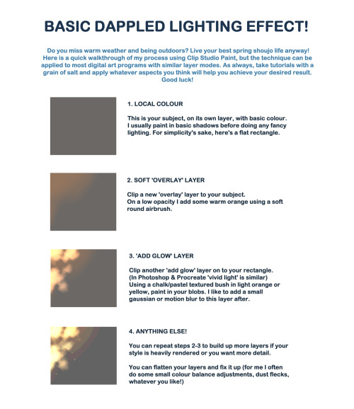

I created a quick walkthrough on my process! You can do the same with any digital art program and brushes you like. As always, learning comes with critical thinking and if you feel this does not apply to you, then no worries! There’s no correct way to do things as long as you achieve the results you want.
The technique can be customized with different brush types and colours, and can be as simple or heavily rendered as you so desire. I hope it helps a little! I like to do lighting like this in my own work for a sense of atmosphere.
Please ignore the fact I spelled complementary wrong, it’s been a long week ok lol


Breaking Down Objects by zephy.fr
Support the artist and follow them on instagram!

Process


I don't have the prettiest hands but I took some pictures for fun and for reference today

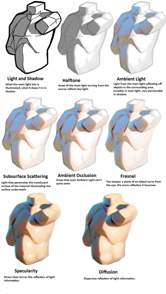

I am so serious when I say if you want to learn about light, you NEED to at least look at modeseven’s tutorials. even if you’re not pursuing a painterly style, this is all essential theory that can be easily adapted to different coloring styles. notice how none of these ever say ‘light with these colors and shade with these colors’? notice how this is teaching how light works on a mechanical level, and reminding the audience to adjust the actual colors they choose by context? THAT is good advice.
(if you’re thinking ‘wow I want to study more of this persons art!’ I encourage you to do so, but proceed with the knowledge that modeseven draws pretty much exclusively weird as hell kink art. sometimes wisdom comes from horny places)

Enchanted Crystal Tutorial by gregor-kari
Support the artist and follow them on Instagram!

THE LAYERS CHEAT SHEET PART TWO (PART ONE HERE) Once again, I’m no expert- there are things about these layers I probably haven’t covered, so please try them out for yourself! Layers 1-7 help your contrast. They are usually a pair of the former two groups I went over in my last post. 1. OVERLAY: Helps your contrast by boosting your lights and darks, while the more mid tone pixels aren’t affected as much. It does this based on the layers beneath it. “Screens” the lights, “multiplies” the darks. 2. SOFT LIGHT: Similar to overlay, but a “softer” effect. You can think of soft light as more transparent. 3. HARD LIGHT: You can look at hard light as an intense version of overlay, with much brighter colors and a much less transparent look. 4. VIVID LIGHT: This is the heavy metal version of overlay- think of it similar to color dodge and color burn. Very intense colors, good for finding interesting lighting and color combos. 5. LINEAR LIGHT: Crazy amounts of contrast and color is added here, even more than vivid light. so heavy metal 6. PIN LIGHT: This one is interesting because besides it also being an intense contrast layer, it can add random noise to the active layer. Apparently this is a combo of the lighten blend mode on the light pixels and darken on the dark pixels, but the noise effect is what makes it really interesting imo. 7. HARD MIX: You will turn this mode on and be like “no” but it is actually adjusting its fill will reveal another overlay-ish type layer. It throws the colors on the active layer towards a more primary color such as blue, or magenta. _____ 8. DIFFERENCE: This will invert your colors, taking into account the layers below. If colors are very close, they will be black. 9. EXCLUSION: This also inverts your colors, taking into account the layers below. If colors are very close, they are grey. Exclusion and difference are layers that would be good for graphic pieces, I haven’t really gotten used to incorporating them in my painting workflow. 10. SUBTRACT: Similar to the above layers, but more intense. You will notice that the darker you make your active layer with Difference, exclusion, and subtract, the lighter and more transparent looking the result will be. 11. DIVIDE: Divide, however, usually results in crazy highlights that are pretty opaque unless the layer is fairly light, and then it will begin to go transparent. ___ 12. HUE: Makes the lower layer take on the hue of the active layer. 13. SATURATION: The lower layers take on the saturation of the active layer. 14. COLOR: The lower layers take on the color of the active layer. 15. LUMINOSITY: The lower layers take on the luminosity, or brightness, of the active layer. Once again, I’m no expert, but I hope this helps. Thanks guys! http://drawmaevedraw.tumblr.com/
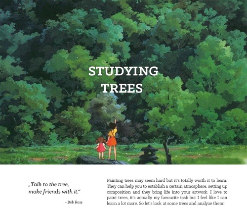

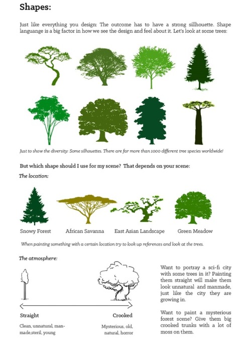
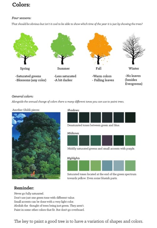
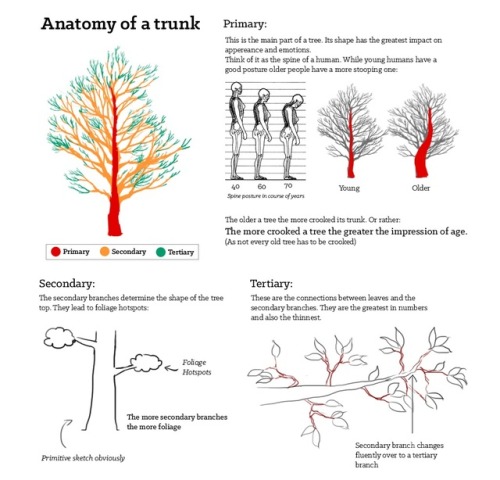
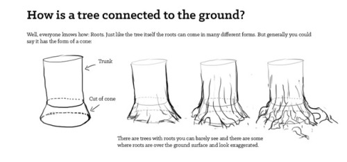
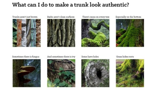
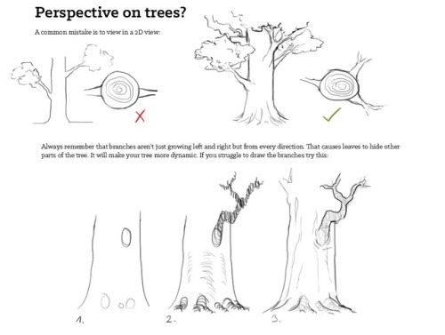
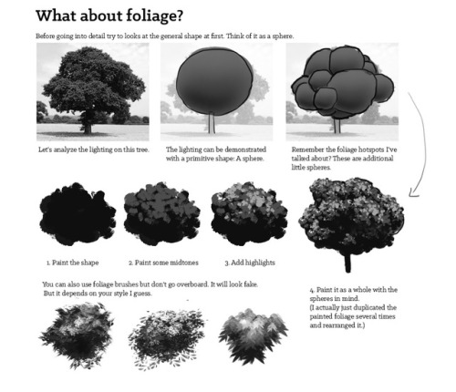
Studying Trees by Fabian Rensch
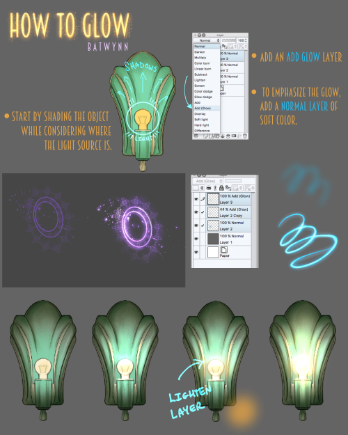
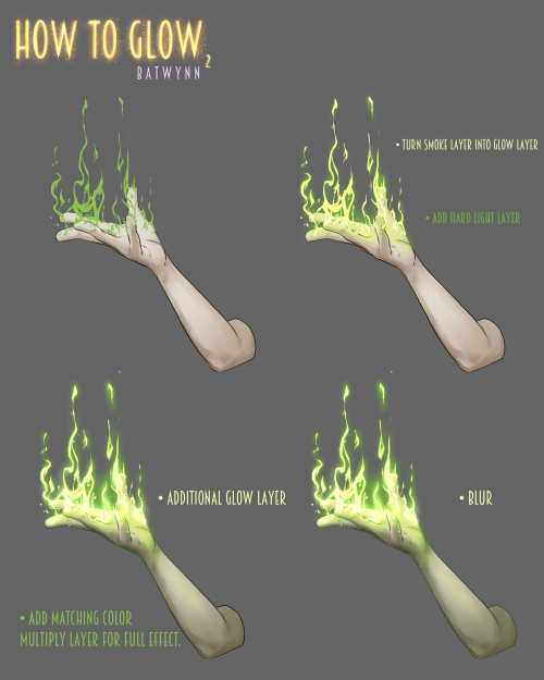
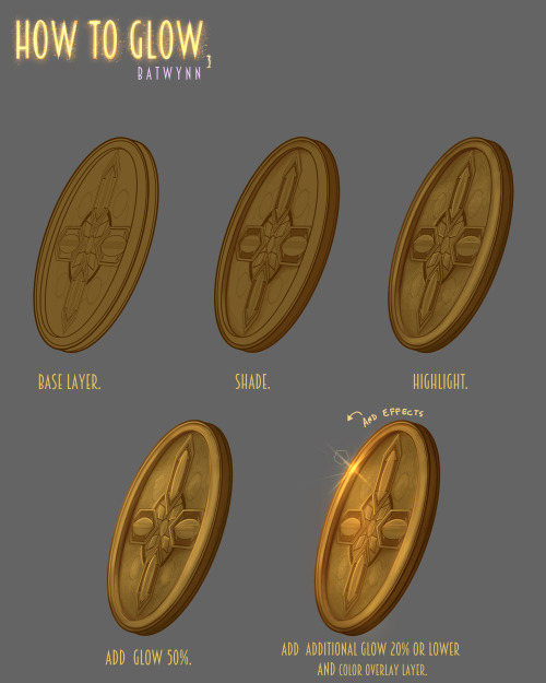
Someone asked how I do the glowy thing, soooo, here’s some how to do the glowy thing in Manga Studio. :3
For more tutorials, please check out my Patreon to help keep me funded.

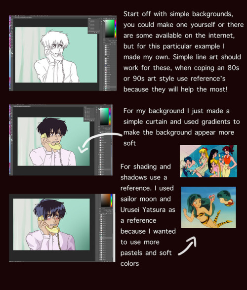
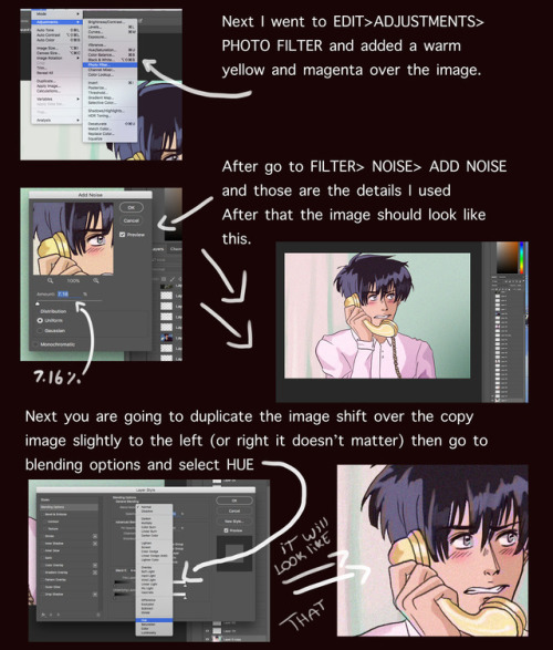
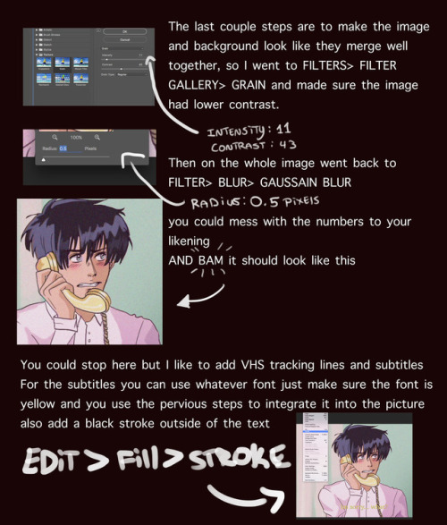
I got a lot of asks about this so I made a tutorial on how I was able to emulate the 80s aesthetic, please keep in mind I’m not an expert and what I put here is just what I personally did. I hope you guys like it and hope it helps
go crazy kids
How to put “wrote fan-fiction” on your résumé:
Leveraged an inventory of established fictional character and setting elements to generate a disruptive custom-curated narrative entertainment asset.

Packaging illustration done for Everything Dice

‘Zlatovláska’ (1911) by Karel Jaromír Erben.
Illustration by Artuš Scheiner.
National Library of the Czech Republic
Wikimedia.


Book and magazine illustration was historically an environment very populated by women in times in which they weren’t allowed the same room for artistic education, exposure and professional careers as cis men artists. Even though the Golden Age of illustration brings usually the names of the “fathers” of the artform, many women developed artistic styles that added new significance to storytelling. Still, it’s important to note that the environment was still a place of great privilege and only few women (especially white women with enough means) were able to find sustainable work in the industry in the XIX and early XX century. Some of the women showcased here became historically relevant many years after they passed, having awards named after them, becoming firsts to enter artistic halls of fame, creating networks for employment that outlived them, and being included in “gay-themed history tours” that recognized their lives, among many other legacies.
These are the few artists showcased here: Eleanor Vere Boyle (1825-1916), Josephine Pollard (1834-1892), Kate Greenaway (1846-1901), Alice Bolingbroke Woodward (1862 — 1951), Jessie Willcox Smith (1863 – 1935), Isobel Lilian Gloag (1865–1917), Helen Stratton (1867-1961), Elizabeth Shippen Green (1871 – 1954), Violet Oakley (1874 – 1961), Anne Anderson (1874 — 1952), Jessie M. King (1875—1949), Elenore Plaisted Abbott (1875–1935), Ruth Mary Hallock (1876-1945), Florence Susan Harrison (1877-1955), Mabel Lucie Attwell (1879-1964), Rie Cramer (1887-1977), Margaret Tarrant (1888-1959), Ida Rentoul Outhwaite (1888—1960), Dorothy P. Lathrop (1891—1980), Cecile Walton (1891—1956), Margaret Tempest (1892-1982), Wanda Gág (1893-1946), Jennie Harbour (1893-1959), Virginia Frances Sterrett (1900—1931), Adrienne Segur (1901-1981), Janet Grahame Johnstone (1928 – 1979) and Anne Grahame Johnstone (1928 – 1998), Trina Schart Hyman (1939-2004) and Kinuko Y. Craft (1940).

EDIT:
It has come to my attention that this post has been reblogged by some terf blogs (I’ve already blocked). Make no mistake, I don’t welcome terfs on my posts (or my blog, for that matter).
In my intention to share some of the artists I was studying during March 8th, I didn’t realize that people could take my inclusion of these often forgotten artists as an exclusion of others. The fact that trans illustrators and visual artists in history haven’t been as acknowledged as cis artists doesn’t mean they weren’t there, it’s a reflection of how systematic gender oppression acts on history and what it upholds.
It was my mistake to not see that this selection could imply exclusion, and even if not my intention, it’s not a possibility I’m willing to let people entertain. Therefore, I added now some trans visual artists and illustrators who were contemporary to the ones I included prior: Lili Elbe (1882-1931), Ovartaci (1894 – 1985), Anton Prinner (1902-1983), Michel Marie Poulain (1906-1991), Jeffrey Catherine Jones (1944-2011), El Kazovsky (1948-2008).
I also want to include a couple of resources on current trans inclusive platforms that house artists through history as well as current illustrators that you can check out right now:
Queer Art History: curated currently by Baylee Woodley (she/her/hers or they/them/theirs), this site includes a category on Transgender & Gender Non-Conforming art, which goes through different historical periods and mediums.
Women Who Draw: this directory and platform is trans-inclusive, it also houses trans and gender non-conforming illustrators currently working.
If you want to include more artists, you’re welcome to do so!