When Noble Long-suffering Odysseus Saw How Old And Worn And Burdened With Grief He Looked, He Halted
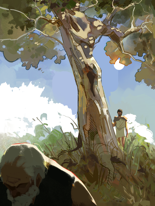
When noble long-suffering Odysseus saw how old and worn and burdened with grief he looked, he halted under a tall pear-tree, tears in his eyes.
More Posts from Ghostfrog81 and Others
I don't get second hand embarrassed i buy mine from gucci
jrpg final bosses will seem way too over the top but then I encounter one fruit fly irl and start to monologue when it dodges me

New brain rot has entered the building!!
Rating Starfleet uniforms (from shows I've watched)
1. Early TOS uniforms

6/10. The fabric looks soft, and I'm kinda into the whole turtleneck thing, plus the women's uniform is practical. The colour palette could be a little more interesting, though, and there's far too many crew members in the same shade of blue.
2. TOS uniforms

7/10. Aside from Kirk's infamous wrap around shirt, these are fairly toned back uniforms in bright colours. Aesthetically, the women's uniforms look good but are ultimately impractical. A solid base for starfleet uniforms. I like the black undershirts.
3. Wrath of Khan uniforms

5/10. Ugly!! The colour is nice and makes the crew look unified, but the cut is unflattering, and all the shiny bits look more imperialist than practical. I get what they were going for, but I find it boring. Also, Spock looks so good in blue that the red is practically criminal.
4. TNG uniforms (1-3)

4/10. Although I like certain design elements of these, as well as the colour choices, I find them too onsie-like. I prefer Troi's uniform here, though. Her second uniform is a bit too boob heavy.
5. TNG (3-7)

8/10. Solid starfleet uniforms. The colours are nice, the designs are sleek and fashionable as well as gender neutral. The collars are particularly nice. Overall, nice. Apart from poor Troi, her uniform is so ugly here god bless her.
6. Skant

4/10. Honorary mention for the skant. It's way too short, but the shape is nice. TNG women don't even get the dignity of tights here. Point up from 3 because Picard and Riker wore them once.
7. AOS

3/10. BARF. The fabric looks cheap and scratchy, and the necklines are weird. The colours are eye-bleachingly ugly, and I really don't get what they were going for with the kids' Halloween costume vibe.
8. SNW

1/10. If I were Ethen Peck, I would think the costume designers hated me. These are unbelievably ugly.
9. First Star Trek film

0/10. Sad beige uniforms for sad beige officers.


some headcanon rules: colors are not totally bound to families, but are used more than others. shapes and flow play a big part in the design. basically go crazy and have fun with your own designs :D
house icons (other than mitth) are just headcanons as well and not confirmed~
fun little makeup ideas for each Chiss family still working on the other ones. inspo pics from pinterest. just search graphic eyeliner if you want to take a look at the cool designs makeup artists have done.


![[ Heaven ]](https://64.media.tumblr.com/cb28ead05bc5a24d02908cd46009b355/dd061f21d2c626c6-f3/s540x810/a0acb798bef828f2cfb698f7dcbb4b1580e3633e.jpg)
![[ Heaven ]](https://64.media.tumblr.com/6295bac5e36506ec870ac331000a2532/dd061f21d2c626c6-a2/s500x750/4c5673041b60f90cfe3710145abf97090572a5ac.jpg)


EXPLORE THE GALAXY!
JOIN STARFLEET!
a nice retro-futurism-style recruitment poster feat. my vulcan original character. im printing it 13x19 to have a sick poster for my room :)
if anything the monkees would get sold to you
-
 ratboywinter liked this · 3 weeks ago
 -
 potania liked this · 3 weeks ago
 -
 doublecubicdeers liked this · 3 weeks ago
 -
 katieelizabethrose liked this · 3 weeks ago
 -
 alpoocka liked this · 3 weeks ago
 -
 angweirdplace liked this · 3 weeks ago
 -
 luisorbus liked this · 3 weeks ago
 -
 furthermuchmore liked this · 4 weeks ago
 -
 kiokesu liked this · 4 weeks ago
 -
 ochretones reblogged this · 1 month ago
 -
 uselessbreadcrumbs reblogged this · 1 month ago
 -
 rock-n-roll-fantasy reblogged this · 1 month ago
 -
 mythicbells-fan-3495 reblogged this · 1 month ago
 -
 dukku-of-catempty liked this · 1 month ago
 -
 cloudspoem liked this · 1 month ago
 -
 aianat liked this · 1 month ago
 -
 calebxg77 liked this · 1 month ago
 -
 sttheron liked this · 1 month ago
 -
 ghost-inabucket liked this · 1 month ago
 -
 neha-s6 liked this · 1 month ago
 -
 unkownbee liked this · 1 month ago
 -
 galusandmalus liked this · 1 month ago
 -
 m4yh4ps liked this · 1 month ago
 -
 katco-cereal liked this · 2 months ago
 -
 dasfeministmermaid liked this · 2 months ago
 -
 shadow-540 liked this · 2 months ago
 -
 luvliteguimehom liked this · 2 months ago
 -
 ssspaluba liked this · 2 months ago
 -
 stinkyrottencheeseisblue liked this · 2 months ago
 -
 colliexcarrot liked this · 2 months ago
 -
 insertgoodnamehere liked this · 2 months ago
 -
 melaselkie1193 liked this · 2 months ago
 -
 andiesunflowers liked this · 2 months ago
 -
 sneakystorms liked this · 2 months ago
 -
 lemech0 liked this · 2 months ago
 -
 raphyo liked this · 2 months ago
 -
 loose-at-the-stays liked this · 2 months ago
 -
 carolina-star liked this · 2 months ago
 -
 tristesse0nocturne liked this · 2 months ago
 -
 applespider reblogged this · 2 months ago
 -
 fanofmanyfandomsbc liked this · 2 months ago
 -
 the-para-pyreverse liked this · 2 months ago
 -
 yourlocalfloridian liked this · 2 months ago
 -
 lilyppp liked this · 2 months ago
 -
 agrebel18 liked this · 2 months ago
 -
 jaeandtheshark reblogged this · 2 months ago
 -
 idfkplskillme liked this · 2 months ago
