[ID In Alt]


[ID in alt]
Tutorial on drawing characters/OCs who have some sort of facial paralysis. It doesn't cover all possible variants because I was using mirror as my main reference lawl
Keep in mind that this is an introductory drawing tutorial and has some generalizations in it, so not every “X is Z” statement will be true for Actual People 👍
Consider supporting me on ko-fi if you find this to be helpful.
More Posts from Malcontentmoon and Others


How to Make Your Art Look Nice: Thumbnailing
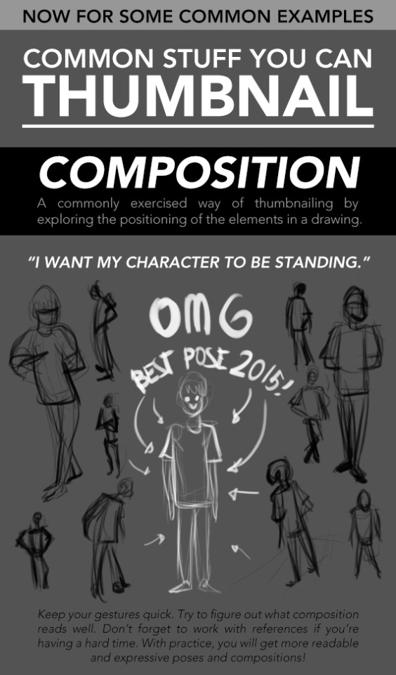
It’s here! For those artists who spend loads of time trying to figure out why their art is not coming out the way they want it to be, making thumbnails (or making studies) is the thing for you! It’s also great of getting rid of the habit of zooming in.
________
Mindsets | Reference and Style | Color Harmony | Contrast

That’s right folks, following the unbelievable response we’ve had to these tutorials, I’ve licensed a BRAND NEW SECOND SERIES of tutorials to a mystery publication (may not be a mystery to some of you!). This means that in addition to the FREE TUTORIALS I’ll be dropping here on Tumblr and around the web each week, there’ll ALSO be a DIFFERENT, 2ND tutorial every week for you, should you wish to subscribe. Full details coming on FRIDAY! Here’s a little peek at a section of one of the 2nd series’ tutorials, which looks at how to THINK when you draw RUNNING FIGURES… And if you want ALL MY OTHER TUTORIALS so far for FREE, just go HERE and HERE! Lorenzo!
art cheats
hello i am here today to not lose track of the art cheats i have discovered over the years. what i call art cheat is actually a cool filter/coloring style/way to shade/etc. that singlehandedly makes art like 20 times better
80’s anime style
glitch effect
glow effects
adding colors to grayscale paintings
foreshortening ( coil )
foreshortening ( perspective )
clipping group (lines)
clipping group (colors)
dramatic lighting ( GOOD )
shading metal
lighting faces
that is all for today, do stay tuned as i am always hunting for cool shit like this
Having troubles with facial angles in your drawing style?
Try a 3D sculpture of your art in your own style in a free program that is simple and very easy to use.
The program is called Sculptris and is a free off-shoot program from Zbrush, that program that you keep hearing about but either takes selling your kidneys or piracy to actually use.
If you download it and sculpt out a facial model, you can have references for your own work for all of time. No more endlessly searching Google for reference materials or twisting/rotating/flipping a drawing to see if there are flaws. And you can easily edit it to create more facial types. This way, you can make character references for any and every face and facial angle that you can think of.
The program offers mirroring right from the start, so your faces will be perfectly symmetrical. You can turn off the symmetry for things like scars or otherwise.
It takes a little time. For instance, I downloaded the program on Christmas and, in my spare time, this took a few days of getting familiar with the program (first day) and then sculpting for a few minutes each day, mostly due to my perfectionist nature. And this one isn’t even done. I still have to mold the mouth, ears, and other smaller aspects before I consider it done. However, I was so giddy over the possibilities that I wanted to share this with my fellow artists.
From now on, I have reference for a face in my own style and will be able to create things so much easier in the future. I hope that this helps you guys and that you have fun with it.
Tips for Illustrators (and other artists too!)
I’m an illustration major at MICA (please check out my blog here as a way to support me for making this post!), so this is catered towards what I learned in my illustration critiques and from professional illustrators. I think these tips can go for other artists too, though!
None of these are things that work all the time, but they’re general “rules” I’ve been taught. You can break them, just know why you’re doing so! These are just things I copied from my critique notes, so most are general tips I’ve heard and copied down.
General
Enjoy what you’re working on, but be okay with changing it.
Anatomy, and accurately trying to portray it, is really important.
Time and space can be portrayed through focus and distance.
When working digitally, make some of your own textures (traditionally) and scan them in. Adding them into a picture adds an element of your own hand and makes your work stand apart from other digital work.
Contrast is a great thing.
Saturation is a great thing, especially in watercolor (soak that brush with pigment!).
Your style should never draw an obscene amount of attention to itself; it should just work fluidly.
Consider what medium(s) work best for your idea.
Cover your paint palettes (particularly reusable ones) to make sure dust doesn’t get in the paints.
Spin the page when you’re working. The time is takes to do that will show some major improvement in your art!
Use dark watercolor and then a light colored pencil on top, never the other way around (it will look muddy and ruin clarity).
Make sure to sometime pin or place you piece far away and step away so you can see the whole composition (or zoom out a lot digitally).
Consider the genre and audience of what you’re working for (and if it’s yourself, then you’re your own audience!).
Illustration is a branch of fine art, don’t forget that.
Fantasy art usually needs a lot of high detail.
Coloring
Pick an overall color palette to work in, then add in other colors as needed.
Complementary colors (ones opposite on the color wheel), when placed next to each other, can pop an object forward or draw attention to it. (Think of a red ornament on a green Christmas tree).
Designate the shadows to be either warm or cool, and the highlights to be the opposite. Stay with this throughout the entire picture.
All colors have a warm and a cool hue (cool and warm blues, cool and warm oranges).
The more saturated a color is, the more it will pop forward in the picture plane.
Don’t use colors right out of the paint tube.
When making a shadow, tint the color with the complementary tone (it makes it a little more grey).
Colorizing backgrounds lines makes them recede in a colored image with line art.
Blue and pink tones are great for use in skin tones.
Flats need to be fairly differentiated colors.
Drawing
The reference should never be an excuse for a misleading or awkward pose. You have the artistic license to alter an awkward pose and not just draw from a photo.
With scratchy or textured line art, find some places of solid black too, to allow the eye to rest (or where you want something to pop out).
How you render all the elements of the picture is what makes your own individual style.
When something is illuminated, it should be the brightest part of the composition.
Anything with a straight angle (like the corner of a room) has one wall/side being lighter in value than the other. There is a crisp distinction.
Sometimes adding more lessens the strength of the image.
Fabric folds are crisp, if they’re too soft they’ll look like clay.
Line heaviness and weight can determine depth.
Anatomy/Characters
Anatomical consistency is very important.
Inside of the mouth is usually dark.
Show character motivations with actions and poses.
You can crop a face or figure to set a mood.
In any and every picture, pay special and close attention to the hands, feet, and face.
Learning musculature, even if you use reference, will help you create the body you want for your character. Understand the human form…it’s easier to alter if you understand it in the first place.
To pop a figure forward, add a little bit of rim lighting (great with backlighting).
Composition
Avoid spots where a line or shape comes really close, but doesn’t cross, the edge of the paper. This is called a tangent and tangents are bad (they suck the eye into just that one spot and stop the composition).
Nothing in the picture is accidentally there, it is all drawn by you, so make sure everything has a conscious placement.
Don’t crop anything that shows essential character expression (including essential parts of the pose).
Never crop a figure at a joint (it makes the limb look amputated unintentionally).
Consider how you show detail with smaller characters…what are the essential characteristics?
Shapes of color or tone can make great framing devices.
For the most part, render the foreground with more clarity than the background…you want atmospheric perspective to be used to make it look like it’s receding.
Line heaviness/weight can combat (in a good way) any very dark areas.
When the character breaks a border (shape, line, panel etc), it shows dominance.
Make the shape of your negative space visually interesting.
“Cornerstops” are great. They are a compositional element that visually blocks your eye from running off the corner of a page.
Shadows can be a great compositional element.
Narrative Illustration (Portraying the narrative)
It is a successful illustration if the story is told.
Use every element of the image to tell the story.
Sometimes you have to take out elements you love for the sake of storytelling.
Think of images as being fast/slow, quiet/loud. What techniques portray these senses for you, and why are you using such techniques? What areas of the picture are slower and faster, why those areas?
Indicate how lavish or simple a place is by the details you choose to include in the background.
Don’t make it obvious that you “curated” the picture; it should look natural.
Cover illustrations don’t always need big and bold text, as long as there’s a strong narrative being portrayed.
Something mid action carries the narrative better than pre or post action.
You should be able to tell a story without relying on text.
Sequential Art (Comics, etc)
Color between panels can draw the eye around the page.
Big jumps in narrative can add humor and excitement, just make sure to think of why you are having the jump there.
When starting a sequence, make it obvious where you start (establishing shot; biggest to smallest, etc).
Make sure panels can read as separate images even if you took the gutter away.
Smaller panels are frequently used for faster/quicker actions.
Removing the background in certain panels allows the scene to be read faster; you only need one background per page (unless the scene in the background is changing).
Style, readability, and timing are key things to keep in mind.
Does the punch line/climax happen at the right time on the page?
Before planning a page, ask yourself: “How much time is elapsing between the first and last panel?”
Consider panel shape and size.
The composition, and where the eye flows inside every panel, informs where the eye travels to next…compositionally lead the eye from panel to panel.
The more panels you have, generally the more time goes on.
Don’t rely on speed/action lines to make things dramatic.
Give word bubbles a little breathing room.
When doing a graphic novel, you’ll usually have to redraw the first few pages since the characters will come more naturally to you by the end pages.
There is a design element to sound effects.
Digital Art (Mostly Photoshop based, but some are general tips)
Before printing, you usually want to switch your file to CMYK (though save a file in RGB too). Print at 300 dpi.
Before printing, you can up the brightness, saturation and contrast until it just starts to look awkward. You’ll learn the best settings for the printer you print at.
Don’t place digital textures anywhere. Consciously arrange them.
Don’t overrender. Digital art tends to be the most successful when it feels less digital than someone would expect.
If your color scheme doesn’t look cohesive, you can use a fill layer of one specific color to unify everything (Layer->fill layer). Lower the opacity to around 15-30%.
literally most things that people write off as just ‘textures’ to use in graphics are stolen & unsourced material created by artists or photographers NOT meant to be used as elements in projects without royalty payments. you can say ‘it’s just random tumblr posts they don’t care’ but you wouldn’t want someone to take your work and edit into their work so they can be praised for their beautiful style and creativity even if they just post it on social media w/o profit, would you?? so maybe if you browse pinterest or google images for pictures without finding the original source, you’re using images that you’re not allowed to use without realizing it.
you see it on here a lot especially in (i won’t link anything but i’m sure you know what i mean) those album track ‘aesthetics’ posts, au ‘aesthetic’ posts (you see these less in kpop, but where people use non-royalty free images to kinda craft a visual au), and even just rather typical graphics that have a lot of ‘texture’ elements. and texture packs too!! that’s often where the problem starts; people just collect images (often literal art), compile them in a folder w/o sources, then insist no one can repost those images w/o crediting the person who compiled them. what???
SO may i suggest some of my fave places you can get FREE, ROYALTY-FREE elements that are totally legal to use
creativemarket has 6 free high-quality resources (textures, brushes, fonts, etc), different every week! wow awesome i check it every week
search ‘freebie’ on behance. awesome stuff!!! lots of v nice templates textures and fonts
mockup zone freebies
unsplash: tons of very nice free photographs, not shitty stock photos
pexels: same idea. + they have an adobe plugin so you can get photos without closing your editor damn nice
pixelsquid is a super cool free program (again w a ps plugin that i love) with lottts of super cool hq 3d elements!
as to not make this too long: spoongraphics, lostandtaken (textures galore), pixeden, freebiesbug.
hot artists don't gatekeep
I've been resource gathering for YEARS so now I am going to share my dragons hoard
Floorplanner. Design and furnish a house for you to use for having a consistent background in your comic or anything! Free, you need an account, easy to use, and you can save multiple houses.
Comparing Heights. Input the heights of characters to see what the different is between them. Great for keeping consistency. Free.
Magma. Draw online with friends in real time. Great for practice or hanging out. Free, paid plan available, account preferred.
Smithsonian Open Access. Loads of free images. Free.
SketchDaily. Lots of pose references, massive library, is set on a timer so you can practice quick figure drawing. Free.
SculptGL. A sculpting tool which I am yet to master, but you should be able to make whatever 3d object you like with it. free.
Pexels. Free stock images. And the search engine is actually pretty good at pulling up what you want.
Figurosity. Great pose references, diverse body types, lots of "how to draw" videos directly on the site, the models are 3d and you can rotate the angle, but you can't make custom poses or edit body proportions. Free, account option, paid plans available.
Line of Action. More drawing references, this one also has a focus on expressions, hands/feet, animals, landscapes. Free.
Animal Photo. You pose a 3d skull model and select an animal species, and they give you a bunch of photo references for that animal at that angle. Super handy. Free.
Height Weight Chart. You ever see an OC listed as having a certain weight but then they look Wildly different than the number suggests? Well here's a site to avoid that! It shows real people at different weights and heights to give you a better idea of what these abstract numbers all look like. Free to use.
Drawing fat characters will make you a better artist, btw. Unironically, once you know how, you will not want to go back
RESOURCES FOR POSES
Line of Action

JustSketch.Me

PoseManiacs

Human-Anatomy-For-Artist.com

MagicPoser

MIXAMO

Pose Archives

Bodies in Motion

Posemy.art

ReferenceAngle

CroquisCafe

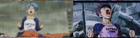
I’m not crazy, y’all. Dragonball Supers animation is bad on a basic level.
Not sure if the Animation Director or the story-artist is more at fault but regardless, the product is bad and someone should have known better.
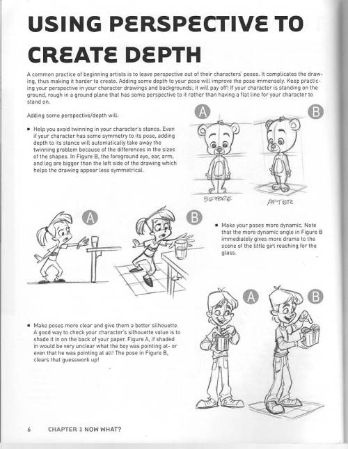
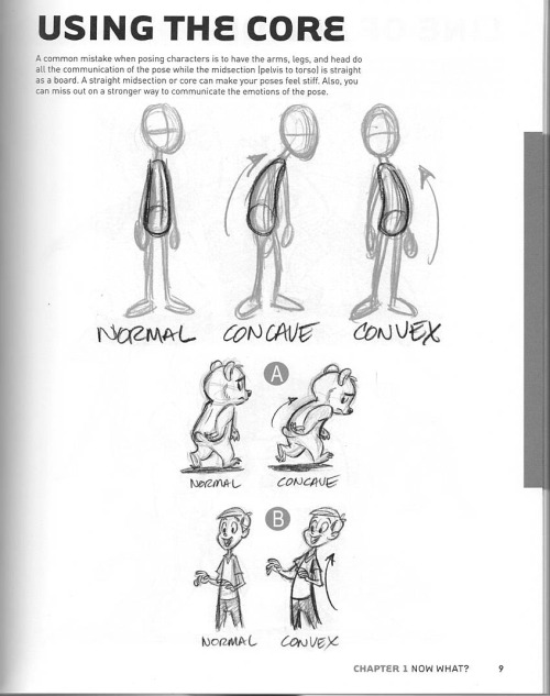
(scans from the book “Character Mentor” by Tom Bancroft)
-
 k-overflow reblogged this · 1 week ago
 -
 pebble-the-ghosts-art reblogged this · 1 week ago
 -
 pebble-the-ghost liked this · 1 week ago
 -
 thisonequack reblogged this · 1 week ago
 -
thisonequack liked this · 1 week ago
-
 hakordraws liked this · 1 week ago
 -
 chu-che reblogged this · 1 week ago
 -
chu-che liked this · 1 week ago
-
 felisdraconis reblogged this · 1 week ago
 -
felisdraconis liked this · 1 week ago
-
 chrysalis-the-butterfly liked this · 1 week ago
 -
 lightoftheseraph liked this · 1 week ago
 -
 macdoozy liked this · 1 week ago
 -
 qualityinfluencerpirate liked this · 1 week ago
 -
 nervousstudentgalaxy liked this · 1 week ago
 -
 wingedcrusadedeer liked this · 1 week ago
 -
 turbolovefatties liked this · 1 week ago
 -
 aryyn-meatgrinder liked this · 1 week ago
 -
 hatoratomoen reblogged this · 1 week ago
 -
hatoratomoen liked this · 1 week ago
-
 sleepiey reblogged this · 1 week ago
 -
sleepiey liked this · 1 week ago
-
 nervous-young-man liked this · 1 week ago
 -
 cozy-heart liked this · 1 week ago
 -
 peppermintlark reblogged this · 1 week ago
 -
peppermintlark liked this · 1 week ago
-
 abssentvideoss liked this · 1 week ago
 -
 pokegeek151 liked this · 1 week ago
 -
 chickengoldnuggets2 liked this · 1 week ago
 -
 milocelium liked this · 1 week ago
 -
 alittle-annihilation reblogged this · 1 week ago
 -
 lazarusemma reblogged this · 1 week ago
 -
 mr-bop-reblogs reblogged this · 1 week ago
 -
 caeb-ruu liked this · 1 week ago
 -
 cvrruptlove liked this · 1 week ago
 -
 fujitsubos liked this · 1 week ago
 -
 robinsnose liked this · 1 week ago
 -
 veryspecificanon reblogged this · 1 week ago
 -
 voyagerii reblogged this · 1 week ago
 -
 leafcreature liked this · 1 week ago
 -
 jekkiefan liked this · 1 week ago
 -
 kuyatehsworld liked this · 1 week ago
 -
 faetoday reblogged this · 1 week ago
 -
faetoday liked this · 1 week ago
-
 intoxicatedinkeep reblogged this · 1 week ago
 -
 charafansmile reblogged this · 1 week ago
 -
charafansmile liked this · 1 week ago
-
 scourgie reblogged this · 1 week ago
 -
 i-am-me-i-am-sam reblogged this · 1 week ago
