
malcontentmoon
52 posts
Latest Posts by malcontentmoon
people NEED to stop gatekeeping making music like ohhhh i don’t have an instrument ohhhhh i don’t know music theory ohhhhh i’m not gonna pay for some program. SHUT UP. take my hand.
you need NONE of that shit!!!!! there’s a website called beepbox.co. literally all you have to do is press things until it sounds a modicum of nice. it’s easy it’s free and it works on anything which has a browser because it’s a website.

if even ONE person starts making music bc of this post it will be worth it.
making bad music is just as important and okay as it is to write badly or draw badly or sing badly. you AREN’T BEHOLDEN TO MAKE GOOD MUSIC. making music is not utilitarian HAVE FUN. HAVE FUN!!!!!!!!!


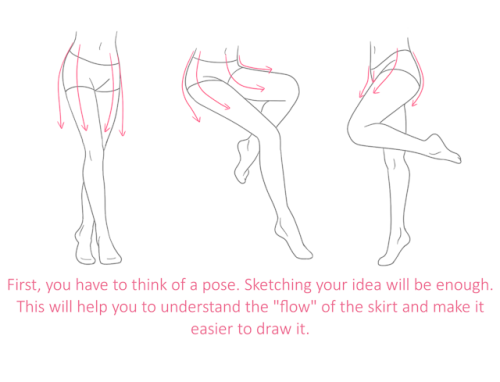
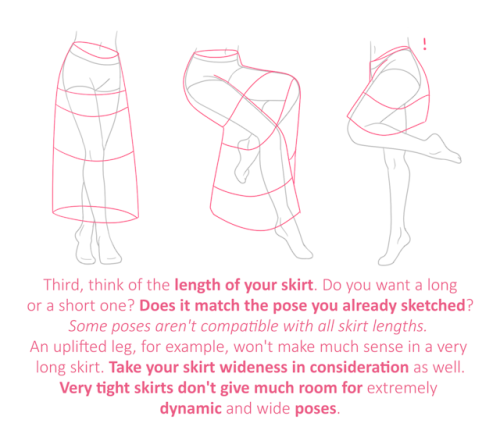
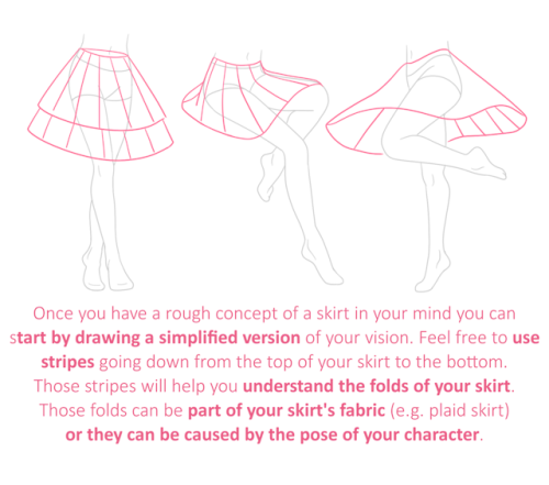
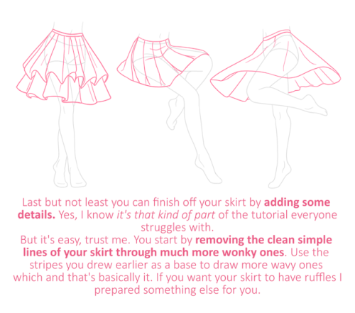
[ID in alt]
Tutorial on drawing characters/OCs who have some sort of facial paralysis. It doesn't cover all possible variants because I was using mirror as my main reference lawl
Keep in mind that this is an introductory drawing tutorial and has some generalizations in it, so not every “X is Z” statement will be true for Actual People 👍
Consider supporting me on ko-fi if you find this to be helpful.
Drawing fat characters will make you a better artist, btw. Unironically, once you know how, you will not want to go back

That’s right folks, following the unbelievable response we’ve had to these tutorials, I’ve licensed a BRAND NEW SECOND SERIES of tutorials to a mystery publication (may not be a mystery to some of you!). This means that in addition to the FREE TUTORIALS I’ll be dropping here on Tumblr and around the web each week, there’ll ALSO be a DIFFERENT, 2ND tutorial every week for you, should you wish to subscribe. Full details coming on FRIDAY! Here’s a little peek at a section of one of the 2nd series’ tutorials, which looks at how to THINK when you draw RUNNING FIGURES… And if you want ALL MY OTHER TUTORIALS so far for FREE, just go HERE and HERE! Lorenzo!
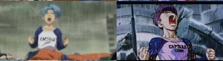
I’m not crazy, y’all. Dragonball Supers animation is bad on a basic level.
Not sure if the Animation Director or the story-artist is more at fault but regardless, the product is bad and someone should have known better.
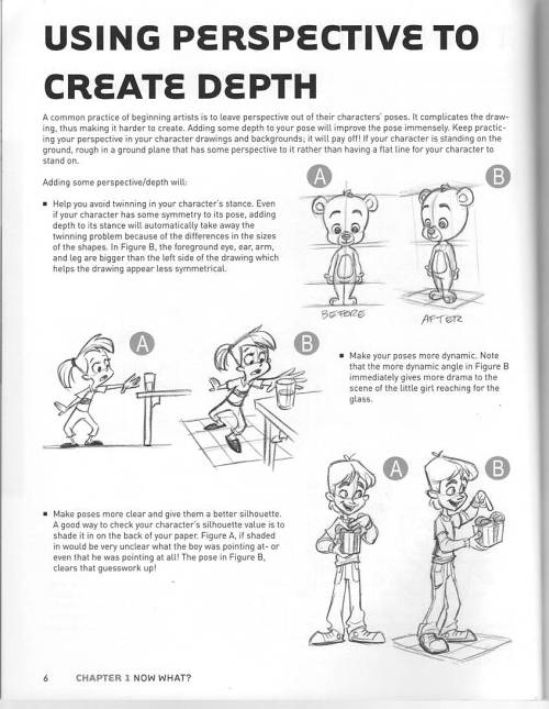
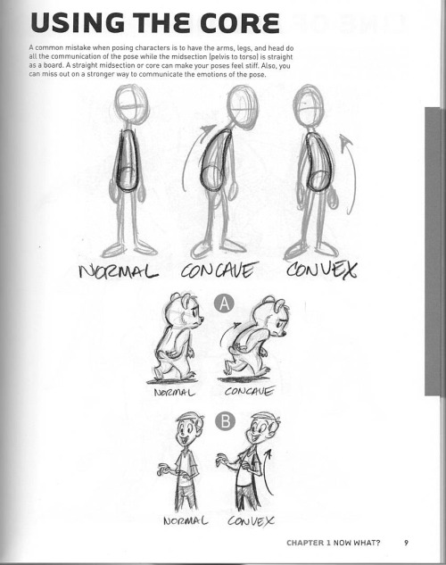
(scans from the book “Character Mentor” by Tom Bancroft)
Tips for Illustrators (and other artists too!)
I’m an illustration major at MICA (please check out my blog here as a way to support me for making this post!), so this is catered towards what I learned in my illustration critiques and from professional illustrators. I think these tips can go for other artists too, though!
None of these are things that work all the time, but they’re general “rules” I’ve been taught. You can break them, just know why you’re doing so! These are just things I copied from my critique notes, so most are general tips I’ve heard and copied down.
General
Enjoy what you’re working on, but be okay with changing it.
Anatomy, and accurately trying to portray it, is really important.
Time and space can be portrayed through focus and distance.
When working digitally, make some of your own textures (traditionally) and scan them in. Adding them into a picture adds an element of your own hand and makes your work stand apart from other digital work.
Contrast is a great thing.
Saturation is a great thing, especially in watercolor (soak that brush with pigment!).
Your style should never draw an obscene amount of attention to itself; it should just work fluidly.
Consider what medium(s) work best for your idea.
Cover your paint palettes (particularly reusable ones) to make sure dust doesn’t get in the paints.
Spin the page when you’re working. The time is takes to do that will show some major improvement in your art!
Use dark watercolor and then a light colored pencil on top, never the other way around (it will look muddy and ruin clarity).
Make sure to sometime pin or place you piece far away and step away so you can see the whole composition (or zoom out a lot digitally).
Consider the genre and audience of what you’re working for (and if it’s yourself, then you’re your own audience!).
Illustration is a branch of fine art, don’t forget that.
Fantasy art usually needs a lot of high detail.
Coloring
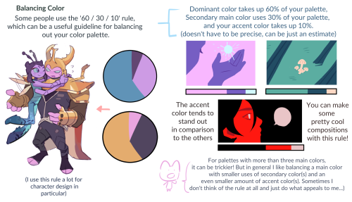
Pick an overall color palette to work in, then add in other colors as needed.
Complementary colors (ones opposite on the color wheel), when placed next to each other, can pop an object forward or draw attention to it. (Think of a red ornament on a green Christmas tree).
Designate the shadows to be either warm or cool, and the highlights to be the opposite. Stay with this throughout the entire picture.
All colors have a warm and a cool hue (cool and warm blues, cool and warm oranges).
The more saturated a color is, the more it will pop forward in the picture plane.
Don’t use colors right out of the paint tube.
When making a shadow, tint the color with the complementary tone (it makes it a little more grey).
Colorizing backgrounds lines makes them recede in a colored image with line art.
Blue and pink tones are great for use in skin tones.
Flats need to be fairly differentiated colors.
Drawing
The reference should never be an excuse for a misleading or awkward pose. You have the artistic license to alter an awkward pose and not just draw from a photo.
With scratchy or textured line art, find some places of solid black too, to allow the eye to rest (or where you want something to pop out).
How you render all the elements of the picture is what makes your own individual style.
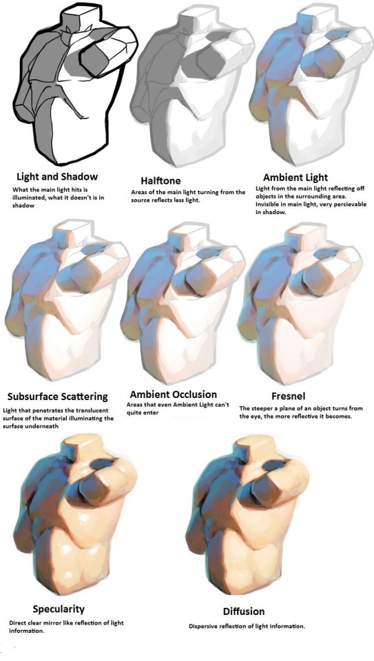
When something is illuminated, it should be the brightest part of the composition.
Anything with a straight angle (like the corner of a room) has one wall/side being lighter in value than the other. There is a crisp distinction.
Sometimes adding more lessens the strength of the image.
Fabric folds are crisp, if they’re too soft they’ll look like clay.
Line heaviness and weight can determine depth.
Anatomy/Characters
Anatomical consistency is very important.
Inside of the mouth is usually dark.
Show character motivations with actions and poses.
You can crop a face or figure to set a mood.
In any and every picture, pay special and close attention to the hands, feet, and face.
Learning musculature, even if you use reference, will help you create the body you want for your character. Understand the human form…it’s easier to alter if you understand it in the first place.
To pop a figure forward, add a little bit of rim lighting (great with backlighting).
Composition
Avoid spots where a line or shape comes really close, but doesn’t cross, the edge of the paper. This is called a tangent and tangents are bad (they suck the eye into just that one spot and stop the composition).
Nothing in the picture is accidentally there, it is all drawn by you, so make sure everything has a conscious placement.
Don’t crop anything that shows essential character expression (including essential parts of the pose).
Never crop a figure at a joint (it makes the limb look amputated unintentionally).
Consider how you show detail with smaller characters…what are the essential characteristics?
Shapes of color or tone can make great framing devices.
For the most part, render the foreground with more clarity than the background…you want atmospheric perspective to be used to make it look like it’s receding.
Line heaviness/weight can combat (in a good way) any very dark areas.
When the character breaks a border (shape, line, panel etc), it shows dominance.
Make the shape of your negative space visually interesting.
“Cornerstops” are great. They are a compositional element that visually blocks your eye from running off the corner of a page.
Shadows can be a great compositional element.
Narrative Illustration (Portraying the narrative)
It is a successful illustration if the story is told.
Use every element of the image to tell the story.
Sometimes you have to take out elements you love for the sake of storytelling.
Think of images as being fast/slow, quiet/loud. What techniques portray these senses for you, and why are you using such techniques? What areas of the picture are slower and faster, why those areas?
Indicate how lavish or simple a place is by the details you choose to include in the background.
Don’t make it obvious that you “curated” the picture; it should look natural.
Cover illustrations don’t always need big and bold text, as long as there’s a strong narrative being portrayed.
Something mid action carries the narrative better than pre or post action.
You should be able to tell a story without relying on text.
Sequential Art (Comics, etc)
Color between panels can draw the eye around the page.
Big jumps in narrative can add humor and excitement, just make sure to think of why you are having the jump there.
When starting a sequence, make it obvious where you start (establishing shot; biggest to smallest, etc).
Make sure panels can read as separate images even if you took the gutter away.
Smaller panels are frequently used for faster/quicker actions.
Removing the background in certain panels allows the scene to be read faster; you only need one background per page (unless the scene in the background is changing).
Style, readability, and timing are key things to keep in mind.
Does the punch line/climax happen at the right time on the page?
Before planning a page, ask yourself: “How much time is elapsing between the first and last panel?”
Consider panel shape and size.
The composition, and where the eye flows inside every panel, informs where the eye travels to next…compositionally lead the eye from panel to panel.
The more panels you have, generally the more time goes on.
Don’t rely on speed/action lines to make things dramatic.
Give word bubbles a little breathing room.
When doing a graphic novel, you’ll usually have to redraw the first few pages since the characters will come more naturally to you by the end pages.
There is a design element to sound effects.
Digital Art (Mostly Photoshop based, but some are general tips)
Before printing, you usually want to switch your file to CMYK (though save a file in RGB too). Print at 300 dpi.
Before printing, you can up the brightness, saturation and contrast until it just starts to look awkward. You’ll learn the best settings for the printer you print at.
Don’t place digital textures anywhere. Consciously arrange them.
Don’t overrender. Digital art tends to be the most successful when it feels less digital than someone would expect.
If your color scheme doesn’t look cohesive, you can use a fill layer of one specific color to unify everything (Layer->fill layer). Lower the opacity to around 15-30%.
It seems that I forgot to post this here…
This is something I wanted to do for a long time - I used the Holbein watercolour tubes I had, added some colours, mixed some and re-created the set of colours recommended by Hayao Miyazaki. This is based on the first (old) edition of the 24 colour set that was being sold in Studio Ghibli’s museum in Mitaka (some colours got discontinued by Holbein though so you can not buy it any more). I will be painting an illustration using this set in another video.
The list of colours (including the ones requiring mixing)
1. Crimson Lake 2. Opera 3. Vermilion 4. Yellow Ocher 5. Permanent Yellow Lemon 6. Permanent Yellow Deep 7. Permanent Yellow Orange 8. Permanent Green No.1 9. Permanent Green No.3 made from Sap Green W075 4:1 Yellow Ochre W034 10. Cadmium Green Deep 11. Cobalt Green Yellow Shade made from Permanent Green No.2 W067 3:1 Viridian (hue) W061 12. Cobalt Blue Hue 13. Cerulean Blue 14. Ultramarine Deep 15. Compose Blue 16. Prussian Blue 17. Bright Violet 18. Light Red 19. Burnt Umber 20. Burnt Sienna 21. Ivory Black 22. Yellow Grey 23. Violet Grey made from W025 Brilliant Pink 9:1 W120 Quinacridone Violet 24. Davis Grey
Works of Hayao Miyazaki © Studio Ghibli used for educational purposes only
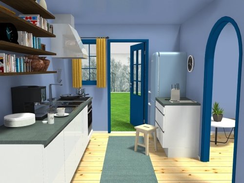
For artists who have problems with perspective (furniture etc.) in indoor scenes like me - there’s an online programm called roomsketcher where you can design a house/roon and snap pictures of it using different perspectives.
It’s got an almost endless range of furniture, doors, windows, stairs etc and is easy to use. In addition to that, you don’t have to install anything and if you create an account (which is free) you can save and return to your houses.
Examples (all done by me):


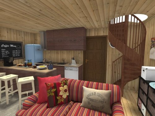
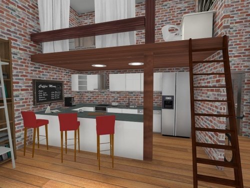
Here’s an example for how you can use it
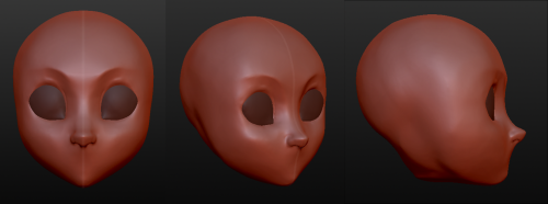
Having troubles with facial angles in your drawing style?
Try a 3D sculpture of your art in your own style in a free program that is simple and very easy to use.
The program is called Sculptris and is a free off-shoot program from Zbrush, that program that you keep hearing about but either takes selling your kidneys or piracy to actually use.
If you download it and sculpt out a facial model, you can have references for your own work for all of time. No more endlessly searching Google for reference materials or twisting/rotating/flipping a drawing to see if there are flaws. And you can easily edit it to create more facial types. This way, you can make character references for any and every face and facial angle that you can think of.
The program offers mirroring right from the start, so your faces will be perfectly symmetrical. You can turn off the symmetry for things like scars or otherwise.
It takes a little time. For instance, I downloaded the program on Christmas and, in my spare time, this took a few days of getting familiar with the program (first day) and then sculpting for a few minutes each day, mostly due to my perfectionist nature. And this one isn’t even done. I still have to mold the mouth, ears, and other smaller aspects before I consider it done. However, I was so giddy over the possibilities that I wanted to share this with my fellow artists.
From now on, I have reference for a face in my own style and will be able to create things so much easier in the future. I hope that this helps you guys and that you have fun with it.


I am sorry for the delay! I hope this will be helpful!
![[Banner ID: Text reading “Creating black characters*” and below that is small text that reads “*with intent!” In the left corner is the ginger cat and in the right corner is the person. The background is a gradient of skin tones that goes from dark to light. /End ID]](https://64.media.tumblr.com/1bedf99d991e0f4df9e2f052cbab6364/9a8b21dc43d90227-67/s500x750/44886223bab9545bc4dbc6e626452ef70634822f.png)
ALT
Welcome!
I’m going to update this list as I post more. So make sure to check periodically!
Anon Office Hours: W-F 12:30-6:30 give or take
Feedback Rules
FAQs!
Lesson 1: “White Man Painted Black”?
Lesson 1.5: “Hair for Thought”- how visualizing affects your writing
Lesson 2: “That One Hairstyle? RETIRE IT!” Black Hair is an Art (pt.1)
Lesson 2.1: Addendum to Hair pt 1
Lesson 2: “It Takes HOW LONG?” Black Hair is an Art (pt.2)
Application! Ice’s Lazy Loc Wash Routine
Application! How to: Simplified Braid
Lesson 3: “Defying the Default”- Skin Tones and the Presence of Black Characters
Application! What are Black fans looking for in Commissions?
Lesson 4: “Do Black People Blush?” Bringing brown complexions to life
Lesson 5: “The Same Place As the Music” Lighting & Color
Lesson 6: “Let’s Have A Talk, First” Stereotypes, pt 1
Lesson 6: “Why’s she so rude?” (She’s Not)- Stereotypes, pt 2
Lesson 6: “Is He the Threat (Or Are You?)”- Stereotypes, pt 3


Dan Fessler’s HD Index Painting Technique let’s you paint pixel art in Photoshop in a non-destructive manner, and lets you use pretty much every tool in a perfectly pixel-gradient fashion!
The article gives you everything you need to try it out for yourself.It’s easy to set up and use, and the results are so fucking cool.
Having troubles with facial angles in your drawing style?
Try a 3D sculpture of your art in your own style in a free program that is simple and very easy to use.
The program is called Sculptris and is a free off-shoot program from Zbrush, that program that you keep hearing about but either takes selling your kidneys or piracy to actually use.
If you download it and sculpt out a facial model, you can have references for your own work for all of time. No more endlessly searching Google for reference materials or twisting/rotating/flipping a drawing to see if there are flaws. And you can easily edit it to create more facial types. This way, you can make character references for any and every face and facial angle that you can think of.
The program offers mirroring right from the start, so your faces will be perfectly symmetrical. You can turn off the symmetry for things like scars or otherwise.
It takes a little time. For instance, I downloaded the program on Christmas and, in my spare time, this took a few days of getting familiar with the program (first day) and then sculpting for a few minutes each day, mostly due to my perfectionist nature. And this one isn’t even done. I still have to mold the mouth, ears, and other smaller aspects before I consider it done. However, I was so giddy over the possibilities that I wanted to share this with my fellow artists.
From now on, I have reference for a face in my own style and will be able to create things so much easier in the future. I hope that this helps you guys and that you have fun with it.

(source)
Unsplash - photography, illustration, and art
Pixabay - same as unsplash
Pexels - stock photos and videos
Stockvault.net - stock photos
freepngimg - icons, pictures and clipart
Veceezy - vectors and clipart
Kissclipart and kissPNG - more vectors and clipart (often transparent!)
Getdrawings - simplistic images and drawing tutorials
Gumroad - photoshop brushes (and more)
Canva - needs login but has lots of templates
Library of Congress - historical posters and photos
NASA - you guessed it
Creative Commons - all kinds of stuff, homie
Even Adobe has some free images
There are so many ways to make moodboards, bookcovers, and icons without infringing copyright! As artists, authors, and other creatives, we need to be especially careful not to use someone else’s work and pass it off as our own.
Please add on if you know any more sites for free images <3


my color tips pdf is now available ! i had a lot of fun with this, i hope you enjoy ^^
BUY HERE or HERE
HEY THIS IS IMPORTANT whats your favorite place to find drawing references?


A master post of Thomas Romain’s art tutorials.
There’s not enough space to post all of them, SO here’s links to everything he has posted (on twitter) so far : 1 2 3 4 5 6 7 8 9 10 11 12.
Now that new semesters have started, I thought people might need these. Enjoy your lessons!


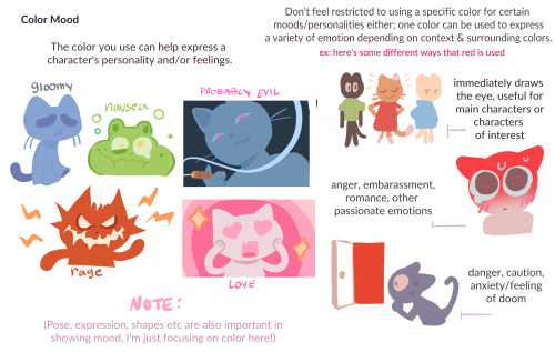
I am so serious when I say if you want to learn about light, you NEED to at least look at modeseven’s tutorials. even if you’re not pursuing a painterly style, this is all essential theory that can be easily adapted to different coloring styles. notice how none of these ever say ‘light with these colors and shade with these colors’? notice how this is teaching how light works on a mechanical level, and reminding the audience to adjust the actual colors they choose by context? THAT is good advice.
(if you’re thinking ‘wow I want to study more of this persons art!’ I encourage you to do so, but proceed with the knowledge that modeseven draws pretty much exclusively weird as hell kink art. sometimes wisdom comes from horny places)
literally most things that people write off as just ‘textures’ to use in graphics are stolen & unsourced material created by artists or photographers NOT meant to be used as elements in projects without royalty payments. you can say ‘it’s just random tumblr posts they don’t care’ but you wouldn’t want someone to take your work and edit into their work so they can be praised for their beautiful style and creativity even if they just post it on social media w/o profit, would you?? so maybe if you browse pinterest or google images for pictures without finding the original source, you’re using images that you’re not allowed to use without realizing it.
you see it on here a lot especially in (i won’t link anything but i’m sure you know what i mean) those album track ‘aesthetics’ posts, au ‘aesthetic’ posts (you see these less in kpop, but where people use non-royalty free images to kinda craft a visual au), and even just rather typical graphics that have a lot of ‘texture’ elements. and texture packs too!! that’s often where the problem starts; people just collect images (often literal art), compile them in a folder w/o sources, then insist no one can repost those images w/o crediting the person who compiled them. what???
SO may i suggest some of my fave places you can get FREE, ROYALTY-FREE elements that are totally legal to use
creativemarket has 6 free high-quality resources (textures, brushes, fonts, etc), different every week! wow awesome i check it every week
search ‘freebie’ on behance. awesome stuff!!! lots of v nice templates textures and fonts
mockup zone freebies
unsplash: tons of very nice free photographs, not shitty stock photos
pexels: same idea. + they have an adobe plugin so you can get photos without closing your editor damn nice
pixelsquid is a super cool free program (again w a ps plugin that i love) with lottts of super cool hq 3d elements!
as to not make this too long: spoongraphics, lostandtaken (textures galore), pixeden, freebiesbug.


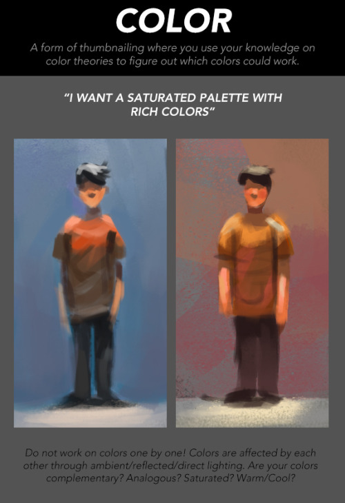


How to Make Your Art Look Nice: Thumbnailing
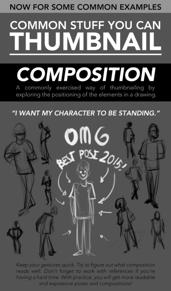
It’s here! For those artists who spend loads of time trying to figure out why their art is not coming out the way they want it to be, making thumbnails (or making studies) is the thing for you! It’s also great of getting rid of the habit of zooming in.
________
Mindsets | Reference and Style | Color Harmony | Contrast

friday night tutorial time
this post is massive but i tried to cover both the conceptual and technical side, hopefully it’s somewhat coherent
continued under cut
Keep reading
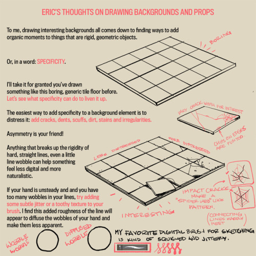
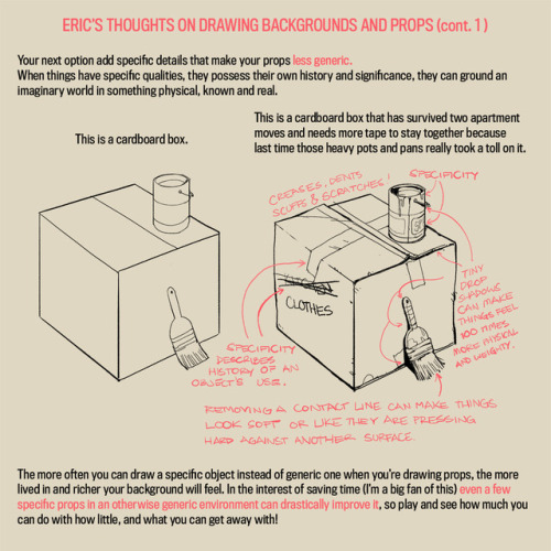
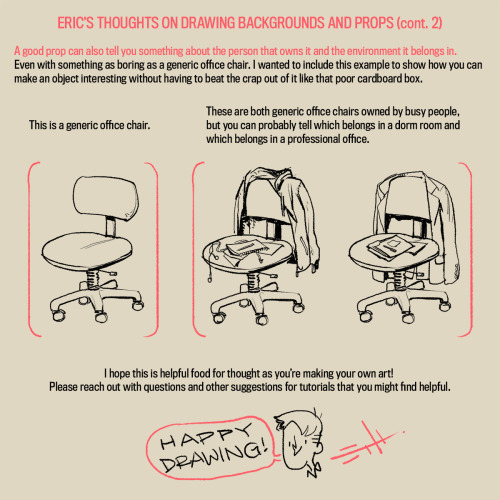
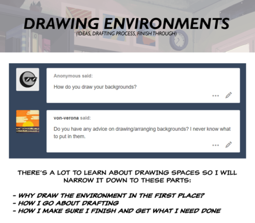
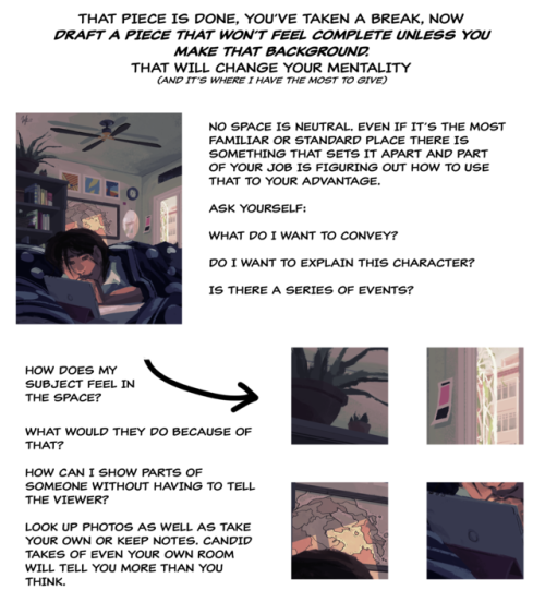
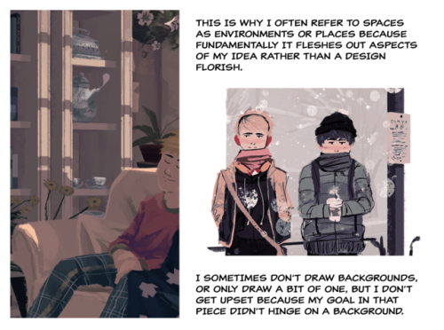
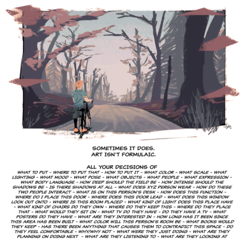
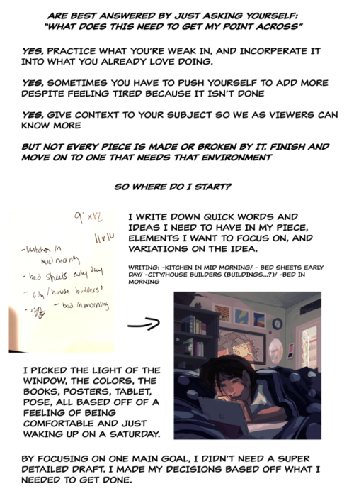
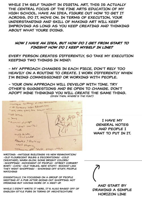
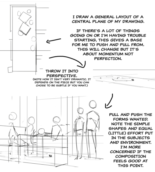
A long time ago an anon asked my thoughts about drawing backgrounds, so I finally got around to putting this together. It’s more prop-centric, but it still represents my philosophy to backgrounds.
I’ll try to do something more about drawing actual background spaces in the future! Please let me know what you think, if anything is unclear, or if you have suggestions for other tutorials you might find helpful!
✨USEFUL ART RESOURCES✨
I've been sharing some stuff I use on tt and ig so here's a compilation of it for y'all too
all except for two of these are totally free btw
happy arting 🤙🤙
edit: updated the video with even more resources
and added a transcript:
hexcolorpedia.com - A bunch of color palettes with hex-codes ready to use.
x6ud.github.io - References of various animal heads at all angles.
sketchfab.com - 3D models to use for art references or for modeling.
pattern.monster - Create and customize patterns to include in your textures or backgrounds.
referenceangle.com - Search for refs of people of different genders, ages and expressions at various angles.
vishopper.com/cut-out-people - High quality people references with a great search engine. You can search by number of people, genders, ages, activity, angles, and more.
color.adobe.com/create/color-wheel - Create color palettes using specific color harmony rules (it has some other useful features too).
texturefabrik.com - Huge collection of high quality textures you can add or overlay on your paintings or designs to add a bit of spice.
figurosity.com - Huge library of action pose models/references, includes a tool for gesture drawing.
unsplash.com - A ton of royalty free images you can use as references or for photo bashing/matte painting.
pureref.com - A very useful software that helps you organize your references while drawing. It always stays on top of your workspace and you can optimize it to your needs (it's a pay what you want download, you can put in zero and try it for free).
reshot.com - Really big library of free to use icons and vector illustrations.
help-me-draw.tumblr.com - Greatly organized library of references, tutorials, tips and tricks. Almost anything you can think of, it's in the tags.
creativemarket.com/free-goods - Four free design assets every week. You can get anything from fonts, textures, mockups, templates, brushes, and more (yes, it still works, contrary to popular belief).
coolors.co - Very quick and simple colour generator. It gives you a new palette every time you press space.
Magic Poser, Easy Pose, Poseit - Three mobile character posing apps. They give you a doll-like character to pose in any way you need it to for your reference.
screenmusings.org/movie - A great library of movie screenshots you can use for studies or reference.
open-foundry.com - A bunch of open-source free to use typefaces.
posemaniacs.com - A huge library of posed characters you can view at different angles and in various lighting scenarios.
colorhunt.co - Site with ready to use colour palettes. You can choose what type of colours you want.
pixabay.com - A huge library of free to use stock images. Great to use for references or photo bashing/matte painting.
patterninja.com - Great site that lets you make patterns by using their own clipart icons or you can upload your own images. Highly customizable.
quickposes.com - Great site for gesture drawing. Choose a type of poses you want and the interval and it'll spit out references for you. Keep in mind that there's nude models in there. There's also a regular library option where you can browse for ref pics.
eplans.com/search - If you need a consistent house plan for your comic or story, this site lets you choose a type of house you want by number of rooms etc. and gives you a floor plan to use as a reference.
posemy.art - Simple but effective 3D model poser with a huge animation/poses library to help you create pose references for your art.
flaticon.com - A huge library of free to use (with attribution) icons. Great tool that allows you to save time and make your design work look more professional.
artstation.com/artwork/GX3Ax1 - Full head reference greatly showing the planes of the face. You can turn it to any angle and adjust the lighting too.
wildlifereferencephotos.com - A continually expanding database of royalty free wildlife photos, in form of digital downloads, to use as a reference for your art.
line-of-action.com - Free online tool that offers timed photo sessions that allow you to practice sketching just like you would in a life-drawing class. You can choose between figure drawing, animals, faces, hands, or environments, and set duration from 30 seconds to 10 minutes per photo.
BONUS: The Sims 4 on Steam - If you're looking for an easy to use tool to design environments/buildings to reference in your drawings or comics, The Sims is a great tool to do just that. It's available on Steam for free (not sponsored lmao)

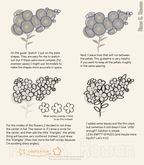
Part 1 of big "how to chibi-fy this flower????" guide is here!!! 🥰


Hello! I remember seeing a tutorial for wrinkles / clothing physics here but i cant seem to find it... where could i see it again? Im having a hard time drawing clothing physics / wrinkles haha 😅

I haven't shared it publicly, but here's a preview image of it. It's available in full to my Patreon supporters, though. It's also in the Lackadaisy Essentials art book, which can be acquired through the BackerKit campaign currently in progress.


two (2) people asked how i did the matchbook thing so take this
this is just a simple idea but if you spend some more time you can get real krazy with it:

making fake prints is so fun please do it immediately free resources under cut xoxo
Keep reading


art cheats
hello i am here today to not lose track of the art cheats i have discovered over the years. what i call art cheat is actually a cool filter/coloring style/way to shade/etc. that singlehandedly makes art like 20 times better
80’s anime style
glitch effect
glow effects
adding colors to grayscale paintings
foreshortening ( coil )
foreshortening ( perspective )
clipping group (lines)
clipping group (colors)
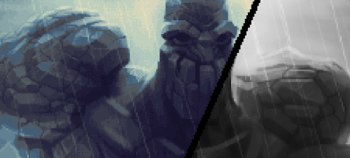
dramatic lighting ( GOOD )
shading metal
lighting faces
that is all for today, do stay tuned as i am always hunting for cool shit like this

They also have an animal one that I linked a whole back on the same site !

pretty cool head lighting ref thing
