People NEED To Stop Gatekeeping Making Music Like Ohhhh I Don’t Have An Instrument Ohhhhh I Don’t
people NEED to stop gatekeeping making music like ohhhh i don’t have an instrument ohhhhh i don’t know music theory ohhhhh i’m not gonna pay for some program. SHUT UP. take my hand.
you need NONE of that shit!!!!! there’s a website called beepbox.co. literally all you have to do is press things until it sounds a modicum of nice. it’s easy it’s free and it works on anything which has a browser because it’s a website.

if even ONE person starts making music bc of this post it will be worth it.
making bad music is just as important and okay as it is to write badly or draw badly or sing badly. you AREN’T BEHOLDEN TO MAKE GOOD MUSIC. making music is not utilitarian HAVE FUN. HAVE FUN!!!!!!!!!
More Posts from Malcontentmoon and Others
art cheats
hello i am here today to not lose track of the art cheats i have discovered over the years. what i call art cheat is actually a cool filter/coloring style/way to shade/etc. that singlehandedly makes art like 20 times better
80’s anime style
glitch effect
glow effects
adding colors to grayscale paintings
foreshortening ( coil )
foreshortening ( perspective )
clipping group (lines)
clipping group (colors)
dramatic lighting ( GOOD )
shading metal
lighting faces
that is all for today, do stay tuned as i am always hunting for cool shit like this
hot artists don't gatekeep
I've been resource gathering for YEARS so now I am going to share my dragons hoard
Floorplanner. Design and furnish a house for you to use for having a consistent background in your comic or anything! Free, you need an account, easy to use, and you can save multiple houses.
Comparing Heights. Input the heights of characters to see what the different is between them. Great for keeping consistency. Free.
Magma. Draw online with friends in real time. Great for practice or hanging out. Free, paid plan available, account preferred.
Smithsonian Open Access. Loads of free images. Free.
SketchDaily. Lots of pose references, massive library, is set on a timer so you can practice quick figure drawing. Free.
SculptGL. A sculpting tool which I am yet to master, but you should be able to make whatever 3d object you like with it. free.
Pexels. Free stock images. And the search engine is actually pretty good at pulling up what you want.
Figurosity. Great pose references, diverse body types, lots of "how to draw" videos directly on the site, the models are 3d and you can rotate the angle, but you can't make custom poses or edit body proportions. Free, account option, paid plans available.
Line of Action. More drawing references, this one also has a focus on expressions, hands/feet, animals, landscapes. Free.
Animal Photo. You pose a 3d skull model and select an animal species, and they give you a bunch of photo references for that animal at that angle. Super handy. Free.
Height Weight Chart. You ever see an OC listed as having a certain weight but then they look Wildly different than the number suggests? Well here's a site to avoid that! It shows real people at different weights and heights to give you a better idea of what these abstract numbers all look like. Free to use.


(source)
Unsplash - photography, illustration, and art
Pixabay - same as unsplash
Pexels - stock photos and videos
Stockvault.net - stock photos
freepngimg - icons, pictures and clipart
Veceezy - vectors and clipart
Kissclipart and kissPNG - more vectors and clipart (often transparent!)
Getdrawings - simplistic images and drawing tutorials
Gumroad - photoshop brushes (and more)
Canva - needs login but has lots of templates
Library of Congress - historical posters and photos
NASA - you guessed it
Creative Commons - all kinds of stuff, homie
Even Adobe has some free images
There are so many ways to make moodboards, bookcovers, and icons without infringing copyright! As artists, authors, and other creatives, we need to be especially careful not to use someone else’s work and pass it off as our own.
Please add on if you know any more sites for free images <3
![[Banner ID: Text reading “Creating black characters*” and below that is small text that reads “*with intent!” In the left corner is the ginger cat and in the right corner is the person. The background is a gradient of skin tones that goes from dark to light. /End ID]](https://64.media.tumblr.com/1bedf99d991e0f4df9e2f052cbab6364/9a8b21dc43d90227-67/s500x750/44886223bab9545bc4dbc6e626452ef70634822f.png)
ALT
Welcome!
I’m going to update this list as I post more. So make sure to check periodically!
Anon Office Hours: W-F 12:30-6:30 give or take
Feedback Rules
FAQs!
Lesson 1: “White Man Painted Black”?
Lesson 1.5: “Hair for Thought”- how visualizing affects your writing
Lesson 2: “That One Hairstyle? RETIRE IT!” Black Hair is an Art (pt.1)
Lesson 2.1: Addendum to Hair pt 1
Lesson 2: “It Takes HOW LONG?” Black Hair is an Art (pt.2)
Application! Ice’s Lazy Loc Wash Routine
Application! How to: Simplified Braid
Lesson 3: “Defying the Default”- Skin Tones and the Presence of Black Characters
Application! What are Black fans looking for in Commissions?
Lesson 4: “Do Black People Blush?” Bringing brown complexions to life
Lesson 5: “The Same Place As the Music” Lighting & Color
Lesson 6: “Let’s Have A Talk, First” Stereotypes, pt 1
Lesson 6: “Why’s she so rude?” (She’s Not)- Stereotypes, pt 2
Lesson 6: “Is He the Threat (Or Are You?)”- Stereotypes, pt 3

holy shit


My zine on vending for the first time! I wish I hadn't waited so long to start and now hopefully others can start too!
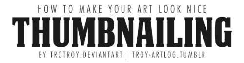


How to Make Your Art Look Nice: Thumbnailing
It’s here! For those artists who spend loads of time trying to figure out why their art is not coming out the way they want it to be, making thumbnails (or making studies) is the thing for you! It’s also great of getting rid of the habit of zooming in.
________
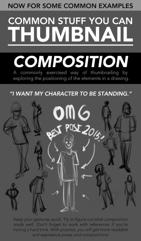
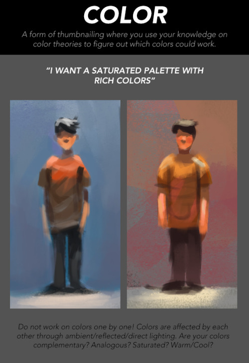
Mindsets | Reference and Style | Color Harmony | Contrast
25 ways to be a little more punk in 2025
Cut fast fashion - buy used, learn to mend and/or make your own clothes, buy fewer clothes less often so you can save up for ethically made quality
Cancel subscriptions - relearn how to pirate media, spend $10/month buying a digital album from a small artist instead of on Spotify, stream on free services since the paid ones make you watch ads anyway
Green your community - there's lots of ways to do this, like seedbombing or joining a community garden or organizing neighborhood trash pickups
Be kind - stop to give directions, check on stopped cars, smile at kids, let people cut you in line, offer to get stuff off the high shelf, hold the door, ask people if they're okay
Intervene - learn bystander intervention techniques and be prepared to use them, even if it feels awkward
Get closer to your food - grow it yourself, can and preserve it, buy from a farmstand, learn where it's from, go fishing, make it from scratch, learn a new ingredient
Use opensource software - try LibreOffice, try Reaper, learn Linux, use a free Photoshop clone. The next time an app tries to force you to pay, look to see if there's an opensource alternative
Make less trash - start a compost, be mindful of packaging, find another use for that plastic, make it a challenge for yourself!
Get involved in local politics - show up at meetings for city council, the zoning commission, the park district, school boards; fight the NIMBYs that always show up and force them to focus on the things impacting the most vulnerable folks in your community
DIY > fashion - shake off the obsession with pristine presentation that you've been taught! Cut your own hair, use homemade cosmetics, exchange mani/pedis with friends, make your own jewelry, duct tape those broken headphones!
Ditch Google - Chromium browsers (which is almost all of them) are now bloated spyware, and Google search sucks now, so why not finally make the jump to Firefox and another search like DuckDuckGo? Or put the Wikipedia app on your phone and look things up there?
Forage - learn about local edible plants and how to safely and sustainably harvest them or go find fruit trees and such accessible to the public.
Volunteer - every week tutoring at the library or once a month at the humane society or twice a year serving food at the soup kitchen, you can find something that matches your availability
Help your neighbors - which means you have to meet them first and find out how you can help (including your unhoused neighbors), like elderly or disabled folks that might need help with yardwork or who that escape artist dog belongs to or whether the police have been hassling people sleeping rough
Fix stuff - the next time something breaks (a small appliance, an electronic, a piece of furniture, etc.), see if you can figure out what's wrong with it, if there are tutorials on fixing it, or if you can order a replacement part from the manufacturer instead of trashing the whole thing
Mix up your transit - find out what's walkable, try biking instead of driving, try public transit and complain to the city if it sucks, take a train instead of a plane, start a carpool at work
Engage in the arts - go see a local play, check out an art gallery or a small museum, buy art from the farmer's market
Go to the library - to check out a book or a movie or a CD, to use the computers or the printer, to find out if they have other weird rentals like a seed library or luggage, to use meeting space, to file your taxes, to take a class, to ask question
Listen local - see what's happening at local music venues or other events where local musicians will be performing, stop for buskers, find a favorite artist, and support them
Buy local - it's less convenient than online shopping or going to a big box store that sells everything, but try buying what you can from small local shops in your area
Become unmarketable - there are a lot of ways you can disrupt your online marketing surveillance, including buying less, using decoy emails, deleting or removing permissions from apps that spy on you, checking your privacy settings, not clicking advertising links, and...
Use cash - go to the bank and take out cash instead of using your credit card or e-payment for everything! It's better on small businesses and it's untraceable
Give what you can - as capitalism churns on, normal shmucks have less and less, so think about what you can give (time, money, skills, space, stuff) and how it will make the most impact
Talk about wages - with your coworkers, with your friends, while unionizing! Stop thinking about wages as a measure of your worth and talk about whether or not the bosses are paying fairly for the labor they receive
Think about wealthflow - there are a thousand little mechanisms that corporations and billionaires use to capture wealth from the lower class: fees for transactions, interest, vendor platforms, subscriptions, and more. Start thinking about where your money goes, how and where it's getting captured and removed from our class, and where you have the ability to cut off the flow and pass cash directly to your fellow working class people
Tips for Illustrators (and other artists too!)
I’m an illustration major at MICA (please check out my blog here as a way to support me for making this post!), so this is catered towards what I learned in my illustration critiques and from professional illustrators. I think these tips can go for other artists too, though!
None of these are things that work all the time, but they’re general “rules” I’ve been taught. You can break them, just know why you’re doing so! These are just things I copied from my critique notes, so most are general tips I’ve heard and copied down.
General
Enjoy what you’re working on, but be okay with changing it.
Anatomy, and accurately trying to portray it, is really important.
Time and space can be portrayed through focus and distance.
When working digitally, make some of your own textures (traditionally) and scan them in. Adding them into a picture adds an element of your own hand and makes your work stand apart from other digital work.
Contrast is a great thing.
Saturation is a great thing, especially in watercolor (soak that brush with pigment!).
Your style should never draw an obscene amount of attention to itself; it should just work fluidly.
Consider what medium(s) work best for your idea.
Cover your paint palettes (particularly reusable ones) to make sure dust doesn’t get in the paints.
Spin the page when you’re working. The time is takes to do that will show some major improvement in your art!
Use dark watercolor and then a light colored pencil on top, never the other way around (it will look muddy and ruin clarity).
Make sure to sometime pin or place you piece far away and step away so you can see the whole composition (or zoom out a lot digitally).
Consider the genre and audience of what you’re working for (and if it’s yourself, then you’re your own audience!).
Illustration is a branch of fine art, don’t forget that.
Fantasy art usually needs a lot of high detail.
Coloring
Pick an overall color palette to work in, then add in other colors as needed.
Complementary colors (ones opposite on the color wheel), when placed next to each other, can pop an object forward or draw attention to it. (Think of a red ornament on a green Christmas tree).
Designate the shadows to be either warm or cool, and the highlights to be the opposite. Stay with this throughout the entire picture.
All colors have a warm and a cool hue (cool and warm blues, cool and warm oranges).
The more saturated a color is, the more it will pop forward in the picture plane.
Don’t use colors right out of the paint tube.
When making a shadow, tint the color with the complementary tone (it makes it a little more grey).
Colorizing backgrounds lines makes them recede in a colored image with line art.
Blue and pink tones are great for use in skin tones.
Flats need to be fairly differentiated colors.
Drawing
The reference should never be an excuse for a misleading or awkward pose. You have the artistic license to alter an awkward pose and not just draw from a photo.
With scratchy or textured line art, find some places of solid black too, to allow the eye to rest (or where you want something to pop out).
How you render all the elements of the picture is what makes your own individual style.
When something is illuminated, it should be the brightest part of the composition.
Anything with a straight angle (like the corner of a room) has one wall/side being lighter in value than the other. There is a crisp distinction.
Sometimes adding more lessens the strength of the image.
Fabric folds are crisp, if they’re too soft they’ll look like clay.
Line heaviness and weight can determine depth.
Anatomy/Characters
Anatomical consistency is very important.
Inside of the mouth is usually dark.
Show character motivations with actions and poses.
You can crop a face or figure to set a mood.
In any and every picture, pay special and close attention to the hands, feet, and face.
Learning musculature, even if you use reference, will help you create the body you want for your character. Understand the human form…it’s easier to alter if you understand it in the first place.
To pop a figure forward, add a little bit of rim lighting (great with backlighting).
Composition
Avoid spots where a line or shape comes really close, but doesn’t cross, the edge of the paper. This is called a tangent and tangents are bad (they suck the eye into just that one spot and stop the composition).
Nothing in the picture is accidentally there, it is all drawn by you, so make sure everything has a conscious placement.
Don’t crop anything that shows essential character expression (including essential parts of the pose).
Never crop a figure at a joint (it makes the limb look amputated unintentionally).
Consider how you show detail with smaller characters…what are the essential characteristics?
Shapes of color or tone can make great framing devices.
For the most part, render the foreground with more clarity than the background…you want atmospheric perspective to be used to make it look like it’s receding.
Line heaviness/weight can combat (in a good way) any very dark areas.
When the character breaks a border (shape, line, panel etc), it shows dominance.
Make the shape of your negative space visually interesting.
“Cornerstops” are great. They are a compositional element that visually blocks your eye from running off the corner of a page.
Shadows can be a great compositional element.
Narrative Illustration (Portraying the narrative)
It is a successful illustration if the story is told.
Use every element of the image to tell the story.
Sometimes you have to take out elements you love for the sake of storytelling.
Think of images as being fast/slow, quiet/loud. What techniques portray these senses for you, and why are you using such techniques? What areas of the picture are slower and faster, why those areas?
Indicate how lavish or simple a place is by the details you choose to include in the background.
Don’t make it obvious that you “curated” the picture; it should look natural.
Cover illustrations don’t always need big and bold text, as long as there’s a strong narrative being portrayed.
Something mid action carries the narrative better than pre or post action.
You should be able to tell a story without relying on text.
Sequential Art (Comics, etc)
Color between panels can draw the eye around the page.
Big jumps in narrative can add humor and excitement, just make sure to think of why you are having the jump there.
When starting a sequence, make it obvious where you start (establishing shot; biggest to smallest, etc).
Make sure panels can read as separate images even if you took the gutter away.
Smaller panels are frequently used for faster/quicker actions.
Removing the background in certain panels allows the scene to be read faster; you only need one background per page (unless the scene in the background is changing).
Style, readability, and timing are key things to keep in mind.
Does the punch line/climax happen at the right time on the page?
Before planning a page, ask yourself: “How much time is elapsing between the first and last panel?”
Consider panel shape and size.
The composition, and where the eye flows inside every panel, informs where the eye travels to next…compositionally lead the eye from panel to panel.
The more panels you have, generally the more time goes on.
Don’t rely on speed/action lines to make things dramatic.
Give word bubbles a little breathing room.
When doing a graphic novel, you’ll usually have to redraw the first few pages since the characters will come more naturally to you by the end pages.
There is a design element to sound effects.
Digital Art (Mostly Photoshop based, but some are general tips)
Before printing, you usually want to switch your file to CMYK (though save a file in RGB too). Print at 300 dpi.
Before printing, you can up the brightness, saturation and contrast until it just starts to look awkward. You’ll learn the best settings for the printer you print at.
Don’t place digital textures anywhere. Consciously arrange them.
Don’t overrender. Digital art tends to be the most successful when it feels less digital than someone would expect.
If your color scheme doesn’t look cohesive, you can use a fill layer of one specific color to unify everything (Layer->fill layer). Lower the opacity to around 15-30%.
-
 muselissome reblogged this · 1 week ago
 -
 aliceswayne reblogged this · 1 week ago
 -
 kingofbugs718312 liked this · 1 week ago
 -
 minfue liked this · 1 week ago
 -
 blueeyestwinburstdragon liked this · 1 week ago
 -
 fluffyapathybunny reblogged this · 2 weeks ago
 -
 hoesaekyoongi reblogged this · 2 weeks ago
 -
hoesaekyoongi liked this · 2 weeks ago
-
 yeehawgeek liked this · 2 weeks ago
 -
 misti-step liked this · 2 weeks ago
 -
 jumbblebee liked this · 2 weeks ago
 -
 jestery-lemon-zest reblogged this · 2 weeks ago
 -
 because-its-20xx reblogged this · 2 weeks ago
 -
 whatsinthesmoothie liked this · 2 weeks ago
 -
 gooooothmoooog liked this · 2 weeks ago
 -
 ohmigoshiloveu liked this · 2 weeks ago
 -
ohmigoshiloveu reblogged this · 2 weeks ago
-
 ausefulblog reblogged this · 2 weeks ago
 -
 themanlykittenkayden liked this · 2 weeks ago
 -
 scoobydoobyally liked this · 2 weeks ago
 -
 shinysteph liked this · 2 weeks ago
 -
 qualiacumque liked this · 2 weeks ago
 -
 unqualified-therapist reblogged this · 2 weeks ago
 -
 freakinflipflop reblogged this · 2 weeks ago
 -
 geminiism reblogged this · 2 weeks ago
 -
 thestoragevault reblogged this · 2 weeks ago
 -
 blackfirewolf reblogged this · 2 weeks ago
 -
 omegajor liked this · 2 weeks ago
 -
 savedmusicstuff reblogged this · 2 weeks ago
 -
 undeadtobias liked this · 2 weeks ago
 -
 echoedbreed liked this · 2 weeks ago
 -
 andydandydandy liked this · 2 weeks ago
 -
savedmusicstuff reblogged this · 2 weeks ago
-
 shwirlyshwoobie liked this · 2 weeks ago
 -
 saezheneia reblogged this · 3 weeks ago
 -
saezheneia liked this · 3 weeks ago
-
 xaloncat liked this · 3 weeks ago
 -
 sintheyokai reblogged this · 3 weeks ago
 -
 bertiebingobiffy reblogged this · 3 weeks ago
 -
 fabulousnomatterwhat liked this · 3 weeks ago
 -
 corruptedremnant reblogged this · 3 weeks ago
 -
 bedrotboy reblogged this · 3 weeks ago
 -
 emptyeggbrain liked this · 3 weeks ago
 -
 againstpollutions liked this · 3 weeks ago
 -
 indohyus reblogged this · 3 weeks ago
 -
 i-am-still-the-me liked this · 3 weeks ago
 -
 pike-the-laurels reblogged this · 3 weeks ago
 -
 nuclearfaggot reblogged this · 3 weeks ago
 -
 nekonero reblogged this · 4 weeks ago
 -
nekonero liked this · 4 weeks ago
