
Latest Posts by thisuserisyou - Page 7


so i just binged carmen sandiego and LET ME JUST SAY……………..really good. love the designs. love the characters. love it love it love it


I DID IT because mml needed one desperately! this show needs more love i swear to GOODNESS
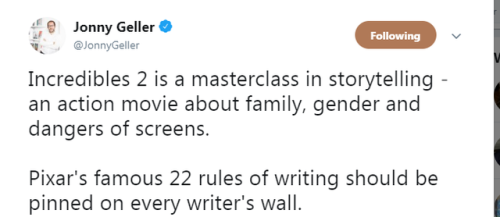
click to read the slides better if you’d like to
some fucking resources for all ur writing fuckin needs
* body language masterlist
* a translator that doesn’t eat ass like google translate does
* a reverse dictionary for when ur brain freezes
* 550 words to say instead of fuckin said
* 638 character traits for when ur brain freezes again
* some more body language help
(hope this helps some ppl)
Since it’s Halloween, don’t forget the scariest costumes ever:
“College loan debt”

“Parental responsability”

“Decreasing property value”

“Dishes I left in the sink for a week”

“MY EX WIFE”

“Unexpected pet surgery bill”

“The guy who wants to date your daughter”

Then, the best one:
“UNCOMFORTABLE SILENCE”


And now, an out-of-context photo from the Milo Murphy’s Law and Phineas and Ferb crossover.


HEYO I worked on this show and we now have a TRAILER. I can’t wait for everyone to see it – I LOVE this show and the whole crew worked so hard. JAN 18TH. NETFLIX. BE THERE.
The best romantic trope is mutual unrequited love. I don’t want any of that “Oh, I’m in love with them, I guess I’d better confess…” BS, that’s for fully functioning human beings. I want my disaster children to go through the flip flapping stages of grief crush style,
Denial: “no you don’t understand, these are platonic feelings of friendship”
Anger: “if they weren’t so hot all the time, I wouldn’t have this problem! Why dont they like me back? Why did my stupid friends introduce us?!”
Bargaining: “this is temporary, I’ll spend time apart, it’ll be fine, I can get rid of these feelings”
Depression: “shitshitshitshitshit this will ruin our friendship oh GODS WHAT AM I DOING?? I don’t deserve them! I’m useless at feelings!”
Acceptance: “okay. I have a crush. This is fine. I’ll be forever alone, and pine for my one true love, but I’ll be fine with their friendship.”
And they are brought together with some unforseen catalyst. It’s the height of romance.


Parts of my 2D animation exercice at Gobelins. Didn’t have time to finish (last scene is missing), but well… It’s done.
If you ever wanted to know how to properly do a 2d character turn, my friend max and I made a video showing you how to use the photoshop timeline to create a rotation of your characters. this can be applied to almost any type of character design. you can watch the full video here on our youtube page.
https://youtu.be/yvUkaBhwAFY

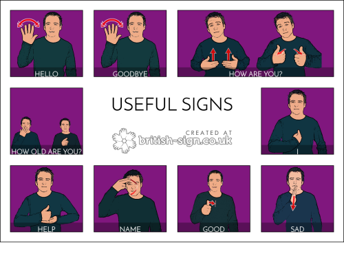
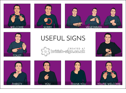
More hearing people should learn some sign language so here are some actually useful signs for us hearing people to learn.


This was something my friend did for art class. And I wanted to share (?)
This was a tutorial funded by the Patreon folks~! They have a new one coming soon so I thought I’d put this one up for everyone. :3
Webcomic tips
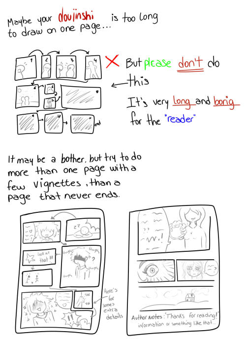
In the conclusion for now, some things I’d really recommend doing if you’re seriously considering making a webcomic (or really a comic in general). Some of these don’t really apply to strips or gag-a-day type of comics, but I’m not talking about those here.
1. Write down ideas\sketch stuff, LEGIBLY. “I’m gonna remember it later” NEVER works. And if you scribble it somewhere on a piece of paper, you’d better scan it or retype in one doc later, because tiny notes always get lost among other doodles in my skethbooks.

(i know it’s hard to keep everything clean and organized, but this mess is just not productive)
If your project is a collaboration, save your conversations. If you’re working alone, make a blog for your ramblings. You have no clue what tears of relief I cry when I open that blog and rememeber I don’t have to painstakingly look through my heaps of sketchbooks and folders for a tiny idea I’m not even sure I wrote down a few months ago.
2. Inspiration folders, or even better, inspo blog with tags also help with collecting and remembering ideas. Color schemes, landscapes, style inspirations, atmospheric stuff, maybe some photo references, all those neat things.

3. Basic tier: character design sheets. Top tier: common poses, expressions. God tier: outfits they wear throughout the comic. Holy cow tier: turnaround sheets for all those outfits.

(I’d die trying to find good pages for references without these)
4. If you haven’t finished detailing the plot, don’t even think about moving on to drawing the comic. You’re gonna regret it when you come up with a really cool plot element that can’t be incorporated anymore because you’ve already drawn all the parts you could’ve tweaked.
5. Don’t just define the plot, make a script. Writing down the lines and the brief description of the actions serves me fine:

(notice that I approximately divided the pages & the text that’d go to each panel on a page)
6. Hard mode: make thumbnails for all the pages, if possible. At least whenever a new chapter starts.
7. If your story involves some convoluted chronology shenanigans, you’d better write down the events of your timeline in the chronological order.
8. Backgrounds. You can’t avoid them, bro. Like half of the comics are backgrounds, especially if your story involves a lot of adventuring and looking around. I know it hurts, but you’ll have to become friends with them. Read some tutorials, practice on photos, go out and sketch some streets, use 3d programs (like Google Sketch) to understand the perspective, use sites like houseplans to visualize your buildings better, I don’t know. Just be prepared for their imminent evil.
9. If you’re drawing digitally, pick a brush size for the lines and stick with it. You don’t want your lines and detail levels to look all wonky and inconsistent in different panels. And I don’t mean the cool stylistic varying lines, I mean this:

Also, things on the background should have thinner and/or lighter lines to avoid distraction. Usually less details too, unless you’re making a busy background with a simple foreground to help it pop out. Or wanna draw the attention to an object on the bg.

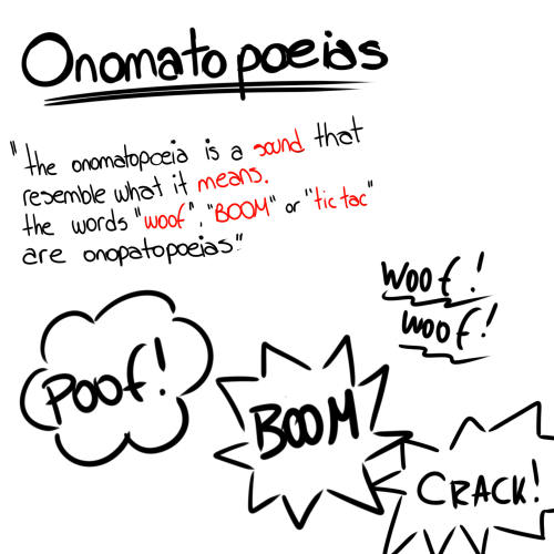
10. Readable fonts. Even if you chose to ignore people with poor sight or dyslexia, the majority of your readers aren’t gonna be excited about struggling to decypher this:

Also, as much as I love my black speech bubbles, colorful text on black still kinda hurts the eyes. I wouldn’t recommend doing that for all the characters. Black speech bubbles are usually used for creepy, inhuman voices. And yes, having a colorful outline in this case helps.
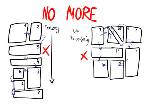
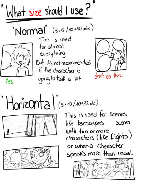
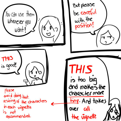
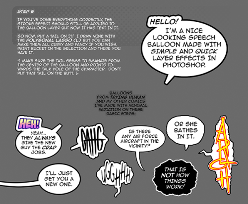
11. Probably newsflash, but did you know that panels have their place, order and functions? They do! My favourite thing ever is how I used panels when I was like 12:

(comics ain’t rocket science, but this one is)
The composition of the panels and word balloons always serve for a better reading experience. They guide your eyes over the page, so that you never feel lost or confused. The images in the comic equal frames in a movie, so it’s pretty damn important in what order you look at things and how quickly you can understand what’s going on!

(Eric Shanower & Scottie Young’s Wizard of Oz)
12. One update a week is fine for testing waters. Don’t overestimate yourself, especially if you have a pretty busy life outside it. A stable comic that updates slowly, but regularly is better than an unpredictable erratic one. You can always pick up the pace later, if you feel confident enough.
13. Try to always have a buffer - a couple of pages in reserve. If you’re making the pages much faster than you’re updating, this shouldn’t be a problem. But if those paces are equally the same, it’s goddamn HARD. But on the other hand, if something happens and you skip an update, those come in handy.
If you’re looking at this list and thinking “wow that’s a LOT of work”, you’re totally right. And it’s okay to be intimidated at first! But that’s why it’s important to start with something small. Once you get the formula down, these things will be natural to you.

someting for a friend
Reblog if you’re the gay cousin
Looking for Something? (Mobile)
Anatomy:
Arms
Breasts
Body Types
Feet
Female
Hands
Heads -Ears -Expressions -Eyes -Facial -Hair -Mouths and Lips -Noses -Tears
Humans
Legs
Male
Muscles
Pelvis
Proportions
Shoulders
Torso
Animals:
Anatomy
Antlers
Beaks
Behaviour
Ears
Facial
Feathers
Fur
Hooves
Horns
Insects
Legs
Paws
Talons
Teeth
Wings
Backgrounds:
Cityscape
Indoors
Organic
Perspective
Quick BGs
Simplistic
Brushes:
Photoshop
Paint tool SAI
Design:
Buildings
Character Design
Clothing
Environments
Folds
Heights
Maps
Names
Sketching
Skin Tones
Drawing and Colouring:
Canvas Size
Colour Palettes
Colour Theory
Comics
Composition
Lighting
Lineart
Painting
Quick Tricks
Shading
Traditional
Fantasy:
Armor
Archery
Horns
Mythical Animals
Mythology
Power Ups
Weapons
Wings
For the Artist:
Copyright
File Types
Exercises
Portfolio
Reminders
Tablets
Tips and Advice
Tools
Languages:
ASL
Ancient
French
German
Grammar
Italian
Japanese
Korean
Morse
Spanish
Misc:
Animation
Commissions
Cosplay
Crafts
Life
Master Lists
Psychological
Resources
School
Writing
Nature:
Blood
Clouds
Fire
Flowers
Grass
Landscapes
Lightning
Metal
Plants
Rocks
Space
Trees
Water
Wood
Poses:
Angles
Animals
Draw Your X
Humans
Movement
Multiple Persons
Programs:
Clip Studio Paint
Krita
Paint Tool SAI
Photoshop
Etc
World Building:
Buildings
Culture
History
Historical Clothing
Video
Links


PLUS!!:
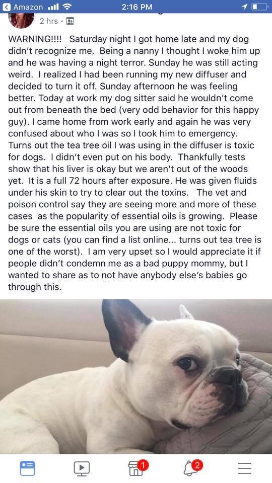
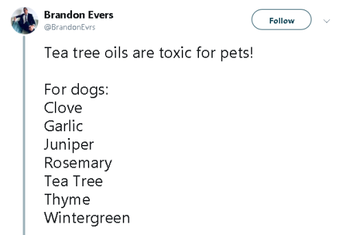
Toxic for rabbits: Anise, Clove, Oregano, Tea Tree, Wintergreen Safe for rabbits: Lavender, lemon, orange, fennel, eucalyptus and peppermint, all should be diluted with water!


I think Della Duck is trying to find her time lost husband using a near light speed test rocket. Her trip affects the entire Duck-Megaverse … which sorta explain 15 minutes for her is 10 years for the triplets but appears to be nearly 65 years for us.

Me.


DUCKTALES #3 COMIC PREVIEW
Some Photoshop Tips
I’ve been getting quite a few asks about the process for the patterns in my stylized artworks, so I decided to put together a couple of tips regarding them.
Firstly, what you need are
— CUSTOM BRUSHES —
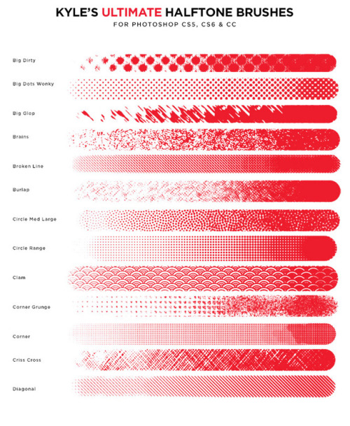
Most of the patterns I use are custom brushes I made, such as those:

For the longest time I was convinced making brushes must be super extra complicated. I was super extra wrong. All you need to start is a transparent canvas (2500px x 2500px max):

This will be your brush tip. When you’re satisfied how it looks, click Ctrl+A to select the whole canvas and go to ‘define brush preset’ under the edit menu

You will be asked to name your new glorious creation. Choose something that describes it well, so you can easily find it between all the ‘asfsfgdgd’ brushes you’ve created to be only used once

This is it. Look at it, you have just created a photoshop brush. First time i did I felt like I was cheated my whole life. IT’S SO EASY WHY HASN’T ANYONE TOLD ME

Time to edit the Good Boi to be more random, so it can be used as a Cool Fancy Pattern. Go into brush settings and change whatever you’d like. Here’s a list of what I do for patterns:
- under Shape Dynamics, I increase Size Jitter and Angle jitter by 5%-15%
- under Brush Tip Shape, I increase spacing by a shitload. Sometimes it’s like 150%, the point is to get the initial brush tip we painted to be visible.
- If I want it to look random and noisy, I enable the Dual Brush option, which acts like another brush was put on top of the one we’ve created. You can adjust all of the Dual Brush options (Size, Spacing, Scatter, Count) as you wish to get a very nice random brush to smear on your backgrounds

The result is as above. You can follow the same steps to create whatever brush you need: evenly spaced dots that look like you painted them by hand, geometric pattern to fill the background, a line of perfectly drawn XDs and so on.
BUT WAIT, THERE’S MORE
— PATHS —
But what if you want to get lots of circles made of tiny dots? Or you need rows of triangles for your cool background? Photoshop can do all of that for you, thanks to the magic of paths.
Typically, paths window can be found right next to Layers:


Draw whatever path you want, the Shape Tool has quite a bit of options. Remember, paths are completely different from brush strokes and they won’t show up in the navigator. To move a path around, click A to enable path selection tool. You can use Ctrl+T to transform it, and if you move a path while pressing Alt it will be duplicated.

Now, pick a brush you wish really was in place of that path you’ve drawn and go to layers, then choose the layer you want it to be drawn on. Then, click this tiny circle under the Paths window:

Then witness the magic of photoshop doing the drawing for you while you wonder how tf have you managed to forget about this option for the past 2 years

You can combine special brushes and paths for all sorts of cool effects. I mostly use them in backgrounds for my cards, but you can do whatever you want with them.

I hope that answers the questions for all of the people who were sending me inquires about the patterns. If you have any questions regarding this or any other Photoshop matter feel free to message me, I’m always up for complaining about how great and terrible Photoshop is C’:


Real, pressure-responsive halftone painting is now possible in Photoshop, with my new Halftone brushes.

I’m starting the ‘genuine setheverman appreciation club’ because yea I know hes a meme but I think hes genuinely funny and a legitimately cool dude, reblog to join the club

dsjkgds First of all thank you so much aaaah QvQ It means a lot to me TvT
Sooo I use Clip Studio Paint for most of the drawings I post on tumblr (I use also photoshop for my school’s works)

I use a simple pencil for the line and sketches QvQ (and here you can see the global ‘interface’ of the software, and it’s in french sorry ahah)

For coloring I use mostly the brushes ‘water color opaque’ and ‘watercolor transparent’ (
For photoshop you can find a lot of brushes on the internet for free > these ones are pretty cool if you want
https://www.deviantart.com/sakimichan/art/Photoshop-Brushes-343664542 –> there are a lot of super brushes on devianart ^^
And for the softwares, Paint tool sai and Krita are really good too! (the last one is free compared to Paint tool sai, Clip studio paint and photoshop so it is really cool ahah)
Hope I gave you the answers you wanted QvQ
(and idk if you wanted to know the tablets I use too but I draw with a cintiq 13 HD or a wacom creative pen and touch QvQ)
@bloosume