Colour Studies - Blog Posts
Part 2/6 - Adapting a Classic (Style)
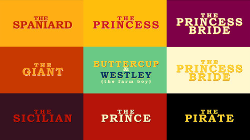
Part 1 - The Family | 3 - The Sicilian Assassins | 4 - Buttercup and Westley | 5 - The Prince and the Count | 6 - Florin Castle
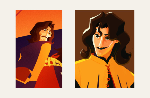
One of the ideas behind this project was about bridging the gap between the old and the new. I wanted to express the vibrance and colourful quality of a medieval (nearing renaissance) setting while using contemporary techniques, to appeal to a modern audience, with a nostalgic undertone.
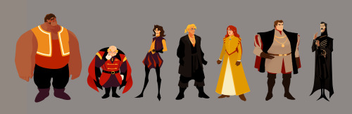
Adding some browns to the palette also helped pushed it towards that slightly nostalgic direction. I shifted the other colours slightly, like using mustard or yellow-orange instead of just yellow, vermillion instead of just orange, and throwing in some violets, all to add that dash of quirky-ness to reflect the fun and witty tone of both the movie and the book.
Another idea is that this version would be a series. This gives us time and opportunity to see and experience the characters' past, like in the book.
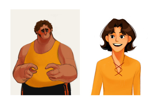
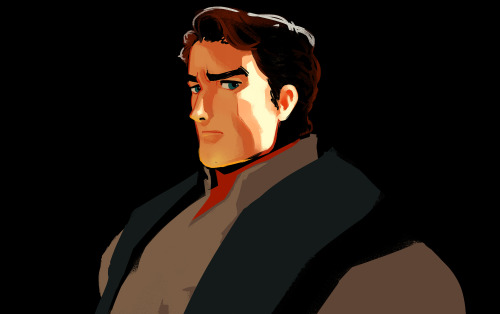
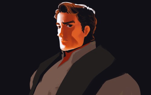
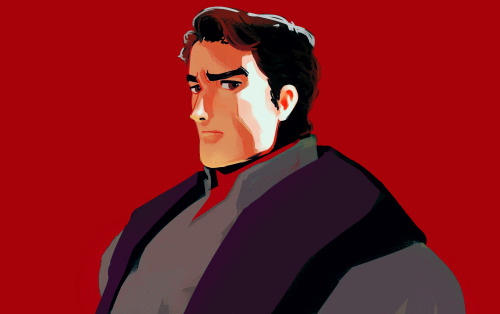
I was figuring out how light would interact with the characters while pushing the role of line. I did studies on how to make a line express form, colour, and light. From afar, the line can be reflected light, but up close the "line" expressing reflected light would spread in a stylized manner. This creates the feeling of an increase of detail when we look at something up close all while strengthening the colourful quality of the project throughout.