Line - Blog Posts


Adventure!! Swipe right for lineart 😳 #water #waterColorPencils #watercolor #art #childrensbook #whimsyillos #whimsical #cute #lineart #line #balloon #steampunk #happy #adventure #illustration #artistOnInsta #artistmichi #renuka #michi #inspiration #child #book
This. Is why i play Battle Cats.


‘The Battle Cats x Eva’ LINE sticker set! Part of the collaboration event between The Battle Cats and Evangelion that starts in the game on July 18, 2019.
All 24 stickers available below~
Keep reading

Microwave Spaghetti Squash - Vegetables Use this simple recipe to learn how to microwave spaghetti squash. an approach that is much simpler and faster than waiting for it to roast in the oven!


Hypnos, God of sleep


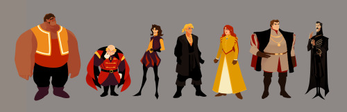
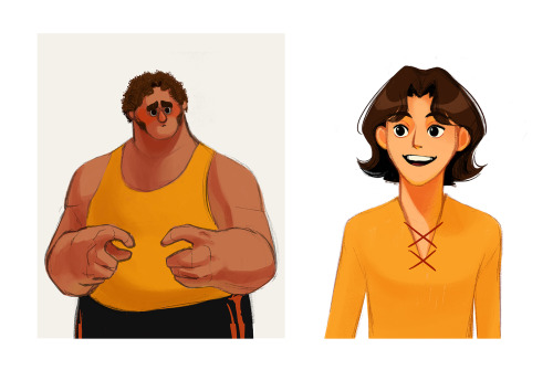
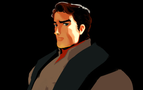
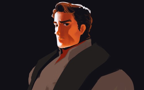
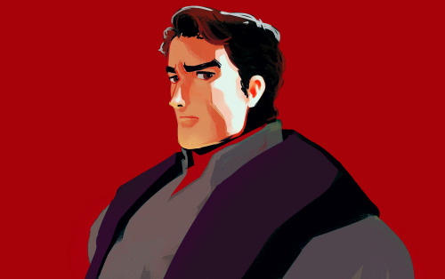
Part 2/6 - Adapting a Classic (Style)
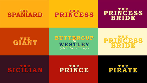
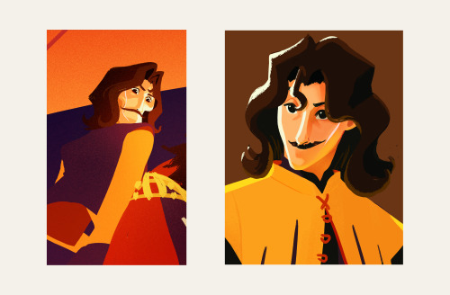
Part 1 - The Family | 3 - The Sicilian Assassins | 4 - Buttercup and Westley | 5 - The Prince and the Count | 6 - Florin Castle
One of the ideas behind this project was about bridging the gap between the old and the new. I wanted to express the vibrance and colourful quality of a medieval (nearing renaissance) setting while using contemporary techniques, to appeal to a modern audience, with a nostalgic undertone.
Adding some browns to the palette also helped pushed it towards that slightly nostalgic direction. I shifted the other colours slightly, like using mustard or yellow-orange instead of just yellow, vermillion instead of just orange, and throwing in some violets, all to add that dash of quirky-ness to reflect the fun and witty tone of both the movie and the book.
Another idea is that this version would be a series. This gives us time and opportunity to see and experience the characters' past, like in the book.
I was figuring out how light would interact with the characters while pushing the role of line. I did studies on how to make a line express form, colour, and light. From afar, the line can be reflected light, but up close the "line" expressing reflected light would spread in a stylized manner. This creates the feeling of an increase of detail when we look at something up close all while strengthening the colourful quality of the project throughout.

I’m currently on a Gotham kick--the typeface/font, not the Batman universe city.
Anyway, I doodled this in International Macroeconomics after a bit of thinking on my last self-imposed design challenge, because I wanted to make something that would WORK with the grid layout trend I’ve been seeing...
...this more or less came out as expected. I’m pretty content with it. I’d wager I could use this as a base for some sort of project later on if I got the right photographs and fiddled around with the black space. Or the white space. Doesn’t really matter, I guess!
Blue and Gray Zigzag Stripes

This zigzag Stripe design is classy, featuring blue and gray abstract patterns.