
269 posts
Latest Posts by arttuti - Page 6


sorry for any grammar mistakes
long time without a tutorial… I tried to explain my general process of working here, hope someone will find it useful :)
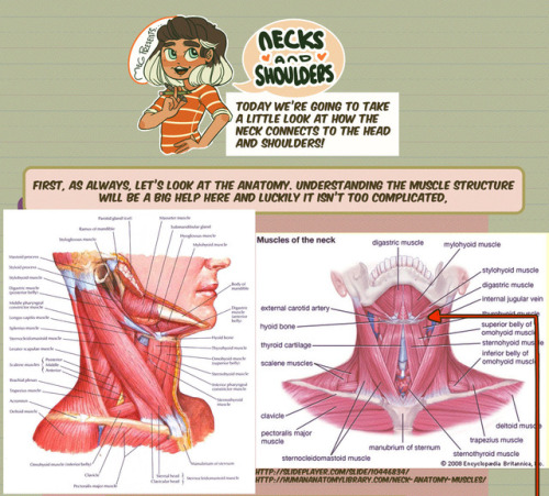
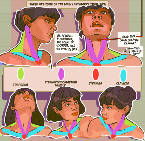
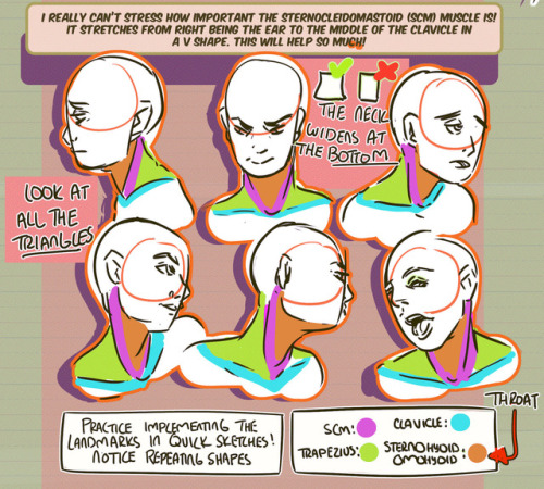
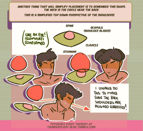
Hey friends! Meg here for TUTOR TUESDAY! Today we take a look at the neck and how it connects to the head and shoulders! Thanks for your patience! If you have any tutorial recs send ‘em in here or my personal. Now go forth and I’ll see you next week!


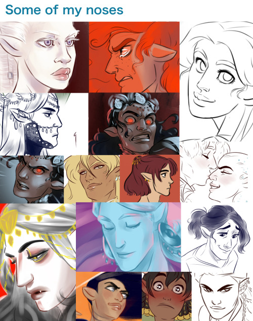
it’s important to think of ears as having 3D volume, and not just being flat bits sticking off the head. it can help to visualize ears as stretchy cups, with a rim and a base. from there you can more easily imagine how their shape distorts as they move in space.
also, don’t forget that the ridges or fur lining of an ear follows the inner curve of the ‘cup’, and can be a great way of further indicating that volume.


Hayao Miyazaki (宮崎駿) sketches showing how to animate running featured in the June, 1980 issue of “月刊アニメーション” magazine.

THE LAYERS CHEAT SHEET PART TWO (PART ONE HERE) Once again, I’m no expert- there are things about these layers I probably haven’t covered, so please try them out for yourself! Layers 1-7 help your contrast. They are usually a pair of the former two groups I went over in my last post. 1. OVERLAY: Helps your contrast by boosting your lights and darks, while the more mid tone pixels aren’t affected as much. It does this based on the layers beneath it. “Screens” the lights, “multiplies” the darks. 2. SOFT LIGHT: Similar to overlay, but a “softer” effect. You can think of soft light as more transparent. 3. HARD LIGHT: You can look at hard light as an intense version of overlay, with much brighter colors and a much less transparent look. 4. VIVID LIGHT: This is the heavy metal version of overlay- think of it similar to color dodge and color burn. Very intense colors, good for finding interesting lighting and color combos. 5. LINEAR LIGHT: Crazy amounts of contrast and color is added here, even more than vivid light. so heavy metal 6. PIN LIGHT: This one is interesting because besides it also being an intense contrast layer, it can add random noise to the active layer. Apparently this is a combo of the lighten blend mode on the light pixels and darken on the dark pixels, but the noise effect is what makes it really interesting imo. 7. HARD MIX: You will turn this mode on and be like “no” but it is actually adjusting its fill will reveal another overlay-ish type layer. It throws the colors on the active layer towards a more primary color such as blue, or magenta. _____ 8. DIFFERENCE: This will invert your colors, taking into account the layers below. If colors are very close, they will be black. 9. EXCLUSION: This also inverts your colors, taking into account the layers below. If colors are very close, they are grey. Exclusion and difference are layers that would be good for graphic pieces, I haven’t really gotten used to incorporating them in my painting workflow. 10. SUBTRACT: Similar to the above layers, but more intense. You will notice that the darker you make your active layer with Difference, exclusion, and subtract, the lighter and more transparent looking the result will be. 11. DIVIDE: Divide, however, usually results in crazy highlights that are pretty opaque unless the layer is fairly light, and then it will begin to go transparent. ___ 12. HUE: Makes the lower layer take on the hue of the active layer. 13. SATURATION: The lower layers take on the saturation of the active layer. 14. COLOR: The lower layers take on the color of the active layer. 15. LUMINOSITY: The lower layers take on the luminosity, or brightness, of the active layer. Once again, I’m no expert, but I hope this helps. Thanks guys! http://drawmaevedraw.tumblr.com/


A selection of reference imagery showing how a hooded sweater will crease and fold in various poses.
The full size image can be downloaded here:
http://jesterman.deviantart.com/art/Hooded-Top-Clothing-Reference-484552908 I recommend using this only for folds, not as an anatomy reference, due to the quality of the camera used, which has distorted some of the proportions from this distance. If you have any suggestions for items of clothing you want to see referenced, drop me a comment!

More cloth folding reference, this time a leather jacket. Note the big thick folds when the arms are moved.

More cloth fold reference, This time for an unbuttoned, untucked shirt! Enjoy! Again - dont use this for anatomy - the proportions are all messed up because of the camera proximity!


Thought about doing a very simple step by step since I had some WIP pics laying around ( ͡° ͜ʖ ͡°) Most of the time I start working on a drawing by laying down simple shadows and highlights in black & white - it’s one of the easiest ways to see how they affect the scene (and my favorite too). I don’t like worrying about too many things at once, so taking little steps is very helpful to avoid ruining the whole image at the very beginning~ commissions | instagram - deviantart - twitter - paigeeworld - facebook


Idk I will probably change some other stuff later, but… LATER, that’s it for now
-dies-


Cuddles reference sheet by *Kibbitzer
Cuddles for everybody! If you’re interested on Patreon you can find the complete series and all the normal and special reference sheets for 5$ per month! use it for your exercises if you need it XD Patrons or not, thanks for supporting me! ^A^/ <3 Facebook Deviantart
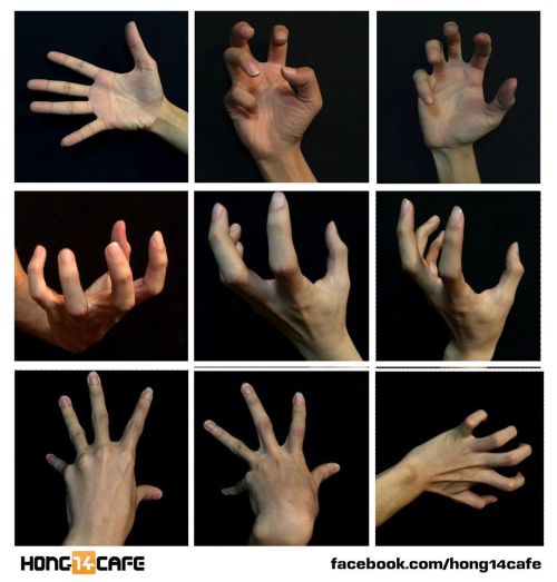
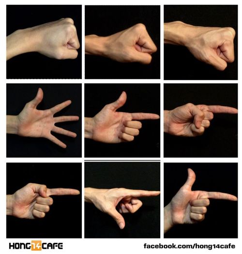
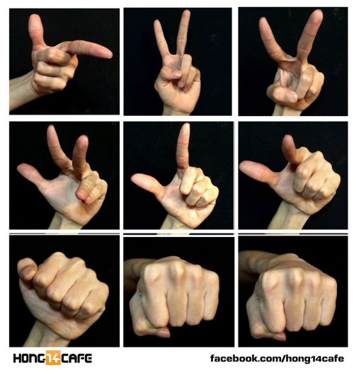
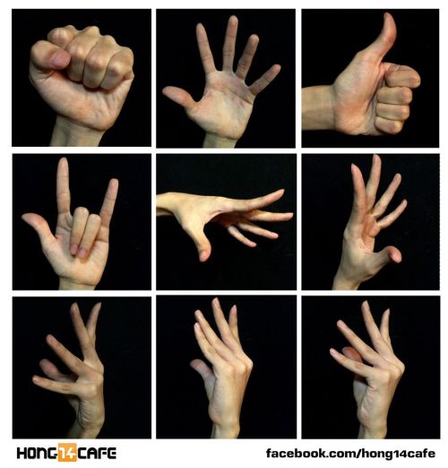
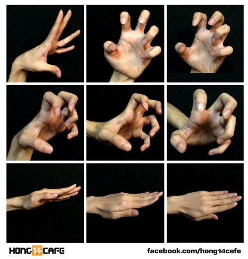
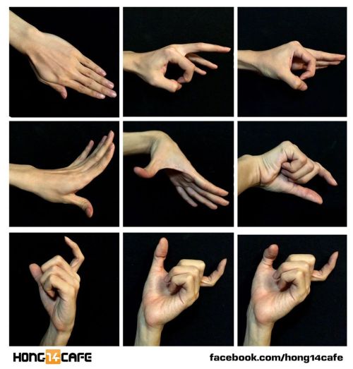
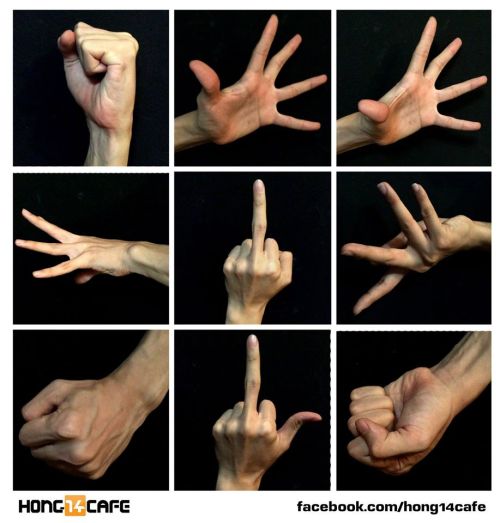
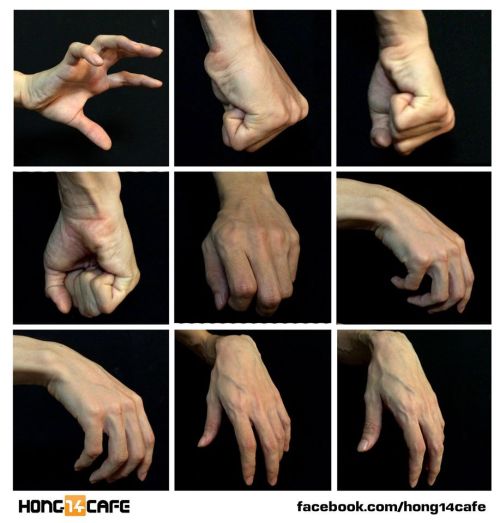
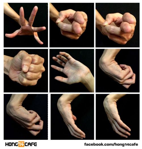
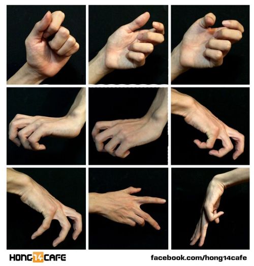
Fantastic hands references by the website Hong14cafe.
Hong14cafe: Facebook | Forum
I absolutely adore your art style I was wondering if you could explain how you draw faces and like heads cause I have a lot of difficulty with constructing the face without having it look like an utter disaster sorry if your busy you don't have to do this but I was just wondering if you could help a young artist out thanks :D
Aww, thanks, anon. I’m pretty haphazard with things, but I’ll try to help.
This is your new best friend!!

The friendly neighborhood scribbly circle here is your foundation for drawing heads from any angle.

Like, any angle.

Because even when viewed in perspective, the head still has the same amount of volume.
As for actually constructing a face and placement of features, you can see that when jotting down a face, I generally lay down those guidelines [here in green] so I have something to work off of when I’m expanding upon a sketch. I would mostly recommend being aware of the underlying structure of the face.

If you’re going for super-anatomically-correct, you can see that facial features line up in specific, symmetrical ways. For real though, nobody’s symmetrical and sometimes noses are long or ears are small and faces are asymmetrical or just plain different. So this is a foundation but not a cast iron rule.
I will say that the more you do it, the easier it will become! It all just takes practice. And I totally tried to screen record a sketch, but my computer is being hella slow and it keeps freezing up, so I give up. In lieu of something new, here’s an older process gif that I think shows things pretty well:

YUP. Hope this helps. o/
Attention anyone who needs hairstyle references
I want to introduce all of you to this amazing place called the ukhairdressers style gallery.
It’s basically a massive database full of high-quality images of different hairstyles. I mean, look at all the options in that sidebar (and part of it’s cut off):

In total they have 976 pages of hairstyles with about 17 styles each, that’s about 16592 hairstyles to look at.
Look at all the stuff they’ve got! Long hair:

Short hair:

Straight hair:

Curly hair:

Afro hair:

Men’s hair:

Hair on older models:

Extra-fancy hair:

Even crazy avant-garde hair:

So if you need help with designing a character or you just want to practice drawing hair, this is a fantastic resource.


I'm having a hard time drawing different glasses from different angles, sort of like a 3/4 view, could you help me with that ?


hope that helps! AND IF u need more help, LOOK FOR SOME GLASSES WEARING PEOPLE n snap their photos
I am so envious of your fabric folds <3 Teach me senpai?
ALL RIGHT I’LL TRY!Note: This is how I personally work with folders, i’m not right neither wrong, different artists have different ways to do the same thing. Remeber to check for more than one as refference!

The shame is HEAVILY influenced by the wind or movement on the character/object, so are the folds that follow the flow of whatever is influencing them!


Always consider the fabric you’re planning to use, a heavy one won’t have as many folds, but will have more bumps, meanwhile thin ones tend to have A LOT of folds and not so many bumps, and often fold over themselfs


If you don’t plan how the object/dynamic/wind whatever will influence the fabric, you may come up with this:


The tip of the arrows will have LESS folds because it’s where the wind is blowing, meanwhile the back of the arrows will have a lot of folds, since it’ll curl and bump on itself!
You can’t just toss folders around without planning how they will be affected, works very similar as hair does!
It ended up so long i really hope it helps omgg ;w;If you want to support me and help me to make more tutorials, you can always tip me! (Not mandatory, don’t feel pressured!)


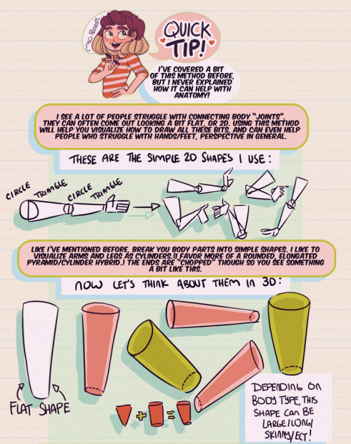
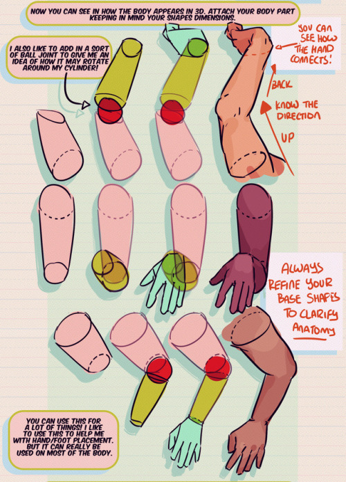
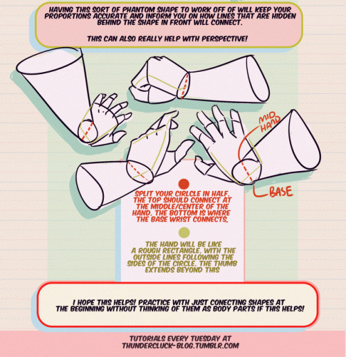
Hey friends!
Meg here for this week’s TUTOR TUESDAY! This week I go over just a little trick that I like to use when drawing and connecting arms/hands/legs/feet ect. This helps me with foreshortening as well. I hope it helps you folks as well! I have tutorials that talk more specifically about hand/foot/leg anatomy here. If you have any tutorial recommendations send ‘em in here or my personal. Now go forth and I’ll see you next week!