IT’S HUEVEMBER!!!, Since I Couldn’t Keep Up With Inktober, I Will Try #huevember This Time. Durning

IT’S HUEVEMBER!!!, Since I couldn’t keep up with Inktober, I will try #huevember this time. durning october I was bussy af with #diademuertos , I will dedicate more time to my art and portfolio. The character I drew is Warren Reddington, one of my characters of the story I will do for my visdev project . . . . #chelsychaconocwarrenreddington #huevember2018 #digitalpainting #visualdevelopment #characterdesign #color #illustration #artistoninstagram #inktober #inktober2018 #LGDF https://www.instagram.com/p/BppDDz-h1v7/?utm_source=ig_tumblr_share&igshid=dd26uog2xhyb
More Posts from Chelsychacon and Others

Brushes by IvanKhomenko

My art summary of 2018, hope you like it! Let's start 2019 with good vibes and creative stuff!!! . . . . https://www.instagram.com/p/BsHd_4ih8h0/?utm_source=ig_tumblr_share&igshid=193phh74oo2aj
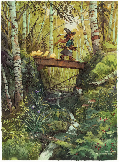

Guiding some lost ducklings back to their mum 🦆🍃


Oil painting by Chris Chan

THE LAYERS CHEAT SHEET PART TWO (PART ONE HERE) Once again, I’m no expert- there are things about these layers I probably haven’t covered, so please try them out for yourself! Layers 1-7 help your contrast. They are usually a pair of the former two groups I went over in my last post. 1. OVERLAY: Helps your contrast by boosting your lights and darks, while the more mid tone pixels aren’t affected as much. It does this based on the layers beneath it. “Screens” the lights, “multiplies” the darks. 2. SOFT LIGHT: Similar to overlay, but a “softer” effect. You can think of soft light as more transparent. 3. HARD LIGHT: You can look at hard light as an intense version of overlay, with much brighter colors and a much less transparent look. 4. VIVID LIGHT: This is the heavy metal version of overlay- think of it similar to color dodge and color burn. Very intense colors, good for finding interesting lighting and color combos. 5. LINEAR LIGHT: Crazy amounts of contrast and color is added here, even more than vivid light. so heavy metal 6. PIN LIGHT: This one is interesting because besides it also being an intense contrast layer, it can add random noise to the active layer. Apparently this is a combo of the lighten blend mode on the light pixels and darken on the dark pixels, but the noise effect is what makes it really interesting imo. 7. HARD MIX: You will turn this mode on and be like “no” but it is actually adjusting its fill will reveal another overlay-ish type layer. It throws the colors on the active layer towards a more primary color such as blue, or magenta. _____ 8. DIFFERENCE: This will invert your colors, taking into account the layers below. If colors are very close, they will be black. 9. EXCLUSION: This also inverts your colors, taking into account the layers below. If colors are very close, they are grey. Exclusion and difference are layers that would be good for graphic pieces, I haven’t really gotten used to incorporating them in my painting workflow. 10. SUBTRACT: Similar to the above layers, but more intense. You will notice that the darker you make your active layer with Difference, exclusion, and subtract, the lighter and more transparent looking the result will be. 11. DIVIDE: Divide, however, usually results in crazy highlights that are pretty opaque unless the layer is fairly light, and then it will begin to go transparent. ___ 12. HUE: Makes the lower layer take on the hue of the active layer. 13. SATURATION: The lower layers take on the saturation of the active layer. 14. COLOR: The lower layers take on the color of the active layer. 15. LUMINOSITY: The lower layers take on the luminosity, or brightness, of the active layer. Once again, I’m no expert, but I hope this helps. Thanks guys! http://drawmaevedraw.tumblr.com/

"mom, are you sure you want to sneak into king's landing? there's guards everywhere, you have an incredibly distinctive appearance, it's going to be nearly impossible"
"this is what i want to do, yes"
"okay, roll stealth. but it's going to be a very high dc"
"natural 20 :)"


Belladonna of Sadness, dir. Eiichi Yamamoto, 1973
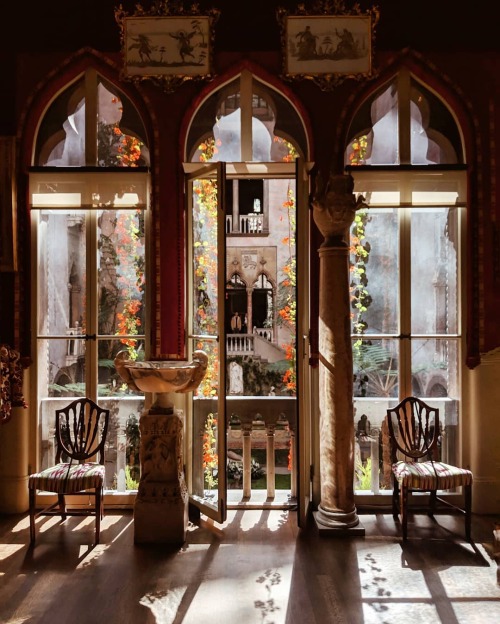
Isabella Stewart Gardner Museum, Boston, Massachusetts, by Melissa Lee

‘Zlatovláska’ (1911) by Karel Jaromír Erben.
Illustration by Artuš Scheiner.
National Library of the Czech Republic
Wikimedia.
I’m sorry kid.

| Visual Developer, Character Designer & Illustrator | Feel free to contact me chelsychacon@gmail.com
224 posts