Tutorial Descent By EWKn

Tutorial Descent by eWKn
More Posts from Chelsychacon and Others
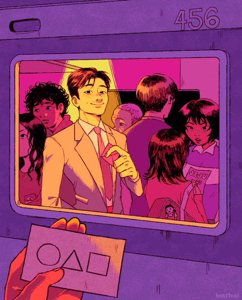
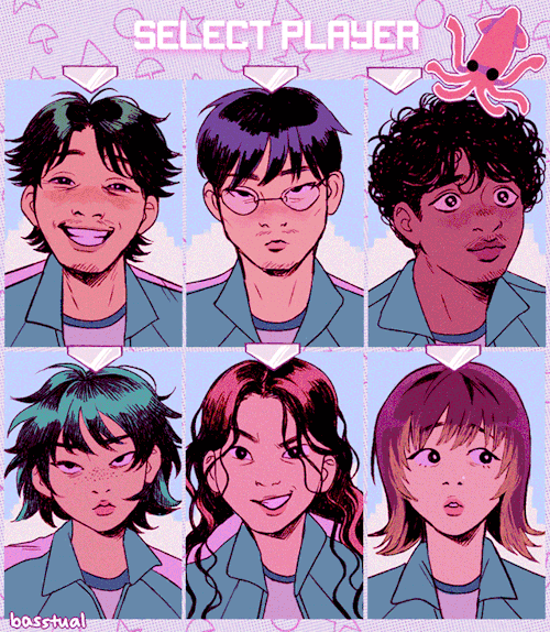
SQUID GAME ◯ △ ☆ ☂


SAVANNAH STEYN as Laena Velaryon House of the Dragon | 1.05 We Light the Way


THE LAYERS CHEAT SHEET PART TWO (PART ONE HERE) Once again, I’m no expert- there are things about these layers I probably haven’t covered, so please try them out for yourself! Layers 1-7 help your contrast. They are usually a pair of the former two groups I went over in my last post. 1. OVERLAY: Helps your contrast by boosting your lights and darks, while the more mid tone pixels aren’t affected as much. It does this based on the layers beneath it. “Screens” the lights, “multiplies” the darks. 2. SOFT LIGHT: Similar to overlay, but a “softer” effect. You can think of soft light as more transparent. 3. HARD LIGHT: You can look at hard light as an intense version of overlay, with much brighter colors and a much less transparent look. 4. VIVID LIGHT: This is the heavy metal version of overlay- think of it similar to color dodge and color burn. Very intense colors, good for finding interesting lighting and color combos. 5. LINEAR LIGHT: Crazy amounts of contrast and color is added here, even more than vivid light. so heavy metal 6. PIN LIGHT: This one is interesting because besides it also being an intense contrast layer, it can add random noise to the active layer. Apparently this is a combo of the lighten blend mode on the light pixels and darken on the dark pixels, but the noise effect is what makes it really interesting imo. 7. HARD MIX: You will turn this mode on and be like “no” but it is actually adjusting its fill will reveal another overlay-ish type layer. It throws the colors on the active layer towards a more primary color such as blue, or magenta. _____ 8. DIFFERENCE: This will invert your colors, taking into account the layers below. If colors are very close, they will be black. 9. EXCLUSION: This also inverts your colors, taking into account the layers below. If colors are very close, they are grey. Exclusion and difference are layers that would be good for graphic pieces, I haven’t really gotten used to incorporating them in my painting workflow. 10. SUBTRACT: Similar to the above layers, but more intense. You will notice that the darker you make your active layer with Difference, exclusion, and subtract, the lighter and more transparent looking the result will be. 11. DIVIDE: Divide, however, usually results in crazy highlights that are pretty opaque unless the layer is fairly light, and then it will begin to go transparent. ___ 12. HUE: Makes the lower layer take on the hue of the active layer. 13. SATURATION: The lower layers take on the saturation of the active layer. 14. COLOR: The lower layers take on the color of the active layer. 15. LUMINOSITY: The lower layers take on the luminosity, or brightness, of the active layer. Once again, I’m no expert, but I hope this helps. Thanks guys! http://drawmaevedraw.tumblr.com/
threw together a quick little narrated video showing the Photoshop layer breakdown for my Valentina piece! It’s actually a pretty simple process when you get down to it 👌🏼


Belladonna of Sadness, dir. Eiichi Yamamoto, 1973


Breaking Down Objects by zephy.fr
Support the artist and follow them on instagram!


Countdown to Hannibal season 3 | Kō No Mono, 2x11

Material things🤟🏼👽

Yuri!!! on ICE sketches c:
-
 sunnyqup liked this · 2 years ago
 -
 bunker-blya liked this · 3 years ago
 -
 chelsychacon reblogged this · 3 years ago
 -
 oglendh liked this · 3 years ago
 -
 fuckingardyn reblogged this · 7 years ago
 -
 njkfztjudiut reblogged this · 7 years ago
 -
 artist0423 reblogged this · 7 years ago
 -
 cat-chmaj-blog liked this · 7 years ago
 -
 a-regular-art-tutorial-blog reblogged this · 7 years ago
 -
 olin-trops-blog liked this · 7 years ago
 -
bloodlustfox liked this · 7 years ago
-
 pandia123 liked this · 7 years ago
 -
 azim-steppes reblogged this · 7 years ago
 -
 fluffysaechero reblogged this · 7 years ago
 -
 i-am-a-suchti liked this · 7 years ago
 -
 briangilman liked this · 8 years ago
 -
 chvngelings reblogged this · 8 years ago
 -
 varthrefs reblogged this · 8 years ago
 -
 jestershark liked this · 8 years ago
 -
 miniguy5-blog reblogged this · 8 years ago
 -
miniguy5-blog liked this · 8 years ago
-
pinopo liked this · 8 years ago
-
 referencehazerd reblogged this · 8 years ago
 -
 chimai liked this · 8 years ago
 -
 antea21 liked this · 8 years ago
 -
 turnip-sized liked this · 8 years ago
 -
 quasionion reblogged this · 8 years ago
 -
 nemira-the-mercenary reblogged this · 8 years ago
 -
 lawofx liked this · 8 years ago
 -
 moopmorpmeep liked this · 8 years ago
 -
 concessit reblogged this · 8 years ago
 -
 the-pale-young-gentlewoman-blog liked this · 8 years ago
 -
buhkkit liked this · 8 years ago
-
 askmist liked this · 8 years ago
 -
mememachine-meme liked this · 8 years ago
-
 swiftyuki liked this · 8 years ago
 -
 ayuyikes liked this · 8 years ago
 -
 buubbalicious reblogged this · 8 years ago
 -
buubbalicious liked this · 8 years ago
-
 love06644 liked this · 8 years ago
 -
 blueravenandsmoke liked this · 8 years ago
 -
 the-thing-in-your-closet liked this · 8 years ago
 -
everythingdeepanddandy95 liked this · 8 years ago

| Visual Developer, Character Designer & Illustrator | Feel free to contact me chelsychacon@gmail.com
224 posts