I'm So Excited To Announce Loish's Digital Art School! I've Been Working On This For A Long Time And

I'm so excited to announce Loish's Digital Art School! I've been working on this for a long time and I'm so glad I can finally share it with you all. This is for those of you who are looking for brushes, tutorials, and other super helpful learning content!
Loish's Digital Art School is a collection of resources for digital artists that includes video tutorials, brushes, palettes, challenges, and more. Most importantly, it’s free! I know how important it is to have access to helpful information, especially if you’re self-taught. To get access, just head on over to Loish.School ❤️
More Posts from Malcontentmoon and Others
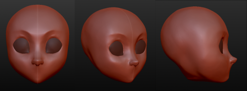
Having troubles with facial angles in your drawing style?
Try a 3D sculpture of your art in your own style in a free program that is simple and very easy to use.
The program is called Sculptris and is a free off-shoot program from Zbrush, that program that you keep hearing about but either takes selling your kidneys or piracy to actually use.
If you download it and sculpt out a facial model, you can have references for your own work for all of time. No more endlessly searching Google for reference materials or twisting/rotating/flipping a drawing to see if there are flaws. And you can easily edit it to create more facial types. This way, you can make character references for any and every face and facial angle that you can think of.
The program offers mirroring right from the start, so your faces will be perfectly symmetrical. You can turn off the symmetry for things like scars or otherwise.
It takes a little time. For instance, I downloaded the program on Christmas and, in my spare time, this took a few days of getting familiar with the program (first day) and then sculpting for a few minutes each day, mostly due to my perfectionist nature. And this one isn’t even done. I still have to mold the mouth, ears, and other smaller aspects before I consider it done. However, I was so giddy over the possibilities that I wanted to share this with my fellow artists.
From now on, I have reference for a face in my own style and will be able to create things so much easier in the future. I hope that this helps you guys and that you have fun with it.

They're done: the Forbidden Halftone Brush Pack of your dreams.
Nine free halftone brushes for Clip Studio Paint. I will not be making another set of these so grab 'em now or never. Upload instructions are included in the folder! Thanks for your support! 😭
Past Freebie Brushes | Subscriber Brushes | And My Brush Tag
New CSP Brushes on my Gumroad!

I made the textures by hand in my sketchbook. They're pay what you want with no minimum.
Enjoy!
I'm so excited to announce Loish's Digital Art School! I've been working on this for a long time and I'm so glad I can finally share it with you all. This is for those of you who are looking for brushes, tutorials, and other super helpful learning content!
Loish's Digital Art School is a collection of resources for digital artists that includes video tutorials, brushes, palettes, challenges, and more. Most importantly, it’s free! I know how important it is to have access to helpful information, especially if you’re self-taught. To get access, just head on over to Loish.School ❤️

(source)
Unsplash - photography, illustration, and art
Pixabay - same as unsplash
Pexels - stock photos and videos
Stockvault.net - stock photos
freepngimg - icons, pictures and clipart
Veceezy - vectors and clipart
Kissclipart and kissPNG - more vectors and clipart (often transparent!)
Getdrawings - simplistic images and drawing tutorials
Gumroad - photoshop brushes (and more)
Canva - needs login but has lots of templates
Library of Congress - historical posters and photos
NASA - you guessed it
Creative Commons - all kinds of stuff, homie
Even Adobe has some free images
There are so many ways to make moodboards, bookcovers, and icons without infringing copyright! As artists, authors, and other creatives, we need to be especially careful not to use someone else’s work and pass it off as our own.
Please add on if you know any more sites for free images <3
for those of you who remember cgtextures circa 2008, texture.ninja has a large repository of public domain textures without annoying hoops to jump through.

Having troubles with facial angles in your drawing style?
Try a 3D sculpture of your art in your own style in a free program that is simple and very easy to use.
The program is called Sculptris and is a free off-shoot program from Zbrush, that program that you keep hearing about but either takes selling your kidneys or piracy to actually use.
If you download it and sculpt out a facial model, you can have references for your own work for all of time. No more endlessly searching Google for reference materials or twisting/rotating/flipping a drawing to see if there are flaws. And you can easily edit it to create more facial types. This way, you can make character references for any and every face and facial angle that you can think of.
The program offers mirroring right from the start, so your faces will be perfectly symmetrical. You can turn off the symmetry for things like scars or otherwise.
It takes a little time. For instance, I downloaded the program on Christmas and, in my spare time, this took a few days of getting familiar with the program (first day) and then sculpting for a few minutes each day, mostly due to my perfectionist nature. And this one isn’t even done. I still have to mold the mouth, ears, and other smaller aspects before I consider it done. However, I was so giddy over the possibilities that I wanted to share this with my fellow artists.
From now on, I have reference for a face in my own style and will be able to create things so much easier in the future. I hope that this helps you guys and that you have fun with it.
I forgot I have to be active here so here’s my Twitter tutorial on how to draw folds I made a while back to help a friend!


Tips for Illustrators (and other artists too!)
I’m an illustration major at MICA (please check out my blog here as a way to support me for making this post!), so this is catered towards what I learned in my illustration critiques and from professional illustrators. I think these tips can go for other artists too, though!
None of these are things that work all the time, but they’re general “rules” I’ve been taught. You can break them, just know why you’re doing so! These are just things I copied from my critique notes, so most are general tips I’ve heard and copied down.
General
Enjoy what you’re working on, but be okay with changing it.
Anatomy, and accurately trying to portray it, is really important.
Time and space can be portrayed through focus and distance.
When working digitally, make some of your own textures (traditionally) and scan them in. Adding them into a picture adds an element of your own hand and makes your work stand apart from other digital work.
Contrast is a great thing.
Saturation is a great thing, especially in watercolor (soak that brush with pigment!).
Your style should never draw an obscene amount of attention to itself; it should just work fluidly.
Consider what medium(s) work best for your idea.
Cover your paint palettes (particularly reusable ones) to make sure dust doesn’t get in the paints.
Spin the page when you’re working. The time is takes to do that will show some major improvement in your art!
Use dark watercolor and then a light colored pencil on top, never the other way around (it will look muddy and ruin clarity).
Make sure to sometime pin or place you piece far away and step away so you can see the whole composition (or zoom out a lot digitally).
Consider the genre and audience of what you’re working for (and if it’s yourself, then you’re your own audience!).
Illustration is a branch of fine art, don’t forget that.
Fantasy art usually needs a lot of high detail.
Coloring
Pick an overall color palette to work in, then add in other colors as needed.
Complementary colors (ones opposite on the color wheel), when placed next to each other, can pop an object forward or draw attention to it. (Think of a red ornament on a green Christmas tree).
Designate the shadows to be either warm or cool, and the highlights to be the opposite. Stay with this throughout the entire picture.
All colors have a warm and a cool hue (cool and warm blues, cool and warm oranges).
The more saturated a color is, the more it will pop forward in the picture plane.
Don’t use colors right out of the paint tube.
When making a shadow, tint the color with the complementary tone (it makes it a little more grey).
Colorizing backgrounds lines makes them recede in a colored image with line art.
Blue and pink tones are great for use in skin tones.
Flats need to be fairly differentiated colors.
Drawing
The reference should never be an excuse for a misleading or awkward pose. You have the artistic license to alter an awkward pose and not just draw from a photo.
With scratchy or textured line art, find some places of solid black too, to allow the eye to rest (or where you want something to pop out).
How you render all the elements of the picture is what makes your own individual style.
When something is illuminated, it should be the brightest part of the composition.
Anything with a straight angle (like the corner of a room) has one wall/side being lighter in value than the other. There is a crisp distinction.
Sometimes adding more lessens the strength of the image.
Fabric folds are crisp, if they’re too soft they’ll look like clay.
Line heaviness and weight can determine depth.
Anatomy/Characters
Anatomical consistency is very important.
Inside of the mouth is usually dark.
Show character motivations with actions and poses.
You can crop a face or figure to set a mood.
In any and every picture, pay special and close attention to the hands, feet, and face.
Learning musculature, even if you use reference, will help you create the body you want for your character. Understand the human form…it’s easier to alter if you understand it in the first place.
To pop a figure forward, add a little bit of rim lighting (great with backlighting).
Composition
Avoid spots where a line or shape comes really close, but doesn’t cross, the edge of the paper. This is called a tangent and tangents are bad (they suck the eye into just that one spot and stop the composition).
Nothing in the picture is accidentally there, it is all drawn by you, so make sure everything has a conscious placement.
Don’t crop anything that shows essential character expression (including essential parts of the pose).
Never crop a figure at a joint (it makes the limb look amputated unintentionally).
Consider how you show detail with smaller characters…what are the essential characteristics?
Shapes of color or tone can make great framing devices.
For the most part, render the foreground with more clarity than the background…you want atmospheric perspective to be used to make it look like it’s receding.
Line heaviness/weight can combat (in a good way) any very dark areas.
When the character breaks a border (shape, line, panel etc), it shows dominance.
Make the shape of your negative space visually interesting.
“Cornerstops” are great. They are a compositional element that visually blocks your eye from running off the corner of a page.
Shadows can be a great compositional element.
Narrative Illustration (Portraying the narrative)
It is a successful illustration if the story is told.
Use every element of the image to tell the story.
Sometimes you have to take out elements you love for the sake of storytelling.
Think of images as being fast/slow, quiet/loud. What techniques portray these senses for you, and why are you using such techniques? What areas of the picture are slower and faster, why those areas?
Indicate how lavish or simple a place is by the details you choose to include in the background.
Don’t make it obvious that you “curated” the picture; it should look natural.
Cover illustrations don’t always need big and bold text, as long as there’s a strong narrative being portrayed.
Something mid action carries the narrative better than pre or post action.
You should be able to tell a story without relying on text.
Sequential Art (Comics, etc)
Color between panels can draw the eye around the page.
Big jumps in narrative can add humor and excitement, just make sure to think of why you are having the jump there.
When starting a sequence, make it obvious where you start (establishing shot; biggest to smallest, etc).
Make sure panels can read as separate images even if you took the gutter away.
Smaller panels are frequently used for faster/quicker actions.
Removing the background in certain panels allows the scene to be read faster; you only need one background per page (unless the scene in the background is changing).
Style, readability, and timing are key things to keep in mind.
Does the punch line/climax happen at the right time on the page?
Before planning a page, ask yourself: “How much time is elapsing between the first and last panel?”
Consider panel shape and size.
The composition, and where the eye flows inside every panel, informs where the eye travels to next…compositionally lead the eye from panel to panel.
The more panels you have, generally the more time goes on.
Don’t rely on speed/action lines to make things dramatic.
Give word bubbles a little breathing room.
When doing a graphic novel, you’ll usually have to redraw the first few pages since the characters will come more naturally to you by the end pages.
There is a design element to sound effects.
Digital Art (Mostly Photoshop based, but some are general tips)
Before printing, you usually want to switch your file to CMYK (though save a file in RGB too). Print at 300 dpi.
Before printing, you can up the brightness, saturation and contrast until it just starts to look awkward. You’ll learn the best settings for the printer you print at.
Don’t place digital textures anywhere. Consciously arrange them.
Don’t overrender. Digital art tends to be the most successful when it feels less digital than someone would expect.
If your color scheme doesn’t look cohesive, you can use a fill layer of one specific color to unify everything (Layer->fill layer). Lower the opacity to around 15-30%.
hot artists don't gatekeep
I've been resource gathering for YEARS so now I am going to share my dragons hoard
Floorplanner. Design and furnish a house for you to use for having a consistent background in your comic or anything! Free, you need an account, easy to use, and you can save multiple houses.
Comparing Heights. Input the heights of characters to see what the different is between them. Great for keeping consistency. Free.
Magma. Draw online with friends in real time. Great for practice or hanging out. Free, paid plan available, account preferred.
Smithsonian Open Access. Loads of free images. Free.
SketchDaily. Lots of pose references, massive library, is set on a timer so you can practice quick figure drawing. Free.
SculptGL. A sculpting tool which I am yet to master, but you should be able to make whatever 3d object you like with it. free.
Pexels. Free stock images. And the search engine is actually pretty good at pulling up what you want.
Figurosity. Great pose references, diverse body types, lots of "how to draw" videos directly on the site, the models are 3d and you can rotate the angle, but you can't make custom poses or edit body proportions. Free, account option, paid plans available.
Line of Action. More drawing references, this one also has a focus on expressions, hands/feet, animals, landscapes. Free.
Animal Photo. You pose a 3d skull model and select an animal species, and they give you a bunch of photo references for that animal at that angle. Super handy. Free.
Height Weight Chart. You ever see an OC listed as having a certain weight but then they look Wildly different than the number suggests? Well here's a site to avoid that! It shows real people at different weights and heights to give you a better idea of what these abstract numbers all look like. Free to use.
-
 fanvoidkeith reblogged this · 1 month ago
 -
fanvoidkeith reblogged this · 1 month ago
-
fanvoidkeith liked this · 1 month ago
-
 lizard-business liked this · 1 month ago
 -
 yesidoodles liked this · 1 month ago
 -
 fyz105244 liked this · 2 months ago
 -
 gryewaren liked this · 2 months ago
 -
 natgoodmans reblogged this · 2 months ago
 -
 snowxhope reblogged this · 2 months ago
 -
snowxhope liked this · 2 months ago
-
 imissmanyland liked this · 3 months ago
 -
 malcontentmoon reblogged this · 3 months ago
 -
 castogrande liked this · 3 months ago
 -
malcontentmoon reblogged this · 3 months ago
-
 shaaaawn liked this · 3 months ago
 -
 cardinalstar liked this · 3 months ago
 -
 lunova-777 liked this · 3 months ago
 -
 archive-of-sorts reblogged this · 3 months ago
 -
 llixulia liked this · 4 months ago
 -
 crebazalr liked this · 4 months ago
 -
 moonlight-m2007 liked this · 4 months ago
 -
 eosofspades reblogged this · 4 months ago
 -
eosofspades liked this · 4 months ago
-
 hikaboom liked this · 4 months ago
 -
 wanderingcorvids reblogged this · 4 months ago
 -
wanderingcorvids liked this · 4 months ago
-
 damadascoxinhas reblogged this · 4 months ago
 -
damadascoxinhas liked this · 4 months ago
-
 peeble reblogged this · 4 months ago
 -
 jazzy-mcdurf liked this · 4 months ago
 -
 curruidcoinhenn reblogged this · 4 months ago
 -
 deliriouslyparanoid liked this · 4 months ago
 -
 justpickupthatpen reblogged this · 4 months ago
 -
 softypyro liked this · 4 months ago
 -
 arttuti reblogged this · 4 months ago
 -
 shotgunanon liked this · 4 months ago
 -
 briggsgotdiggs liked this · 4 months ago
 -
 inhighheels liked this · 4 months ago
 -
 caddies reblogged this · 5 months ago
 -
 art-of-loosing liked this · 5 months ago
 -
 calamansi-calamity reblogged this · 5 months ago
 -
 danielequelelopesbarbosa liked this · 5 months ago
 -
 poptartish liked this · 5 months ago
 -
 helianthus-talks liked this · 5 months ago
 -
 beebuzzly reblogged this · 5 months ago
 -
 illumickeynati liked this · 5 months ago
 -
 aspho3579 liked this · 6 months ago
