Art Reference - Blog Posts
Recently added some more links to this and it's now so much bigger than my original masterpost. Check it out!

My resource site gets updated every time I find something useful! Take a look if you want to learn how to draw, animate, write, set up portfolios, etc.
My resource site gets updated every time I find something useful! Take a look if you want to learn how to draw, animate, write, set up portfolios, etc.
✷ Tonk's Art Resources ✷
Hi! No one asked but I wanted to make a big list of art resources I use because I like to try and help people be creative! Not everything I list is free (mostly the books & some PDFs), but I’ll try my best to keep a big portion of it unpaid.
I've also made a carrd with the same links and a set of software links + prices but I'll be updating this with more things I find that I think would be helpful. :)
Drawing
GES DRAW PARTY - Timed model videos
Drawing Tutorials Online - Figure drawing tutorials (& fun SVA student sketchbook videos)
Line of Action - Timed model Photos
3 tips to improve your PEOPLE SKETCHING (fast urban sketching techniques), Sketching Scottie
Creating Backgrounds, Tim Mcburnie
Drawabox
Reference Angle
Kaycem
Colour Theory
Why Color Studies Are So Powerful, Light Ponderings
Marco Bucci
Colour Tips and Tricks, Iniro (PDF)
This post
Animation
The Animator’s Survival Kit, Richard E. Williams (book) - I think this one is a pretty obvious must-have
How to Animate Night In The Woods [Scribble Kibble #103], Crowne Prince - Helped me get a grip on After Effects
Little Miss Hellraiser Toon Boom Harmony Rig, Edu Bruks - Free Toon Boom Harmony rig
Alex Grigg // Animation for Anyone
BaM Animation
Storyboarding
Exploring Storyboarding, Wendy Tumminello (book)
Storyboarding Essentials: SCAD Creative Essentials, David Harland Rousseau & Benjamin Reid Phillips (book)
Storyboard Pro Crash Course/Tips for beginners, OhJeeToriG
A Guide To Storyboards, MagicBunnyArt (PDF)
Character Design
Character Design Crash Course - A huge free course document with assignments you can work through
Delicious in Dungeon - Fundamentals of Character Design, lines in motion
Writing
Writing for Animation, Comics, and Games, Christy Marx (book)
Screenplay: The Foundations of Screenwriting, Syd Field (book) - I have the 1987 edition
Reedsy
How to Plot a Comic From Start to Finish!, McKay & Gray
Portfolio Tips
How to make a Character Design Portfolio, Jackie Droujko
Top Tips on How to Kickstart Your Storyboard Portfolio, Brown Bag Films
25 Tips to Create an Animation Demo Reel, Sir Wade Neistadt
Extras
PuccaNoodles’ Animation/Art Resource Sheet
My Study References Pinterest board
Motivation Station - Playlist of sketchbook videos and some speedpaints that I use to motivate & inspire me
The Illustrated Freelancer’s Guide, Heather Parry & Maria Stoian (PDF) - Really useful for freelancers in the UK
Software substitution chart
Adobe Suite substitute chart
Remember to check out the carrd, it might have a more updated list!
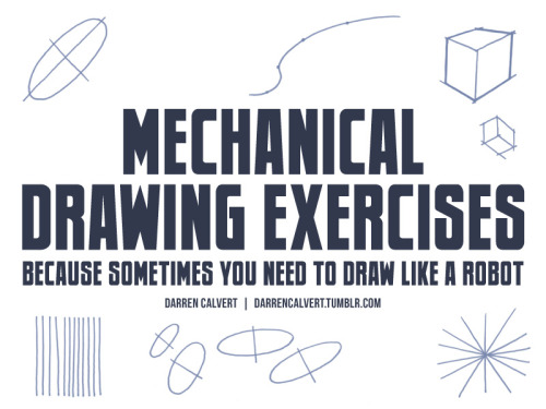


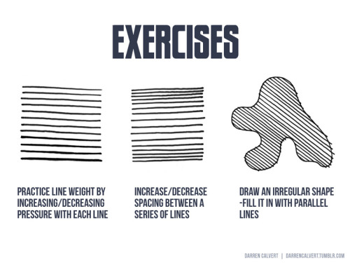


People often say to me: “You draw like some kind of inhuman machine. If I eat your brain, will I gain your power?” The answer is yes, but there is another way. The key to precise drawing is building up muscle memory so that your arm/hand/fingers do the things you want them to do when you want them to do them. Teaching yourself to draw a straight line or to make sweet curves is just a matter of practice and there are some exercises you can do to help improve. If you’re going to be doodling in class or during meetings anyway, why not put that time to good use?


what it says on the tin! I offered to throw together something on drawing raw meat (in a mouthwashing server, naturally) so here it is in case someone finds it useful


Oh, uh. I guess I should mention that I’ve made this thing. Three months after release sounds like a perfect time. Untitled Tile Painter is a quirky little drawing tool that lets you lay down funky geometric Bauhaus-inspired patterns. It’s 50% a useful thing for actual people and 50% me wanting to stretch my UMG muscles on something. It’s also a little bit like a control panel of an alien spaceship, as far as UX goes. Give it a go, if it looks like your kind of thing! It’s entirely free and all generated images are yours to keep and use as you see fit.

The Exotic Animal Photo Reference Repository is live!
You can find it at: https://www.animal-photo-references.com!

Here's how this repository works: all photos were taken by me, a human, at zoos, aquariums, sanctuaries, and other facilities with animals in human care. There is no AI involved in the photo editing or creation and there never will be. Right now there's 56 species on the site; my catalog has over 300 and I will be uploading the rest of them as fast as I can.
Artists creating derivative or transformative works (without AI) have blanket permission to use these references. Yes, even for work you're going to sell.
All other usage/reproduction requires permission, but assume I'm friendly and please do ask! That's educators, researchers, the media, people who need images for a school presentation, etc. This is just to retain copyright/control in case they're scraped/reused unethically - it doesn't meant I don't want folk to have access! So please do reach out via the contact form on the repository website, I don't bite and I'm most likely going to say yes.
Please don't repost the repository photos to your own blogs: I've created @animalphotorefs as a dedicated blog to share photos from the site, and of course I'll reblog a lot of it here! That again just helps with retaining copyright and sourcing of the images. If you really want to repost some for a specific purpose, please just ask me first!
Also, folks, this project has no funding. It's just me and my camera.
There will never be a paywall on the site - I believe resources like this absolutely must be free for everyone to access. So please, please, please support the repository if you use it. Want sneak peeks at photos, cute videos I take, or to help choose what I photograph and what gets posted first? You can do that through Patreon (and there's a free trial on the most interactive tier!) If you'd like to just drop a tip, I've also set up a Ko-Fi.
I can't wait to hear what everyone thinks of the repository.
To whet your thirst for cute photos, here's an Indian rhinoceros contemplating a goose.


Notes on painting portraits with saturated color and early access to a new piece up on Patreon! 💫


Drawing one or two leaves is manageable, but drawing a whole cluster of them is a different challenge altogether! I created a tutorial about conveying dense details, like foliage, quickly and efficiently - here’s a snippet from that video ✨
You can watch the full tutorial over on my Patreon! It's my latest tutorial which means that it's available for just $5 - next month it will go into the backlog which costs $10 to access. If you want this tutorial for $5, make sure you sign up this month!
how r you so good at drawing (halo) armor. You’re literally one of the best I’ve ever seen. Tips please if possible? (specifically for the shapes of the armor)
Oh god heLLO; I'm super bad at explaining my process of drawing RvB armor, as it's been multiple years since I've done it up until recently, so I'm super rusty but I will do my best to explain myself!!!
I've never made any sort of tip guide or tutorial, so please bear with me!

USE REFERENCES!!! This can go for renders from the Halo games directly (ArtStation was a great place to start, I'm not sure how things are post AI ""art"" surge, though) but at the very least, screenshot the heCK out of the series from whatever season you want to draw. There are a lot of different angles, and after they started to animate, it made it easier to get references with arms up or splayed out to the sides, or legs bent and hand motions!! Depends on what you're looking for!!

For this Reference, I used a Halo 3 render, as well as the Caboose-isms poster render. There are more clear renders out there, I'm sure!
First step that I take in learning to draw a new set of armor is color coding the sections that I'm going to draw, and then labeling them with points of interest that make me remember the detail later; Like grooves, or a bevel that looks weird or silly. Color coding and labelling the parts made it easier for me to break it down into smaller bits to draw piece by piece, bc let's face it; Armor can be super tedious and daunting, especially if you're just starting out.
Remember It's ALL SHAPES!!! IT'S JUST SHAPES!!!! Break them down into more simple shapes to find what works best for you! Keep it loose in the sketch stage, so you don't get lost in the pesky details

Remember that the armor goes on TOP of a body, and isn't a part of their body! Halo Infinite dOES have prosthetics that are a bit smaller than the armor, which adds depth and flavor to your armor though!
When in doubt, draw it larger than you mean to, and size it down to fit your other pieces!

SIMPLIFY IT!!! TRACE TO LEARN!!!! Really just figure out where the pieces go and put them together like a puzzle! Armor is simply just, hard, and there's no easy way to learn quickly how to do it efficiently and well; It really does take a lot of practice and trying and sketching and watching clips and staring at other's art to maybe notice shortcuts or even details you didn't notice before!!
But the biggest tip that I can give you is just, don't be afraid to make "bad art" don't be afraid to draw "bad armor" !!! It doesn't have to be perfect, the details don't all have to align on model 100% of the time! All of my art, paintings and all, have things that I fudged or missed, or messed up on and didn't notice, but I still have fun painting and drawing because I like making people laugh with my comics and I like having them feel stuff about my paintings!
Sorry if this wasn't what you were looking for, but I hope this helps even just a little bit!!


Weekly art tip: Drawing folds!
Hope you guys enjoy it I’ve put a lot work to make this ^^
I tried to make it as simple as possible :)


I made an art/anatomy tutorial about birds! I hope people will find it helpful!


HANDS POINTING from the How to THINK when you Draw ENCYCLOPEDIA - the world’s ONLY encyclopedia of drawing tutorials , all of which is FREE for EVERYONE, FOREVER - and I post LOADS of DIFFERENT tutorials EVERY DAY on OUR MASSIVE INSTAGRAM HERE and OUR GIANT TWITTER HERE and on TIKTOK HERE !
PLUS! CLICK HERE for 300 EXTRA FREE TUTORIALS!
Lorenzo!
Sorry if this is a silly question but how do you get that glowy look for colours in your art?? It looks so cool and pretty
Hi! Not a silly question at all! I'll use this drawing that has a transparent white canvas background as an example. Here it's fully colored and without any effects.

When I'm ready to export as a PNG, I merge all the layers into one and then duplicate that one layer.

This is where the effects happen. On that duplicate layer, I use gaussian blur to begin. Usually I go for somewhere between 5 and 10.

Then, again on that blurred layer, I change the layer mode. Typically I'll do multiply, overlay, shade, or shade/shine.

Here I pick overlay.

I usually adjust the opacity to my liking during this stage as well. In this case I set to 60%.

You can also see there is a "glow" around him. Sometimes, if I don't want this "glow", I'll clip the layer to remove it.

And that's essentially it! I use Paint Tool SAI as my drawing app, but I know different apps have different blur and layer mode options that you can experiment with 😊
This is definitely one of my fav things to do with my drawings. It can really make it so much more appealing to look at in the end...
Quick little video tutorial! This is a method I use to block in shapes when I’m fighting the urge to polish my lineart at an early stage, especially in rough concept art that doesn’t actually need polished lineart.
I group two layers in photoshop—a rough sketch, and a flat color—and then carve out the negative space by painting into a mask on the group, instead of filling in the positive shapes. From there I can start painting and adding shading into that group, knowing that I’ve already locked down a good initial silhouette for the object/character:

It feels like oil painting, and I end up finding silhouettes/shapes in a way I wouldn’t if I was obsessively cleaning up the linework first. Digital art has a tendency to veer towards cleanliness/polish, so I love finding little opportunities for happy accidents and a bit of mess!
I used it on my unicorn piece last month, for instance, which I think would have lost a lot of its dynamism and charm if I had worried too much about doing a full ink pass:

Hope this is at all helpful! It’s not a method I use 100% of the time, but it really helps move my process along when I do need it 👍🏼

How I Animate

The Technique:
I draw the frames and then I use the liquify tool to push the lines into the next frame and redraw them where I need to. This allows me to keep the lines consistent, but gives me the control of frame by frame animation bc I am still making each frame manually! I also use 3d models as reference to help me with the angles! Super important to use reference while you animate (and with art in general), if youre no good handling 3d models then act it out and record yourself!

The Theory:
i think most people are at least loosely familiar with the 12 principles of animation (if youre not, heres a 2.5 minute video showcasing them!), but may not necessarily know how to employ them. the main 3 i tend to focus on when I animate is rhythm, telegraphing, and inertia so ill cover those there 👍
1. Timing & Rhythm
Timing is how you space out your frames both in how long an individual frame is held for, and also when you drawn an inbetween of two frames you can favour one frame slightly more than the other instead of drawing the exact average of the cels, giving the favoured cel more timing weight.

Left line has the cels evenly spaced out on the timeline, right holds the first cel for longer and the second cel slightly favours the last frame. It creates a more interesting rhythm to the animation! Rhythm is how I think of animation timing. Theres a beat like a song to every animation I make, and creating an interesting beat is what makes an animation fun to watch (for me, anyway):

2. Anticipation / Telegraphing

Before I animate a big change in movement, I like to telegraph that its coming. Usually this is doing a little counter movement in the opposite direction, but thats not the only way to telegraph a motion, e.g. eye movement can telegraph a head turn!

3. Follow-through / Overshoot / Inertia


Unless the movement is mechanical, it wont come to a hard stop and will have some level of bounce or easing out to it. How much "bounce" you add will have a big impact on how the animation feels, but a very subtle bounce will add a natural feeling to the end of a motion.

Secondary animations will use a lot of this, note that the head and the hand have a small amount of continuous motion (primary animation), and then the hair has a lot of bounce and inertia (secondary animation which reacts to the primary animation). Note the different amounts applied to the braid vs the sideburn vs the bangs
anyway! I hope this was insightful ❤️ if you like my art you can commission me by the by :)
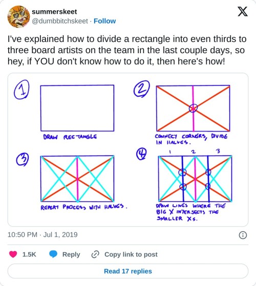
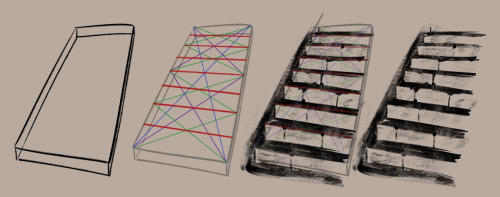
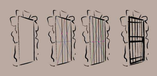
really helpful technique ^ once you know how to divide by halves and thirds it makes drawing evenly spaced things in perspective waaay easier:
Watercolor Tutorial with Yoichi Nishikawa
"Follow along and learn more about the whimsical beautiful world of background art with Yoichi Nishikawa. In this 30-minute tutorial Yoichi walks through the process, shares techniques, and introduces the tools used to create his signature airy cloud backgrounds. Academy Museum family day programs are made possible in part by a grant from the City of Los Angeles Department of Cultural Affairs. To protect the health of our community, the Academy Museum enforces health and safety protocols that are kept up to date on our website." - Academy Museum Youtube Description


HEY, YOU!
DO YOU LIKE OLD COMPUTER GRAPHICS?!


did you like ANY of these photos? would you like to see HUNDREDS MORE OF THEM?! with THOUSANDS OF UNIQUE TEXTURES?! ALL FROM FUCKING DECEMBER 15TH, YEAR 2000?!
NOW YOU CAN!!!
THERE'S ALSO A BUNCH OF CLIPART FROM 1997 IN .WMF FORMAT. I DON'T KNOW HOW TO USE THAT, BUT YOU MIGHT!
STILL not convinced???? LOOK AT THE DISC THEY CAME FROM!

WHAT THE HELL IS THAT!??!?!?!?!?! DON'T WAIT! GO LOOK AT THOSE JPEGS... TODAY!
On the note of """"fandom colors"""", I just want all you artists to know that you don't have to come up with color designs out of your head in order for things to be valid. Referencing design, photos, etc for color pallets is an IMPORTANT part of character and graphic design. (Just like using references for poses!!!) I like to find photos of landscapes or flowers and mosaic blur them- then pick the colors I like out of those. Great way to make cohesive and we'll balanced pallets.
real and true!!!
there is always something to learn in art. today I'd like to share a couple of things that might sound obvious, but to me they pointed out some past mistakes in perspective drawing. hopefully, I won't forget to use this knowledge next time!
music: Elijah Lee - Dreamy
videos mentioned