Font - Blog Posts


I was messing with the different fonts on my drawing app and this happened.
Alternates Below:


Introducing: the Stanford Font
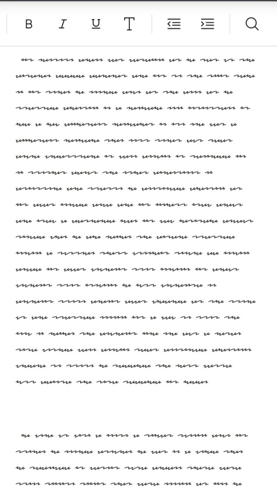
After many hours of tedious work, I can finally share with you my recreation of Ford’s handwriting in Journal 3!
Have you ever wanted to be able to make your own Journal entries and make them look authentic? Perhaps you just want to write “I love you” in Ford’s beautiful, sweeping lettering? Now you can!

It’s in no way perfect, mainly due to my complete lack of font-creating experience, but I did my best to make it as accurate to the Journal as possible! Below is a quote from the page labeled “July 18th”:

You can download Stanford here!

Sé pequeño sé una gota en el jardín sigue el curso de agua que nos lleve donde nunca fuimos por senderos que se bifurcan por mundos paralelos En los primeros 3 minutos se hizo el universo precisamente todo esta pasando aqui y ahora La mosca no razona bien yo le zumbo en sus oidos albinos parpadean bajo el sol, temido un ave rayó el cielo en un trémolo trueno Por calles con luz de patio colmaré tus anhelos todo esta pasando aqui y ahora... Robert Mustang


WARNING. A BOLD HEADLINE TYPEFACE INSPIRED BY A FLASH OF 1.5 SECONDS FROM THE ORIGINAL NEON GENESIS EVANGELION TV SERIES, A CREATIVE REBUILD OF AN ENTIRE TYPESET, INSPIRATION SPARKED FROM A MONTAGE OF ‘BLINK & YOU’LL MISS IT’ CRITICAL UI/GUI SYSTEM-ERROR ALERTS.
FREE DOWNLOAD
I just found the funniest font ever
Like. What is this. Why is this. Who is the target audience of this?


Kind of random: this cool, analytical article on the Papyrus font!
So, I had no idea that Papyrus is apparently a hated font? I thought it was pretty cool-looking when I was a kid. Trying to use it now, though, yeah, there's something just not quite right about it. Thought this article was fascinating because of its in-depth analysis of the font. Knowing nothing beforehand about font construction, it was really neat to see all the considerations that can go into font design.
In an nutshell: Papyrus, unlike Comic Sans, is actually a pretty well-structured/balanced font. The flaw is that it's too perfect: intended to look "handmade," yet every letter is identical the other letters of its kind, and so it comes off looking fake.


Infinity Paper Poster
instagram: @leotheartist

Infinity Paper Posters
instagram: @leotheartist

Typeface: ABC - leo the artist

3D TYPEFACE: ABC - leotheartist

leo the artist - the future is private

Track progress


leo the artist - freedom

by Collins https://ift.tt/33QBJ78 -> Telegram Design Bot
@font-face con Wordpess - Firefox
Firefox per qualche motivo non supporta il @font-face di default su Wordpress, perciò bisogna modificare il file .htaccess includendo questa riga:
Header set Access-Control-Allow-Origin "*"
@font-face - Font personalizzato sul proprio sito web
Per usare i @font-face, convertire il font su http://www.fontsquirrel.com/fontface/generator
Il generatore creerà una cartella con il nostro font convertito con varie estensioni, copiarli tutti nella cartella font del nostro sito web e impostare il CSS in questo modo:
@font-face {
font-family: 'Nomefont';
src: url('font/Nomefont.otf');
src: url('font/Nomefont-webfont.eot');
src: url('font/Nomefont-webfont.eot?#iefix') format('embedded-opentype'),
url('font/Nomefont-webfont.woff') format('woff'),
url('font/Nomefont-webfont.ttf') format('truetype');
url('font/Nomefont-webfont.svg#Nomefont') format('svg');
font-weight: normal;
font-style: normal;
}
Dove Nomefont è appunto il nome del nostro font che vogliamo utilizzare. Alla fine basterà inserire
font-family: "Nomefont";
nella parte del CSS che ci interessa per veder funzionare il nostro font non web-safe nel nostro sito!

Toilet sign Lomann mono font - Atelier Lomann
> https://lab.atelier-lomann.ch
> @atelierlomann


free handwriting font (but not limited to) for digital journaling
get them at my ko-fi shop
do let me know if you encounter any issues!