Gd - Blog Posts
😣😣😣🖤🙏🏻


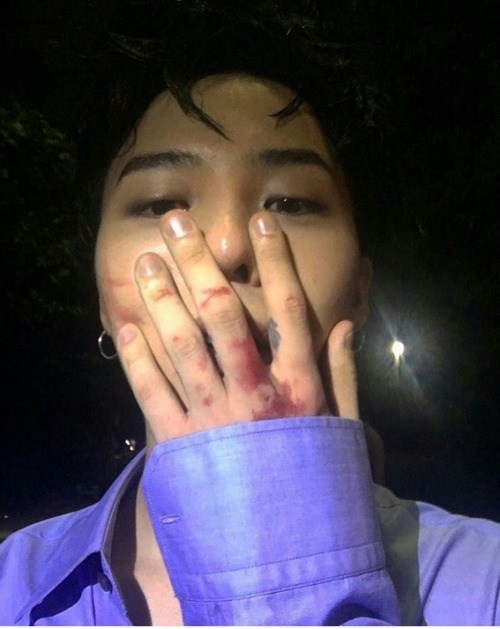
the visual of the century is back 💕


#BRINGBACKGTOP 😞🙏

they’re so cuteness 💔

I drew the whole squad from Trigonometry Launch!
Difficulties from Base Game:
Auto Difficulty: Air 🌬️ Detected👁️🗨️
Easy Difficulty: Water 🌊 on the Hill ⛰️
Normal Difficulty: Fire 🔥 in the Hole 🕳️
Hard Difficulty: Area ⛺ Confirmed ✅
Harder Difficulty: Rock 🪨 on the Ground 🗿
Insane Difficulty: Wind 🍃 from the Landscape 🖼️
N/A Difficulty: The Shadows👤 from the Grave 🪦
Demon Difficulties from Base Game:
Easy Demon Difficulty: Lightning 🌩️ on the Road 🛣️
Medium Demon Difficulty: Tears 😭 on your Eyes 👀
Hard Demon Difficulty: Kids 🧒 at the Basement 🏚️
Insane Demon Difficulty: Knife 🔪 on the Heart 🫀
Extreme Demon Difficulty: Blood 🩸 in the Bath 🛁
Fanmade Difficulties I Made:
Forgiving Angel Difficulty: Hope 😇 in your Mind 😌
Difficulty Error: File 📁 Corrupted ❌
Auto Demon Difficulty: Enemy 😈 Spotted 👁️🗨️
He could have been a soccer star but he chose to be the king of kpop.

❤️🖤💟
SPADE PLEASE CALM DOWNNNNN

also while I’m here I forgot to say I’m Viprin approved once again

forgot to post this my bad

sorry for starving you my tumblr audience… I hope this will be good enough to feed y’all…


extras from Halloween, a costume (and a little doodle) based on the level B!
you have to look at this right now, day one of RobTop’s redesign being out and Spade already decided to make fanart because he’s that cool…..

Tehe 🤭
(Feat. @fadinglight3443's design for Robtop)
I CANNOT GET ENOUGH OF YOUR ART THIS IS SO COOOOOOOOL


Bloodlust!!! 🩸
It’s been actual ages since I last drew him oops,, new one on the right, still a wip!! Bloodlust is the result of Bloodbath snapping(?) its a Jekyll Hyde type of thing where it’s the same guy, but more of a final form after losing all hope. Bloodbath letting go of his humanity (demanity?) after losing literally everything,, his status, his purpose in the world, he failed the hell realm and now his own friends, once immortal high ranks now disappearing, he’s lost saku, and phobos.. and throughout the whole time there’s an unseen someone urging him to turn on the world entirely..
just imagine one of those corny werewolf transformation images LOL THOSE ONES THATS WHAT BLOODLUST IS

my music taste!
me literally listening to a ton of this while making this image and post lol


Day One - Blog Post #1
I knew that class would be good today when we walked in and there was a picture of an egg on the powerpoint. I thought we were probably going to talk abt how an egg is a naturally good package, I didn’t think that we were going to have the opportunity to try and design a safe package for an egg in 20 minutes!
We weren’t given a lot of direction other than to make the package, so my group wondered if we were supposed to focus on appearance, function or perhaps both. We decided to go for both and used two rolls of duck tape to encase the egg, paper to cushion it and then we wrapped it in foam. We also gave our package a little bit of decoration in the form of a pipecleaner bow and an origami butterfly.

I think we focused too much on the appearance of the package instead of putting as much focus on the function. Our package was poorly taped and when Nancy shoved it off the table, unfortunately, the package burst a bit and the eggshell got a crack in it.
It was really fun to do something so fast and right away and got our brains thinking for the rest of the day!
We learned how to score paper using a bone tool and tried it out ourselves on a box shape. So far, I’m really enjoying how hands on this class is.
Our assignment for this next week is to take a package that we were given in class and reproduce it three times, let’s see how it turns out!
Something to reflect on: We’re always wanting to think of the environment as graphic designers but when it comes to packaging and brand, brand needs to come first for a corporation. I think that makes it the graphic designer’s job, to provide a sustainable design for the company in question from the get-go. When redesigning for a brand, however, and working for someone like coca-cola who uses tons and tons of plastic each year but is so iconic, how much room does a designer have to play and is it that designer’s duty to do what they can to help the environment even if it means deviating from brand standards? Is it possible to stick to brand standards with the environment in mind?